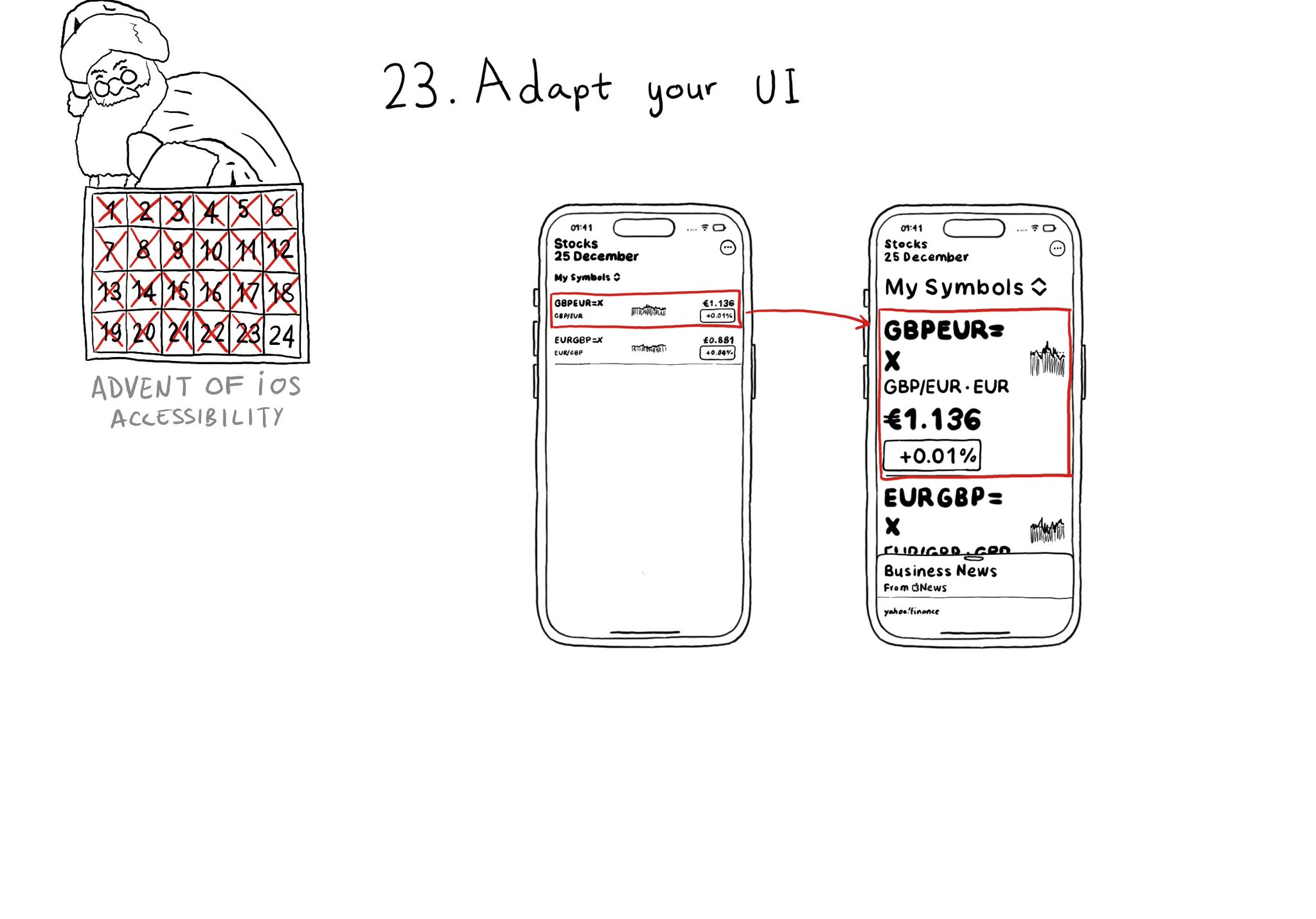
Love this feature! Yahoo released the possibility to explore charts with audio, in the finance app, when using screen readers in 2019. You can do now something very similar since iOS 15.

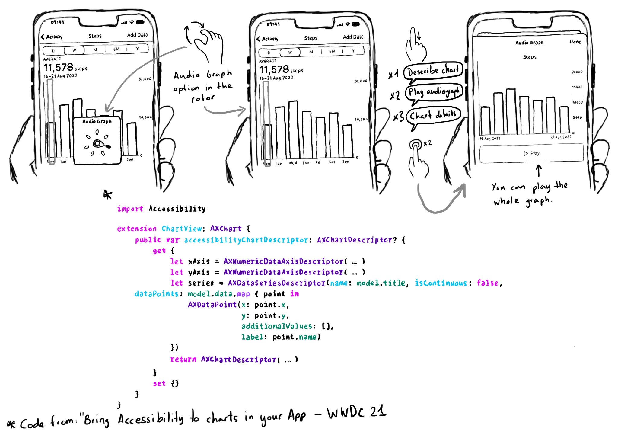
You can move your finger in the x-axes, and it will play a sound with a different pitch depending on the data in the y-axes, making it easier to identify trends in the graphs.
You need to conform to the AXChart protocol by implementing the accessibilityChartDescriptor property.
Documentation: https://developer.apple.com/documentation/accessibility/audio-graphs
WWDC21 session: https://developer.apple.com/videos/play/wwdc2021/10122/
You may also find interesting...

Too much data can overwhelm users. Very little is an incomplete experience. It is hard to find a balance on verbosity and the users may have different preferences. To help with this issue, the AXCustomContent APIs let you mark data as optional.

Since iOS 14, you can get a human readable localised name for a UIColor, with a very useful property called accessibilityName, that you can use in accessibility attributes like labels or values. How cool is that? https://developer.apple.com/documentation/uikit/uicolor/accessibilityname

Support both orientations, if possible. I know not even iOS itself does it, but it hasn't always been like that. You'll create a more robust UI that will be easier to port to iPadOS. And especially, don't force your users to rotate their devices.