You don't have to offer an alternative layout just for the accessibility category. You can actually compare content size categories. So you could tweak the UI already for anything equal to or larger than .extraExtraLarge, for example.
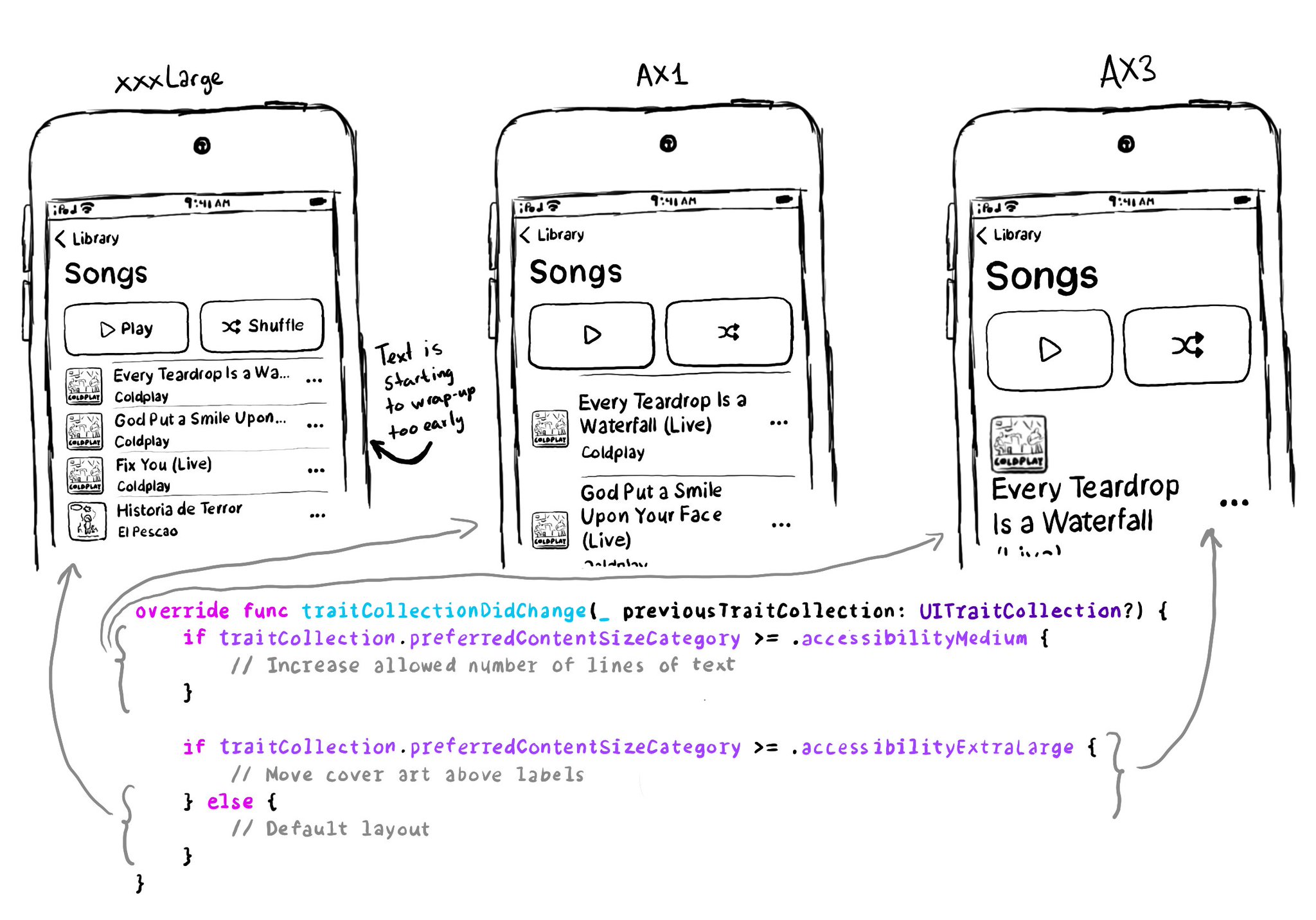
You don't have to offer an alternative layout just for the accessibility category. You can actually compare content size categories. So you could tweak the UI already for anything equal to or larger than .extraExtraLarge, for example.
Some of you have asked me how you can support what I do. This would really help, and would be hugely appreciated:
Find these posts useful? Share them at work, on social media, or with anyone that might find them interesting. Let's spread the word!
Check out any of my apps or games: Xarra!, RetroRapid!, or Mestre!.
A download and a review go a long way. They're free by default. On the App Store, ratings and reviews really help more people discover them.
Finding any of them useful? If so, and if you can afford it, purchasing lifetime access to all features or subscribing lets me buy the coffee that keeps me caffeinated. Caffeine keeps me going to maintain the apps, bring in new features that I hope you'll love, and keep writing.
If you want to keep yourself up to date with what’s going on, or what has been published lately, on how to develop more accessible mobile apps, make sure you subscribe to Accessible Mobile Apps Weekly by @RobinKanatzar from @accessible_apps.
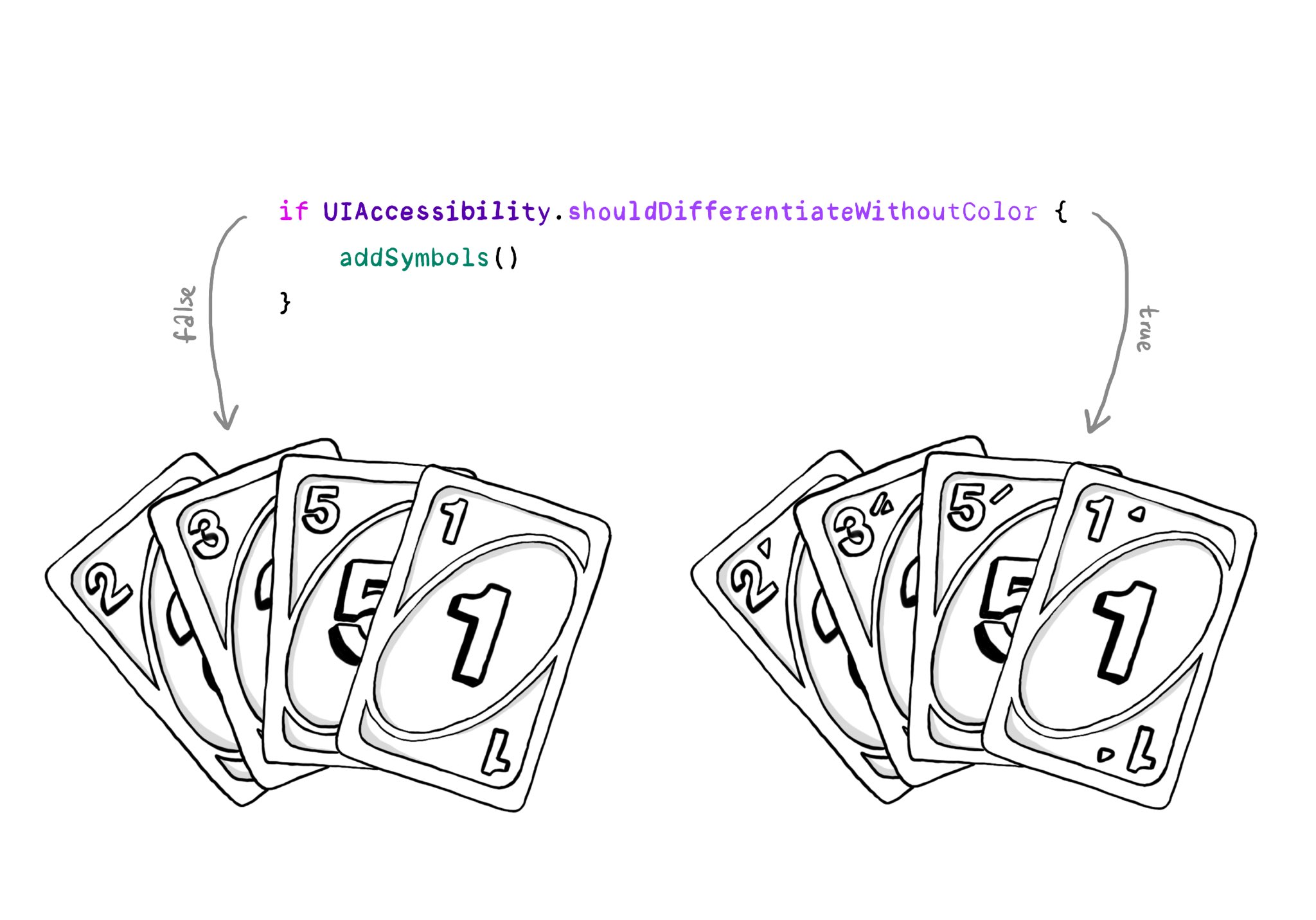
You should convey important information in multiple modes, not just color. If you are still required to do so, at the very least you should complement that info with other modes, like symbols, if the user requested differentiation without color.
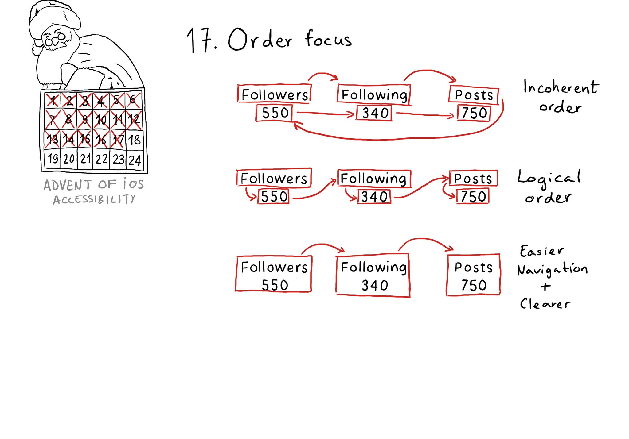
Check for the traversal order of elements in your app. Sometimes, the default top-left to bottom-right order might not be the most logical one. Sometimes, you may consciously want to tweak the order. Some other times, grouping is the answer.
Content © Daniel Devesa Derksen-Staats on Accessibility up to 11! is licensed under CC BY 4.0. License details