It is not just about applying accessibility APIs, but about caring, and thinking of features that can make your app more accessible and inclusive to everyone. Twitter's alt-text feature is a great example. Thanks, @TwitterA11y! You'll be missed.
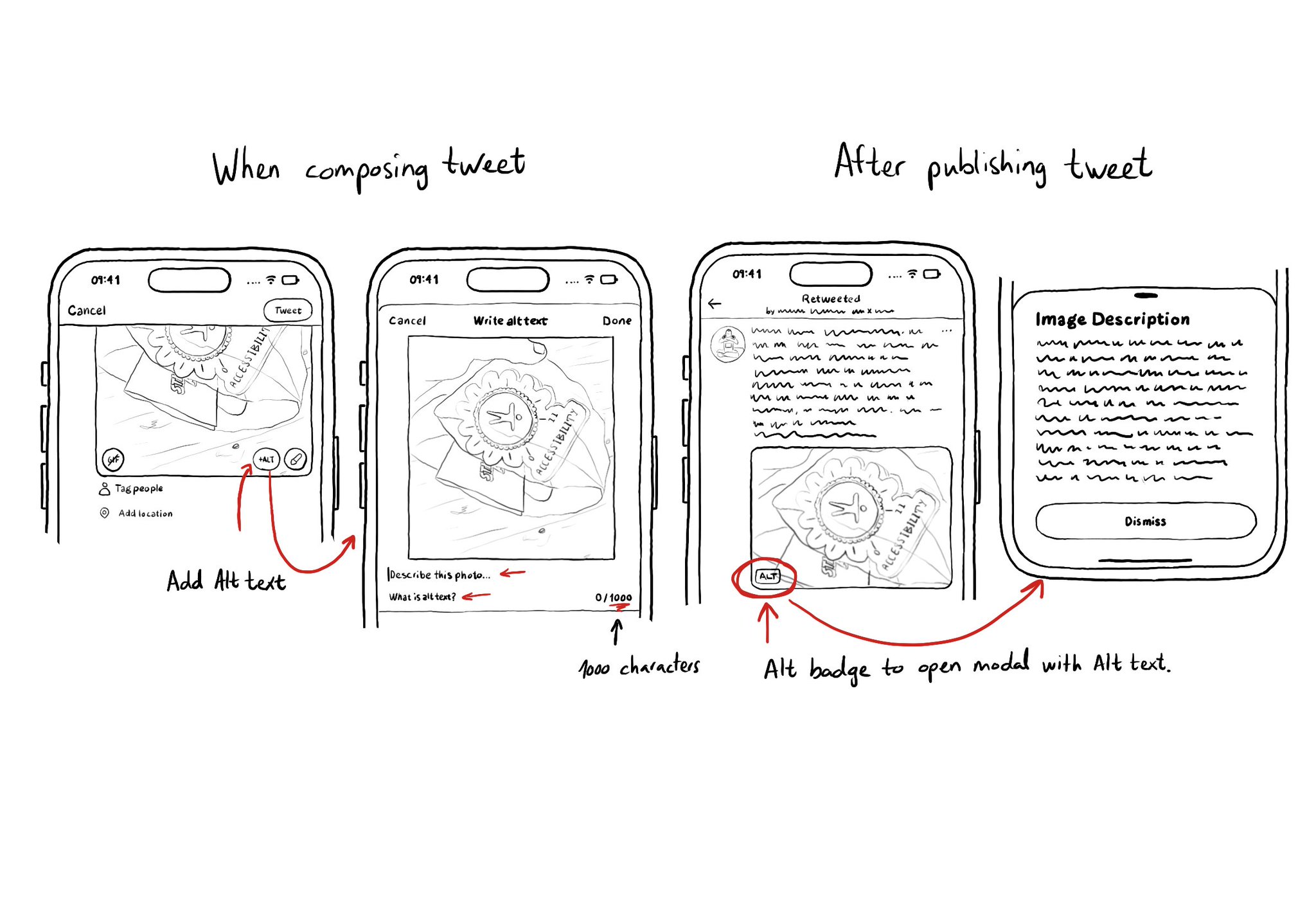
It is not just about applying accessibility APIs, but about caring, and thinking of features that can make your app more accessible and inclusive to everyone. Twitter's alt-text feature is a great example. Thanks, @TwitterA11y! You'll be missed.

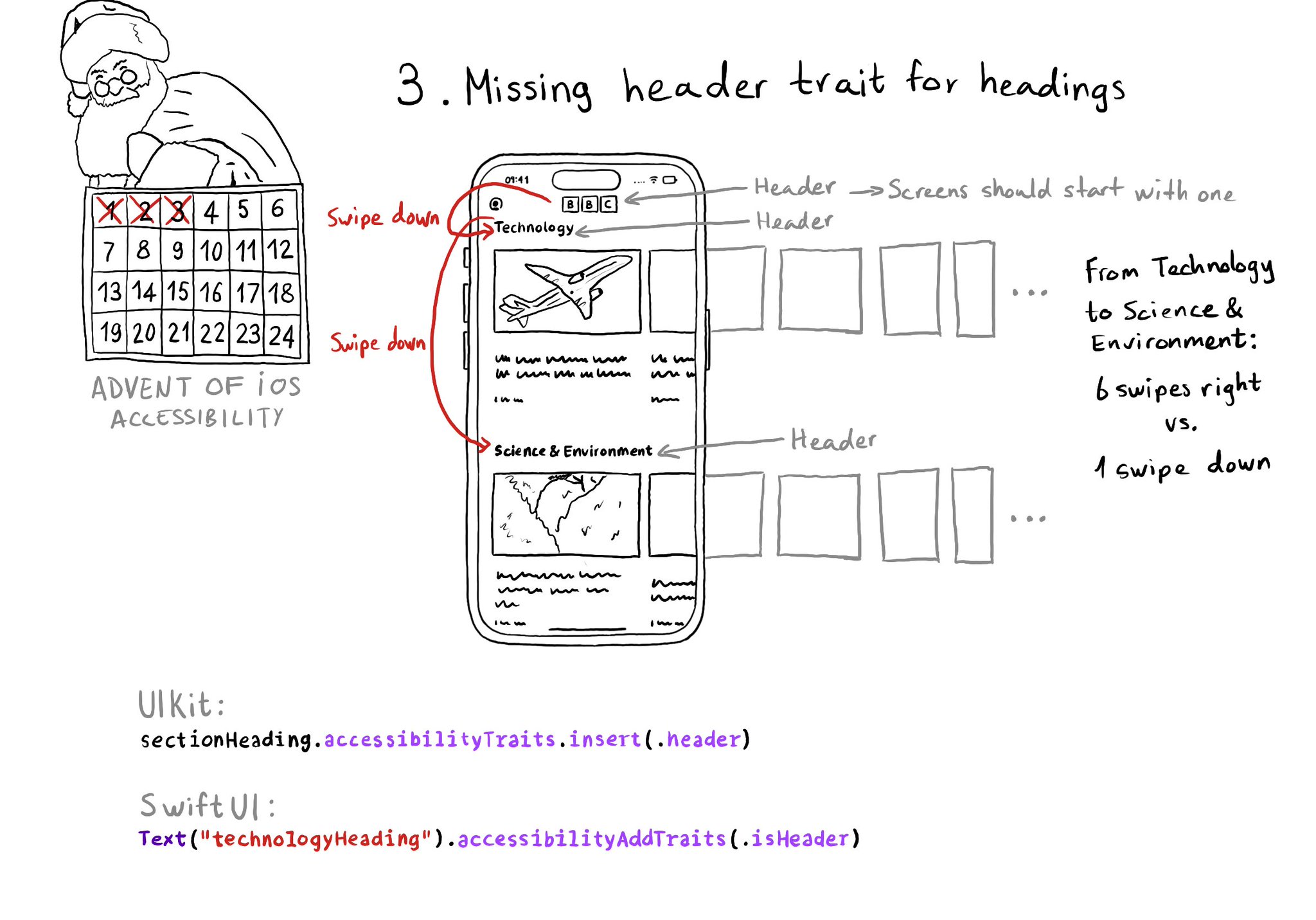
Anything representing a heading in the app should have the header trait. It allows for a faster way of exploring a screen and jumping to the part of the app you are interested in. Screens should also start with a header.
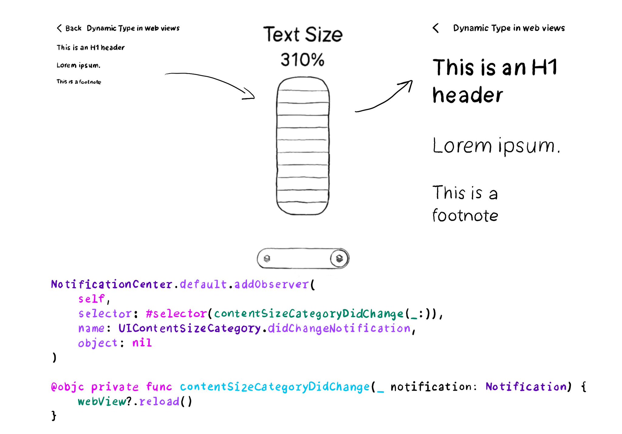
You can add an observer to listen for changes in the content size category, in case it is more convenient than overriding traitCollectionDidChange(_:).
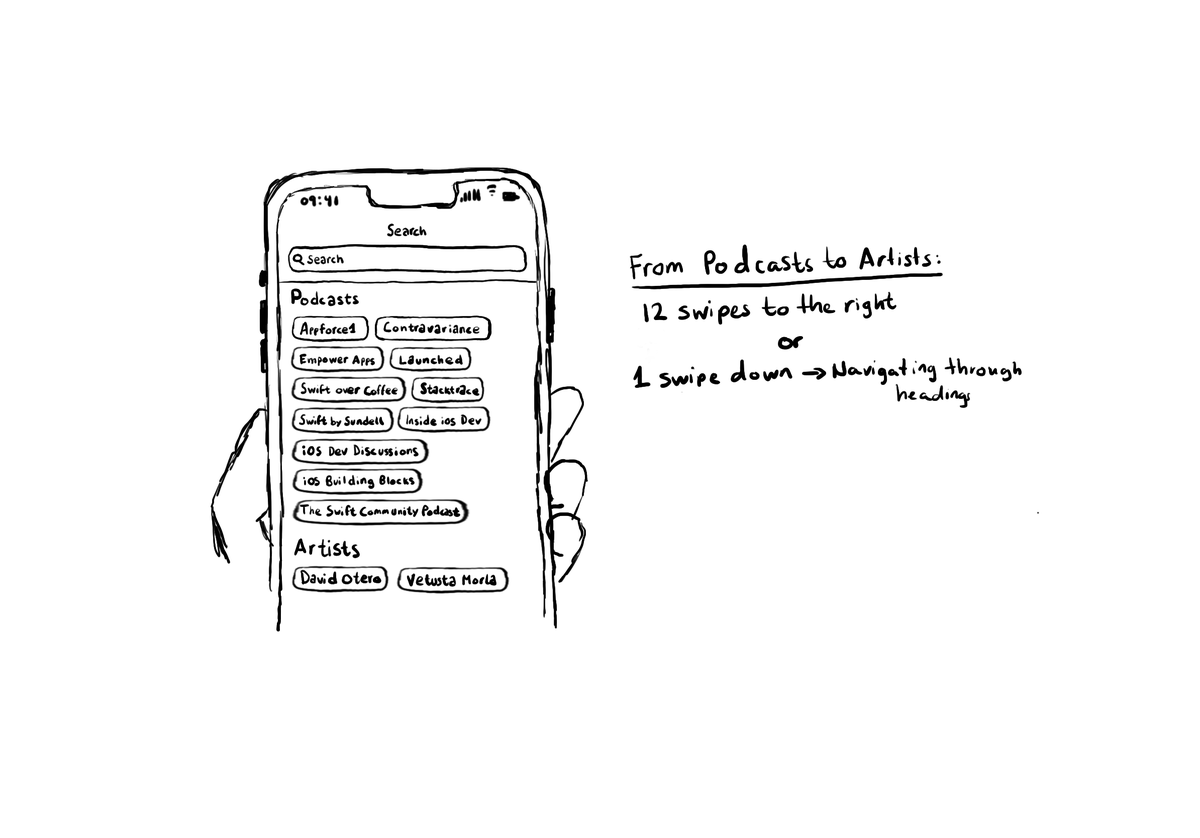
Configuring the header accessibility trait, when appropriate, is one of my favourite accessibility quick wins. In this example, you need a single swipe down, instead of 12 swipes to the right to get to from Podcasts to Artists, in the app.
Content © Daniel Devesa Derksen-Staats on Accessibility up to 11! is licensed under CC BY 4.0. License details