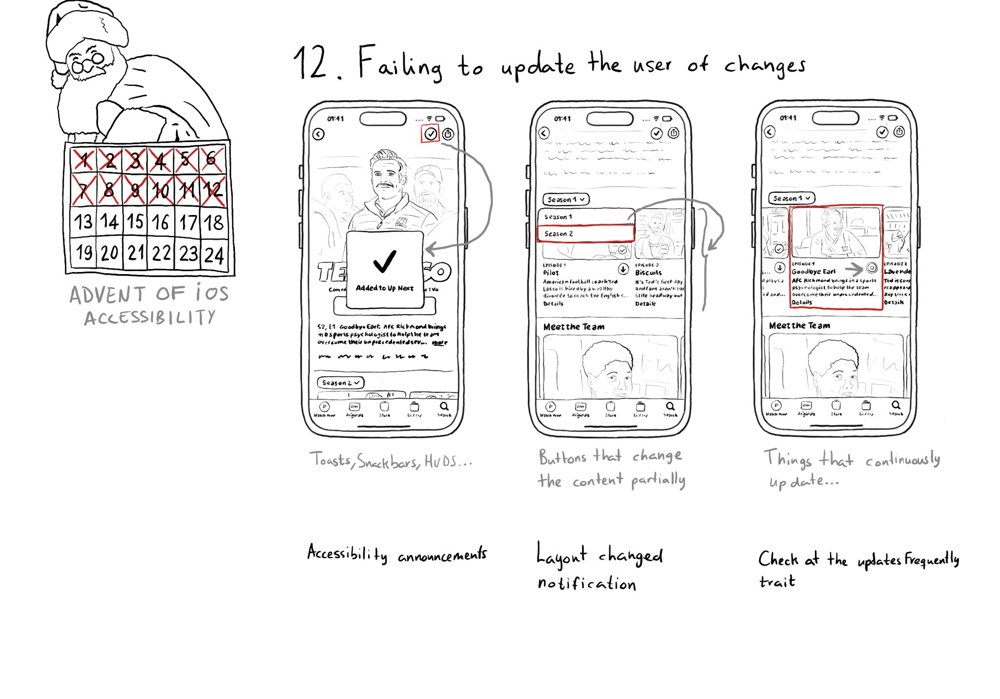
Sometimes we may fail to convey to the user of things changing on the screen in a perceivable way. Toasts and similar should be announced. We may want to make clear that some content on the screen changed. Or we might want to update on progress.
Sometimes we may fail to convey to the user of things changing on the screen in a perceivable way. Toasts and similar should be announced. We may want to make clear that some content on the screen changed. Or we might want to update on progress.
Some of you have asked me how you can support what I do. This would really help, and would be hugely appreciated:
Find these posts useful? Share them at work, on social media, or with anyone that might find them interesting. Let's spread the word!
Check out any of my apps or games: Xarra!, RetroRapid!, or Mestre!.
A download and a review go a long way. They're free by default. On the App Store, ratings and reviews really help more people discover them.
Finding any of them useful? If so, and if you can afford it, purchasing lifetime access to all features or subscribing lets me buy the coffee that keeps me caffeinated. Caffeine keeps me going to maintain the apps, bring in new features that I hope you'll love, and keep writing.
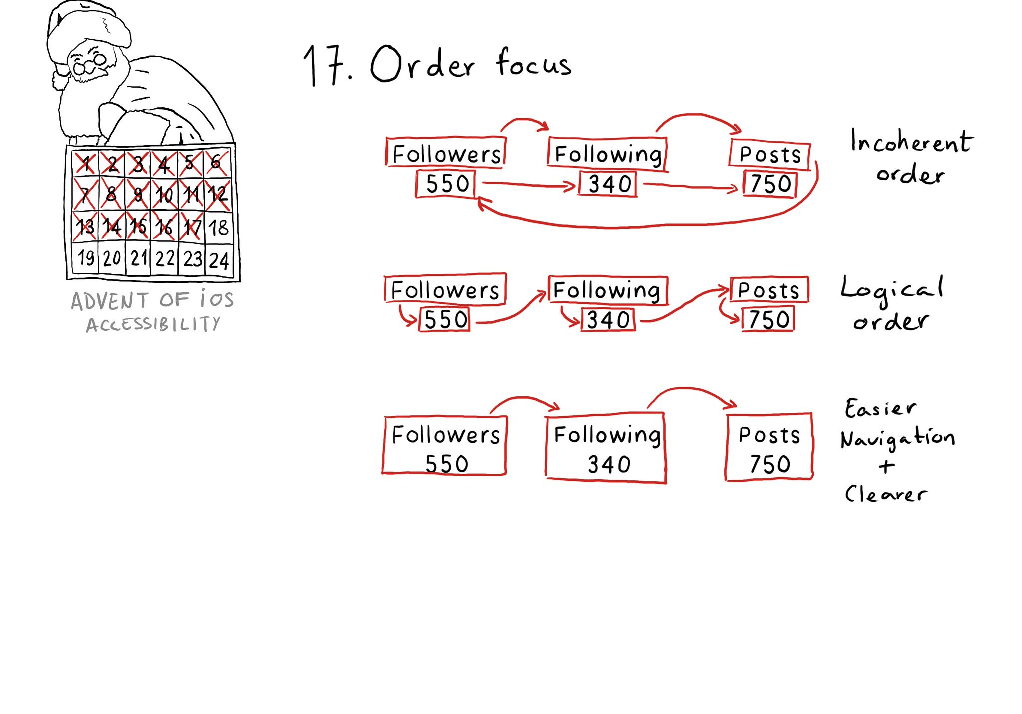
Check for the traversal order of elements in your app. Sometimes, the default top-left to bottom-right order might not be the most logical one. Sometimes, you may consciously want to tweak the order. Some other times, grouping is the answer.
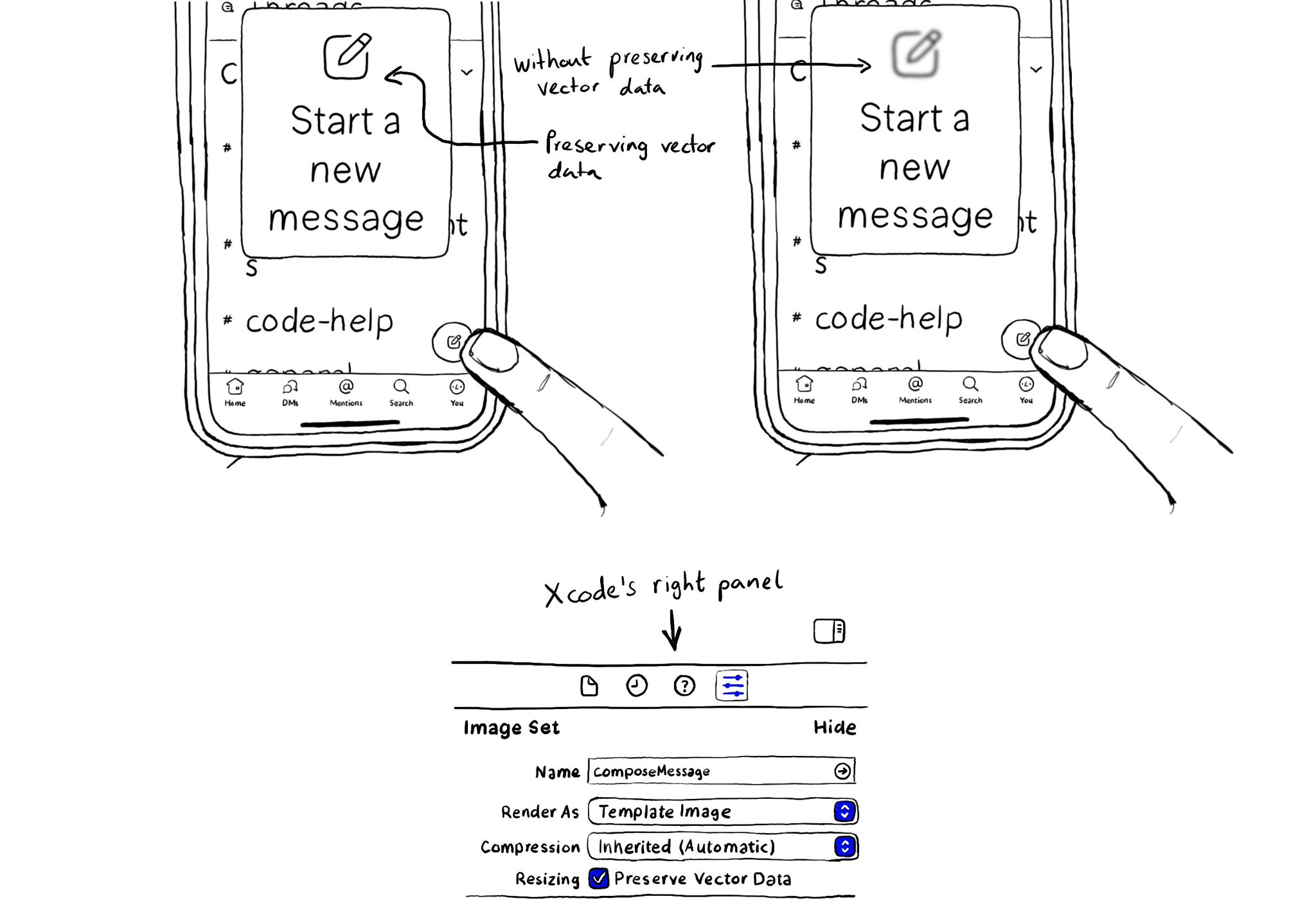
When configuring a largeContentImage or adjustsImageSizeForAccessibilityContentSizeCategory, it is important to use a pdf asset and preserve the vector data so the icons are crisp at any size.
To capture the gesture, you can override the accessibilityPerformEscape() function. In there you can dismiss your view, and return true if you could successfully handle it. https://developer.apple.com/documentation/objectivec/nsobject-swift.class/accessibilityperformescape()
Content © Daniel Devesa Derksen-Staats on Accessibility up to 11! is licensed under CC BY 4.0. License details