Color contrast between text and background is very important for perceivability. As colors come closer to each other, they’re more difficult to distinguish. Notice that colors that work well with big font sizes may not for smaller text.
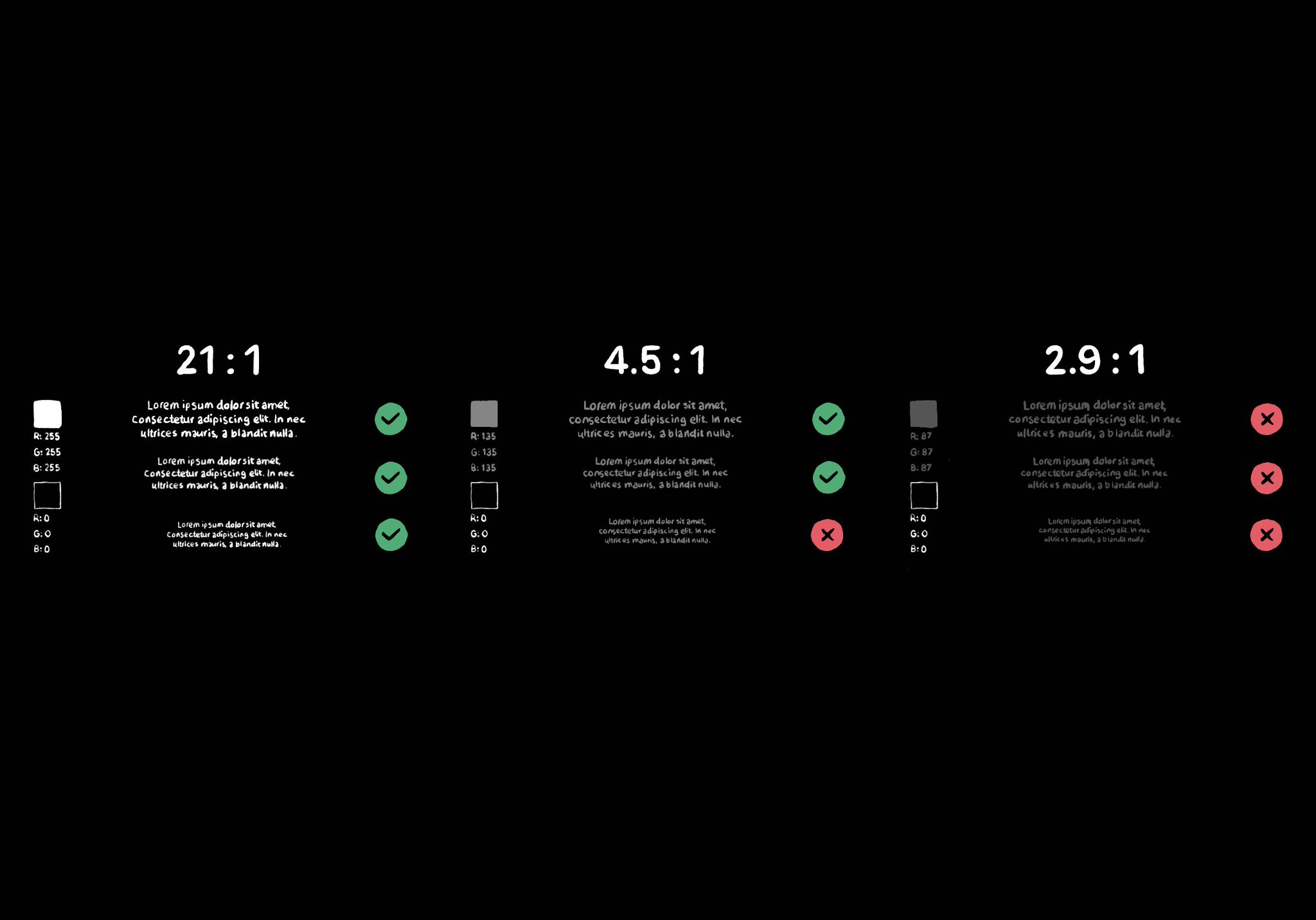
Color contrast between text and background is very important for perceivability. As colors come closer to each other, they’re more difficult to distinguish. Notice that colors that work well with big font sizes may not for smaller text.
Some of you have asked me how you can support what I do. This would really help, and would be hugely appreciated:
Find these posts useful? Share them at work, on social media, or with anyone that might find them interesting. Let's spread the word!
Check out any of my apps or games: Xarra!, RetroRapid!, or Mestre!.
A download and a review go a long way. They're free by default. On the App Store, ratings and reviews really help more people discover them.
Finding any of them useful? If so, and if you can afford it, purchasing lifetime access to all features or subscribing lets me buy the coffee that keeps me caffeinated. Caffeine keeps me going to maintain the apps, bring in new features that I hope you'll love, and keep writing.
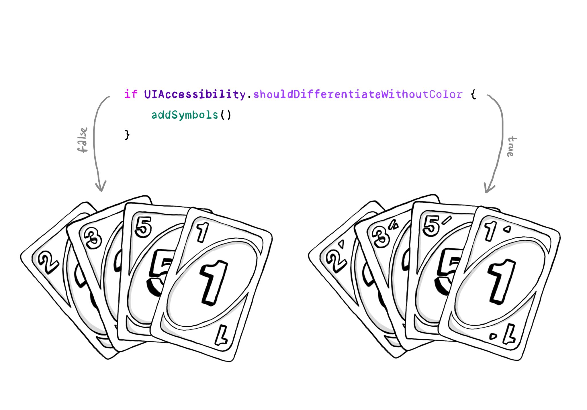
You should convey important information in multiple modes, not just color. If you are still required to do so, at the very least you should complement that info with other modes, like symbols, if the user requested differentiation without color.
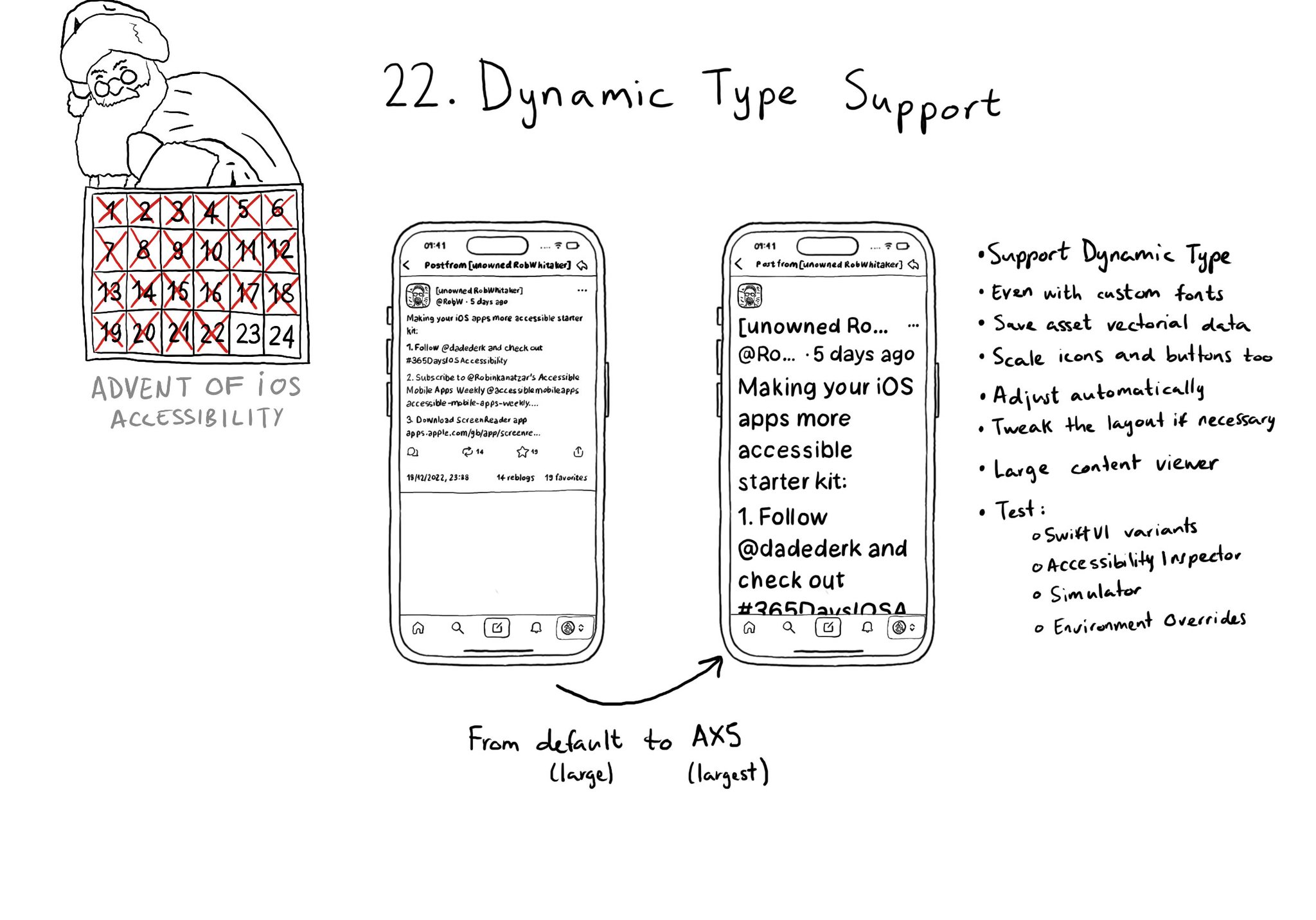
Make sure you support Dynamic Type up to the largest text size available. Take into account that there are five extra accessibility sizes available from the Accessibility Settings. It can make a huge difference for lots of users.
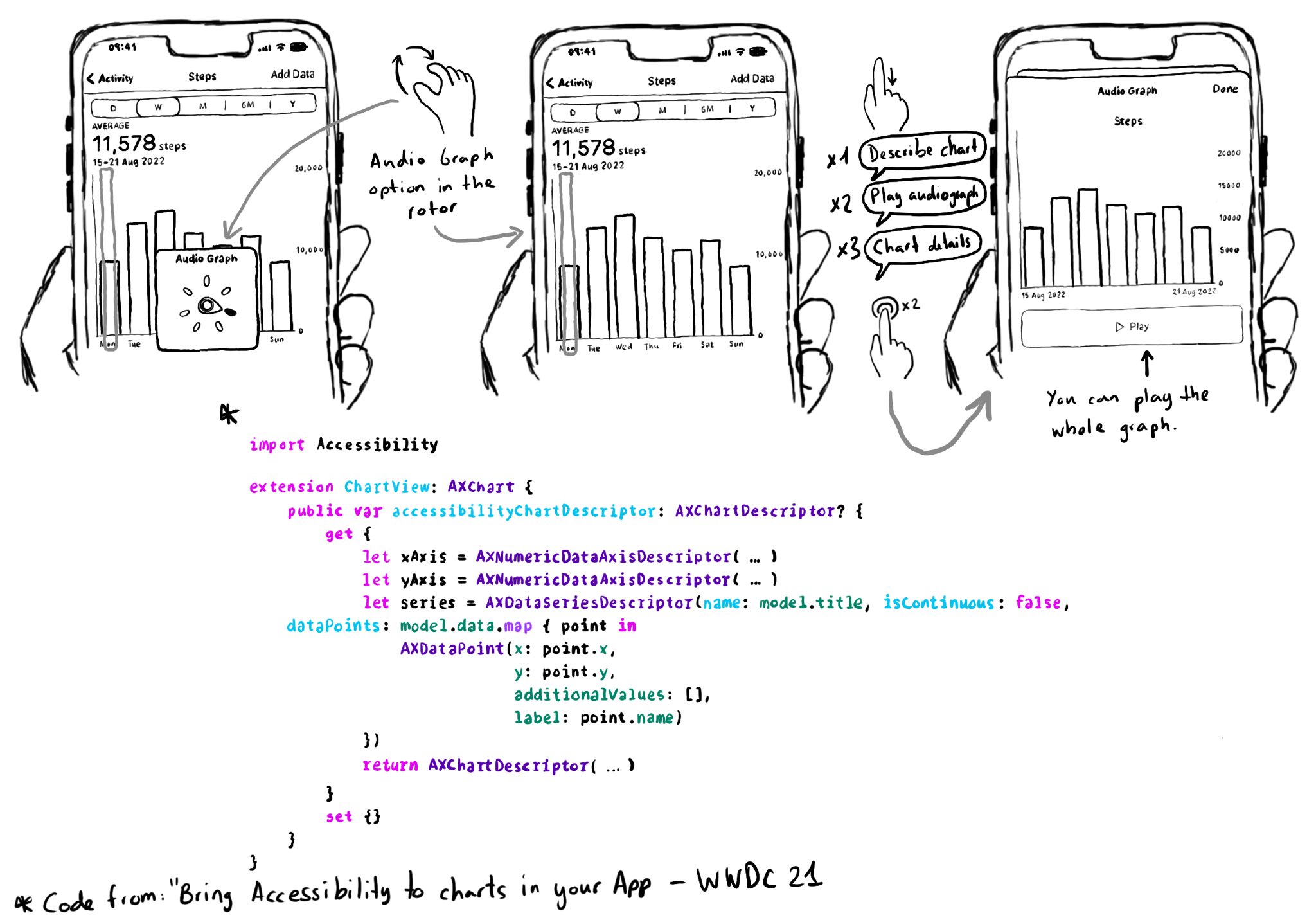
Love this feature! Yahoo released the possibility to explore charts with audio, in the finance app, when using screen readers in 2019. You can do now something very similar since iOS 15. https://coolblindtech.com/yahoo-finance-app-makes-charts-accessible-to-blind-and-partially-sighted-users/ You can move your finger in the x-axes, and it will play a sound with a different pitch depending on the data in the y-axes, making it easier to identify trends in the graphs. You need to conform to the AXChart protocol by implementing the accessibilityChartDescriptor property. Documentation: https://developer.apple.com/documentation/accessibility/audio-graphs WWDC21 session: https://developer.apple.com/videos/play/wwdc2021/10122/
Content © Daniel Devesa Derksen-Staats on Accessibility up to 11! is licensed under CC BY 4.0. License details