With accessibilityRepresentation(representation:), you can create a custom component and it can be perceived by assistive technologies as the view you pass as representation. No need to manually configure accessibility attributes.

A budgeting planner app with custom sliders to configure categories like food and entertainment. All it takes to make it accessible is to use the .accessibilityRepresentation modifier and pass a native Slider configured accordingly. Example and code from “SwiftUI Accessibility: Beyond the basics” from WWDC 21.

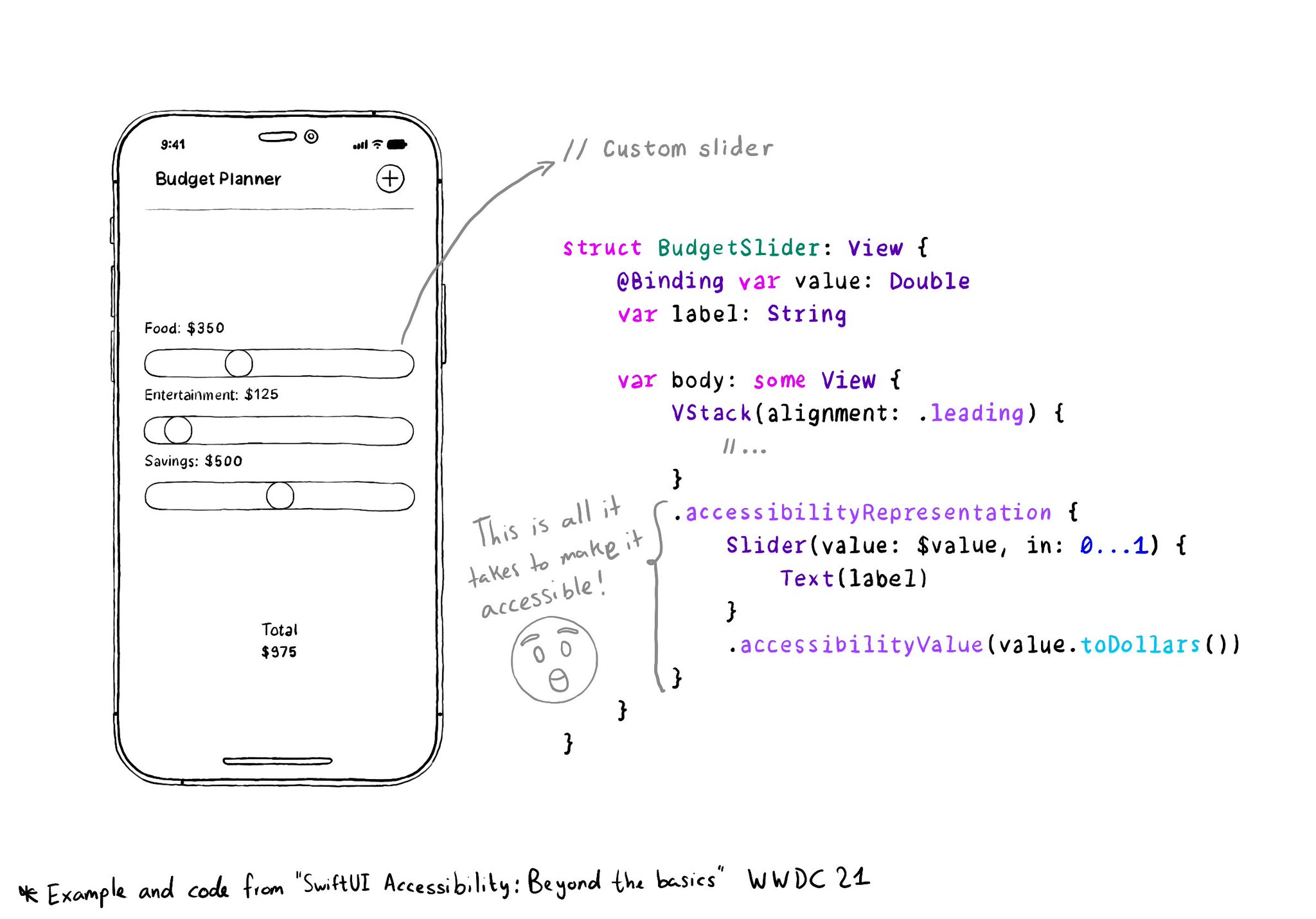
It is one of the most interesting additions to SwiftUI to help you develop accessible UI components. If your custom component behaves similarly to a native one, this is the way to go.

https://developer.apple.com/documentation/swiftui/view/accessibilityrepresentation(representation:)

You may also find interesting...

All the accessibility capabilities you can check for, have counterpart notification names you can observe in case the user changes its preferences while using your app. https://x.com/dadederk/status/1577435144129892352

Touch target sizes are recommended to be at least 44 x 44 points. Buttons in the navigation bar ( especially when not using nav bar button items), dismiss buttons, and custom toolbars, are use cases that tend to have smaller sizes.

"We have one job, and that's to make our apps work. And if you are not implementing accessibility features, you are forgetting about making it work for a lot of people" @NovallSwift Couldn't have said it better! https://x.com/novallswift/status/1328387659744505856

Created in Swift with Ignite.

Supporting Swift for Swifts