Check isReduceTransparencyEnabled to lower transparency. A great example is Spotlight. Not only transparency is removed but it keeps the main color of the background, it feels personalized and contextual but reduces noise and improves contrast.
Some of you have asked me how you can support what I do. This would really help, and would be hugely appreciated:
Find these posts useful? Share them at work, on social media, or with anyone that might find them interesting. Let's spread the word!
Check out any of my apps or games: Xarra!, RetroRapid!, or Mestre!.
A download and a review go a long way. They're free by default. On the App Store, ratings and reviews really help more people discover them.
Finding any of them useful? If so, and if you can afford it, purchasing lifetime access to all features or subscribing lets me buy the coffee that keeps me caffeinated. Caffeine keeps me going to maintain the apps, bring in new features that I hope you'll love, and keep writing.
You may also find interesting...
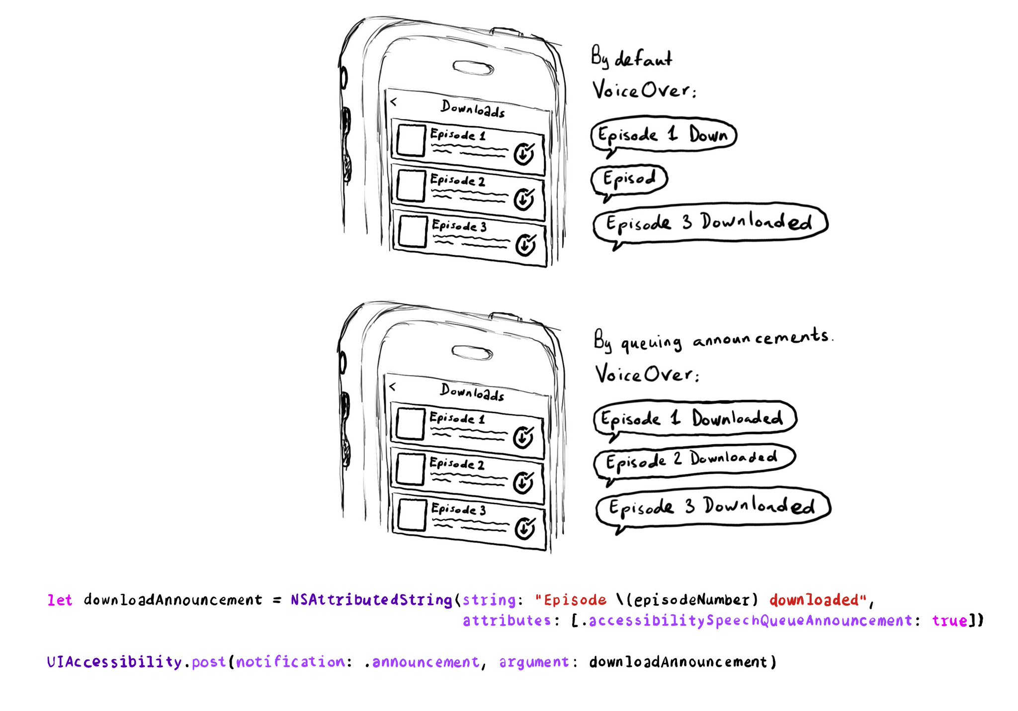
If you need to send announcement notifications that can step into each other, they will by default, interrupt ongoing announcements. But you can pass attributed strings as parameters too, letting you specify announcements to be queued.
If you want to keep yourself up to date with what’s going on, or what has been published lately, on how to develop more accessible mobile apps, make sure you subscribe to Accessible Mobile Apps Weekly by @RobinKanatzar from @accessible_apps.
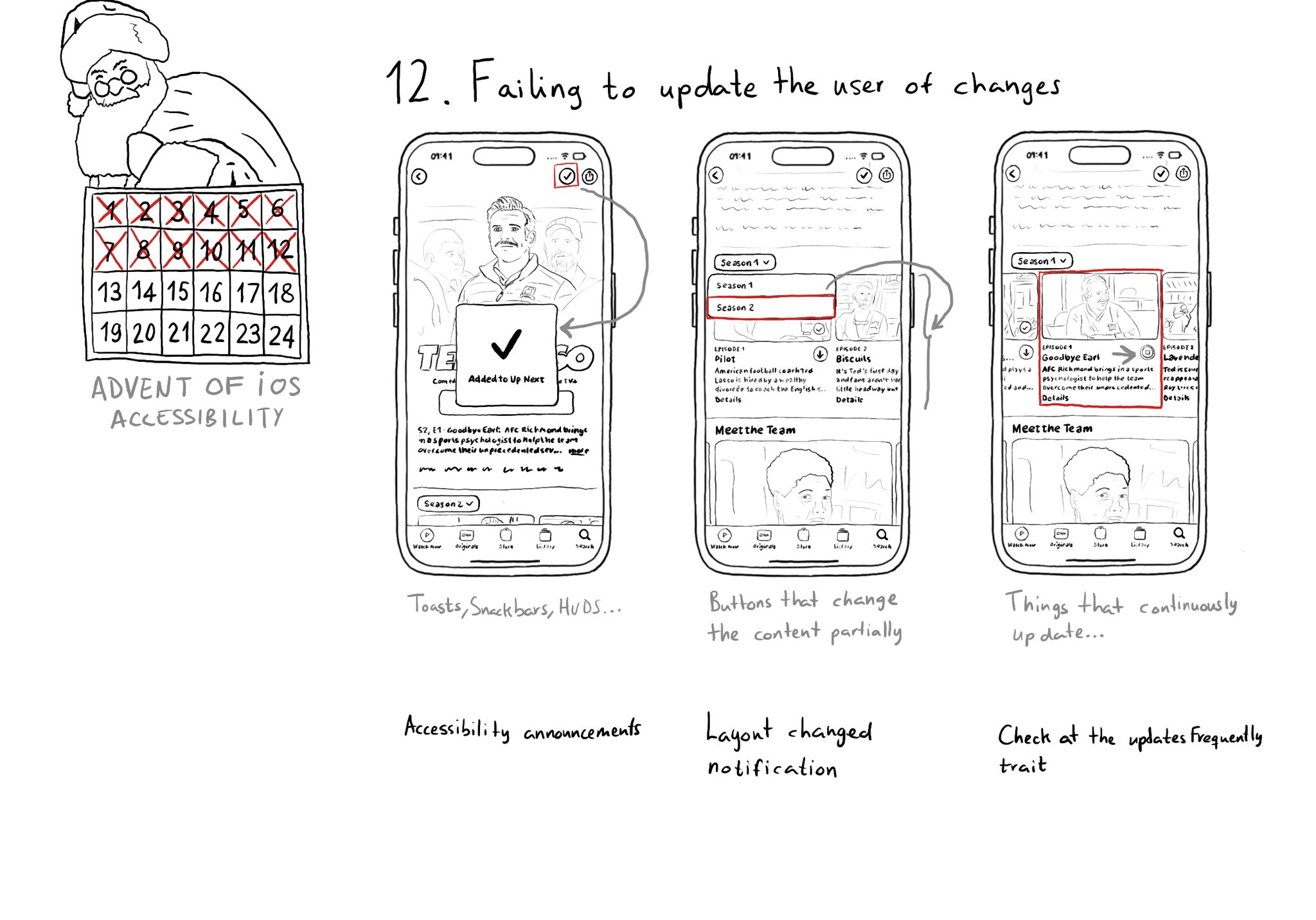
Sometimes we may fail to convey to the user of things changing on the screen in a perceivable way. Toasts and similar should be announced. We may want to make clear that some content on the screen changed. Or we might want to update on progress.
Content © Daniel Devesa Derksen-Staats on Accessibility up to 11! is licensed under CC BY 4.0. License details