Meet @jordibruin developer of Navi (and other great apps) and organizer of @swiftuiseries (with an accessibility category). Navi is sadly not available anymore but it was worth an Apple Design Awards nomination. It added subtitles to FaceTime!
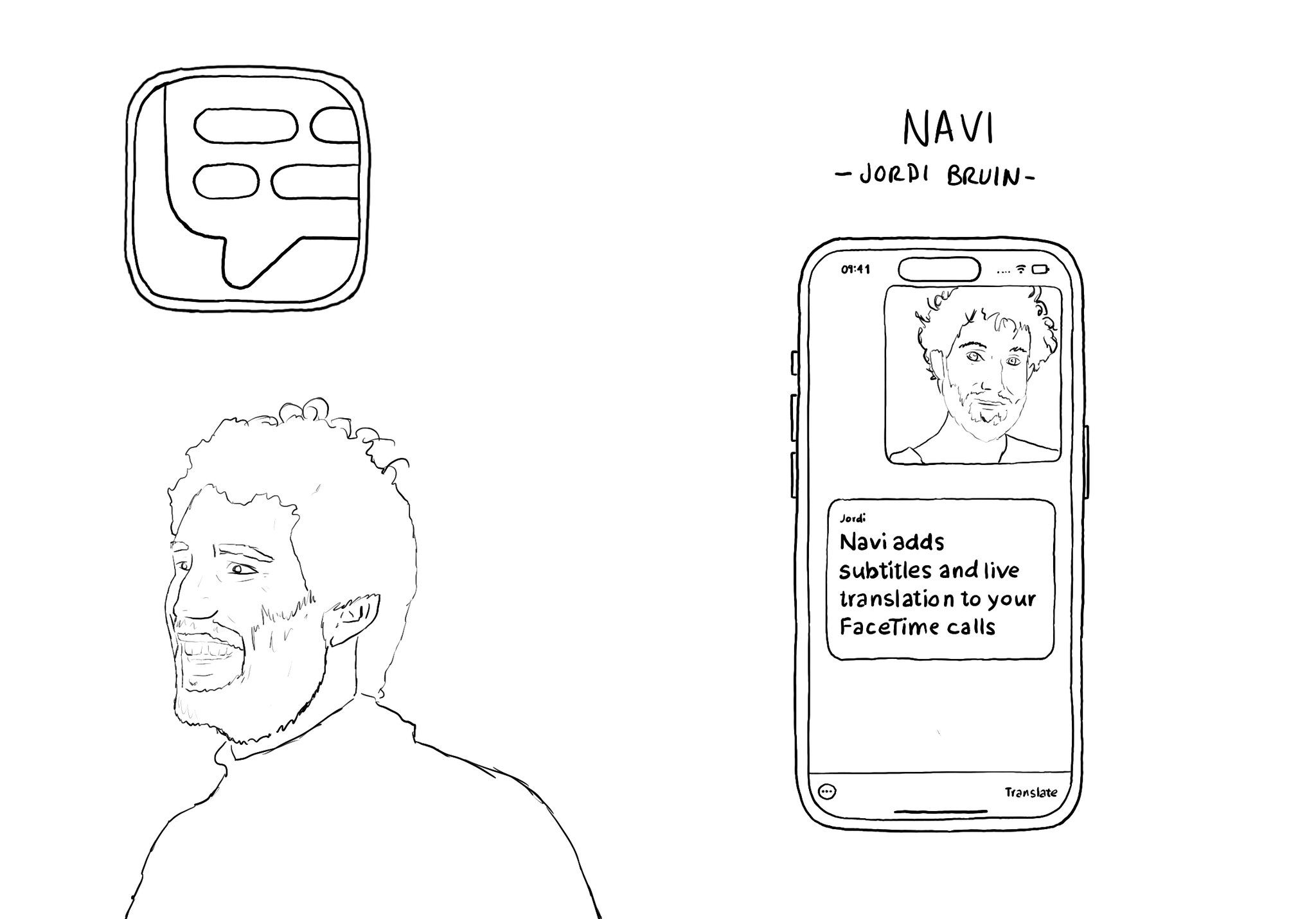
Meet @jordibruin developer of Navi (and other great apps) and organizer of @swiftuiseries (with an accessibility category). Navi is sadly not available anymore but it was worth an Apple Design Awards nomination. It added subtitles to FaceTime!
Some of you have asked me how you can support what I do. This would really help, and would be hugely appreciated:
Find these posts useful? Share them at work, on social media, or with anyone that might find them interesting. Let's spread the word!
Check out any of my apps or games: Xarra!, RetroRapid!, or Mestre!.
A download and a review go a long way. They're free by default. On the App Store, ratings and reviews really help more people discover them.
Finding any of them useful? If so, and if you can afford it, purchasing lifetime access to all features or subscribing lets me buy the coffee that keeps me caffeinated. Caffeine keeps me going to maintain the apps, bring in new features that I hope you'll love, and keep writing.
SwiftUI has equivalent accessibility modifiers for some of UIAccessibility's properties in UIKit. Same basic concepts apply. Label: https://developer.apple.com/documentation/swiftui/view/accessibilitylabel(_:)-9ek2h Value: https://developer.apple.com/documentation/swiftui/view/accessibilityvalue(_:)-8esl7 Traits: https://developer.apple.com/documentation/swiftui/view/accessibilityaddtraits(_:) Hint: https://developer.apple.com/documentation/swiftui/view/accessibilityhint(_:)-3i2vu
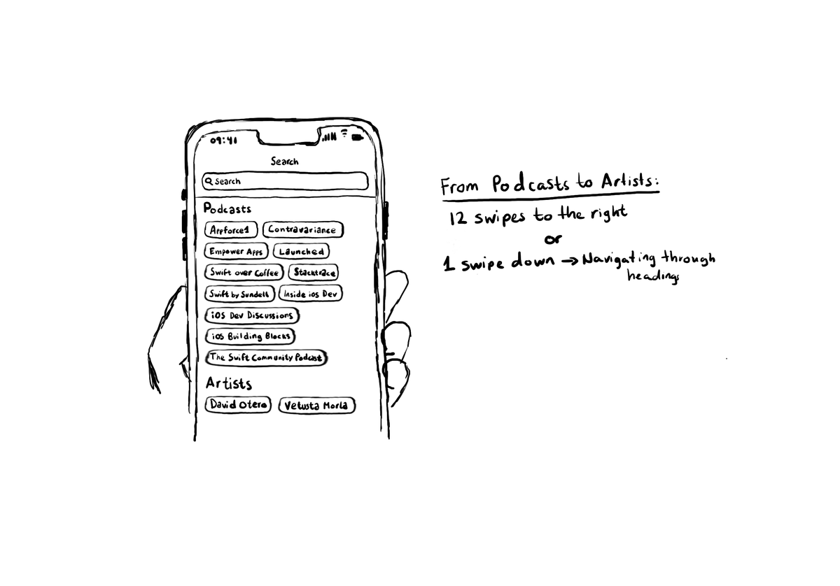
Configuring the header accessibility trait, when appropriate, is one of my favourite accessibility quick wins. In this example, you need a single swipe down, instead of 12 swipes to the right to get to from Podcasts to Artists, in the app.
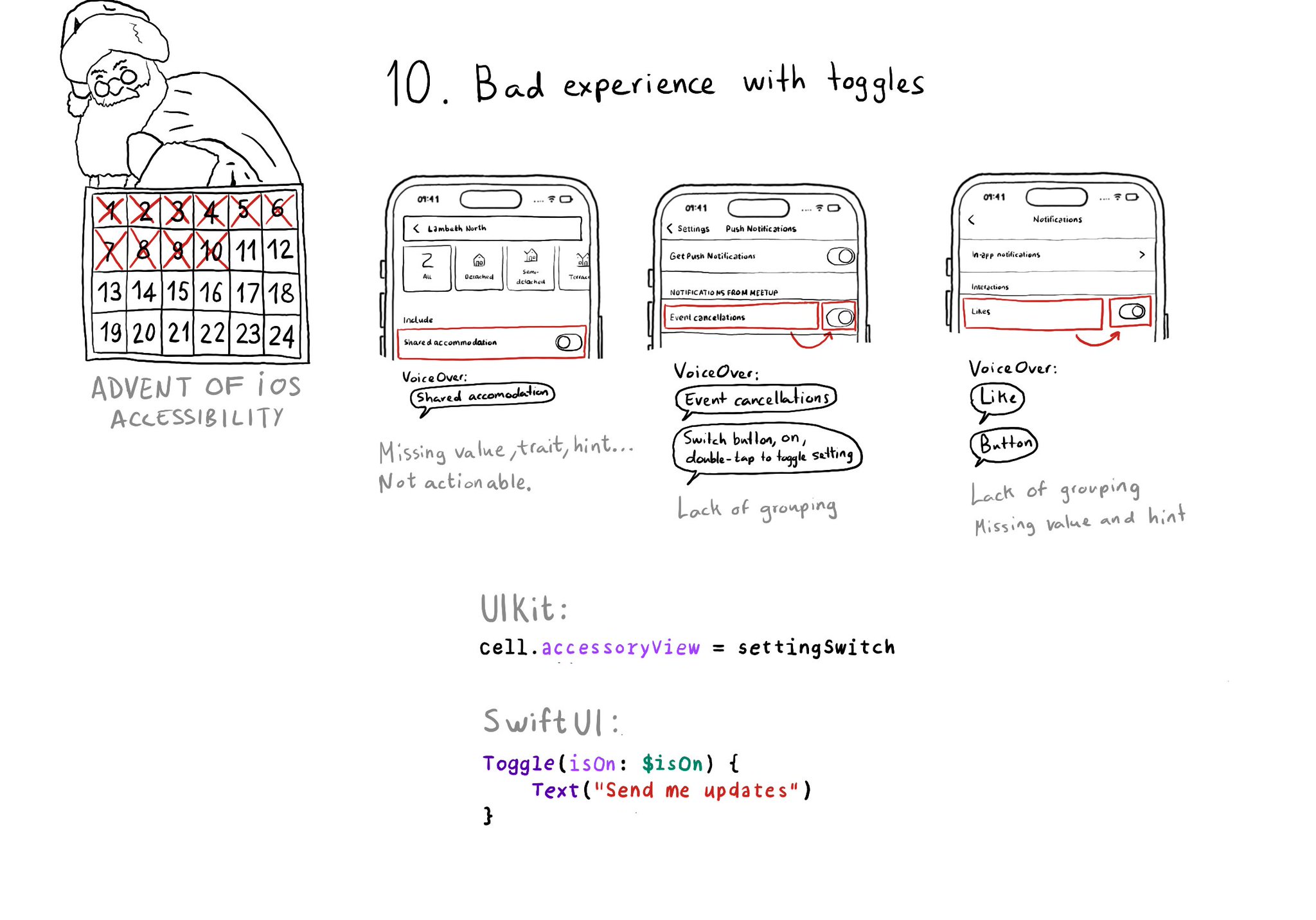
Toggles or UISwitches are often found separated from the label that precedes (and describes) them; with an unclear label; missing a value, trait, or hint; or even not being actionable at all.
Content © Daniel Devesa Derksen-Staats on Accessibility up to 11! is licensed under CC BY 4.0. License details