Anything representing a heading in the app should have the header trait. It allows for a faster way of exploring a screen and jumping to the part of the app you are interested in. Screens should also start with a header.
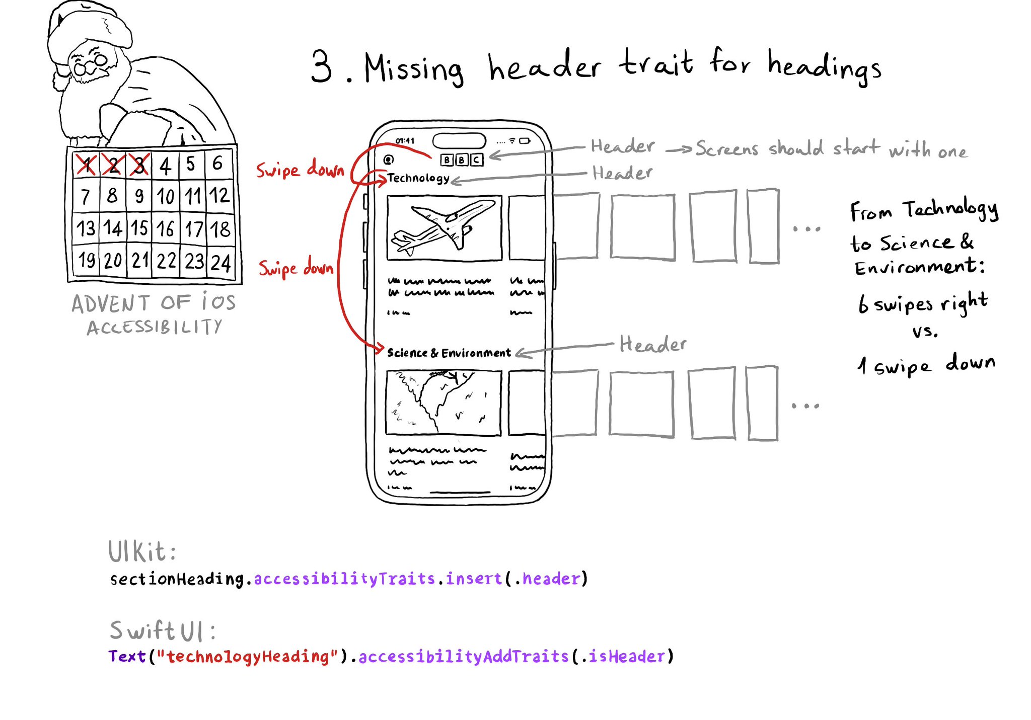
Anything representing a heading in the app should have the header trait. It allows for a faster way of exploring a screen and jumping to the part of the app you are interested in. Screens should also start with a header.
Some of you have asked me how you can support what I do. This would really help, and would be hugely appreciated:
Find these posts useful? Share them at work, on social media, or with anyone that might find them interesting. Let's spread the word!
Check out any of my apps or games: Xarra!, RetroRapid!, or Mestre!.
A download and a review go a long way. They're free by default. On the App Store, ratings and reviews really help more people discover them.
Finding any of them useful? If so, and if you can afford it, purchasing lifetime access to all features or subscribing lets me buy the coffee that keeps me caffeinated. Caffeine keeps me going to maintain the apps, bring in new features that I hope you'll love, and keep writing.
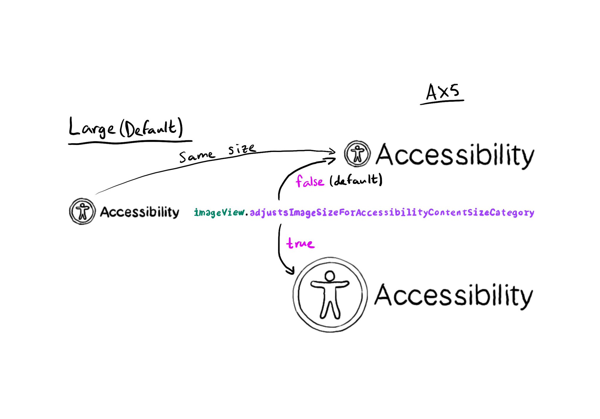
Images can automatically scale for accessibility content size categories, by setting the adjustsImageSizeForAccessibilityContentSizeCategory property to true, for any UIImageView you'd like to get its size adjusted. https://developer.apple.com/documentation/uikit/uiaccessibilitycontentsizecategoryimageadjusting/adjustsimagesizeforaccessibilitycontentsizecategory
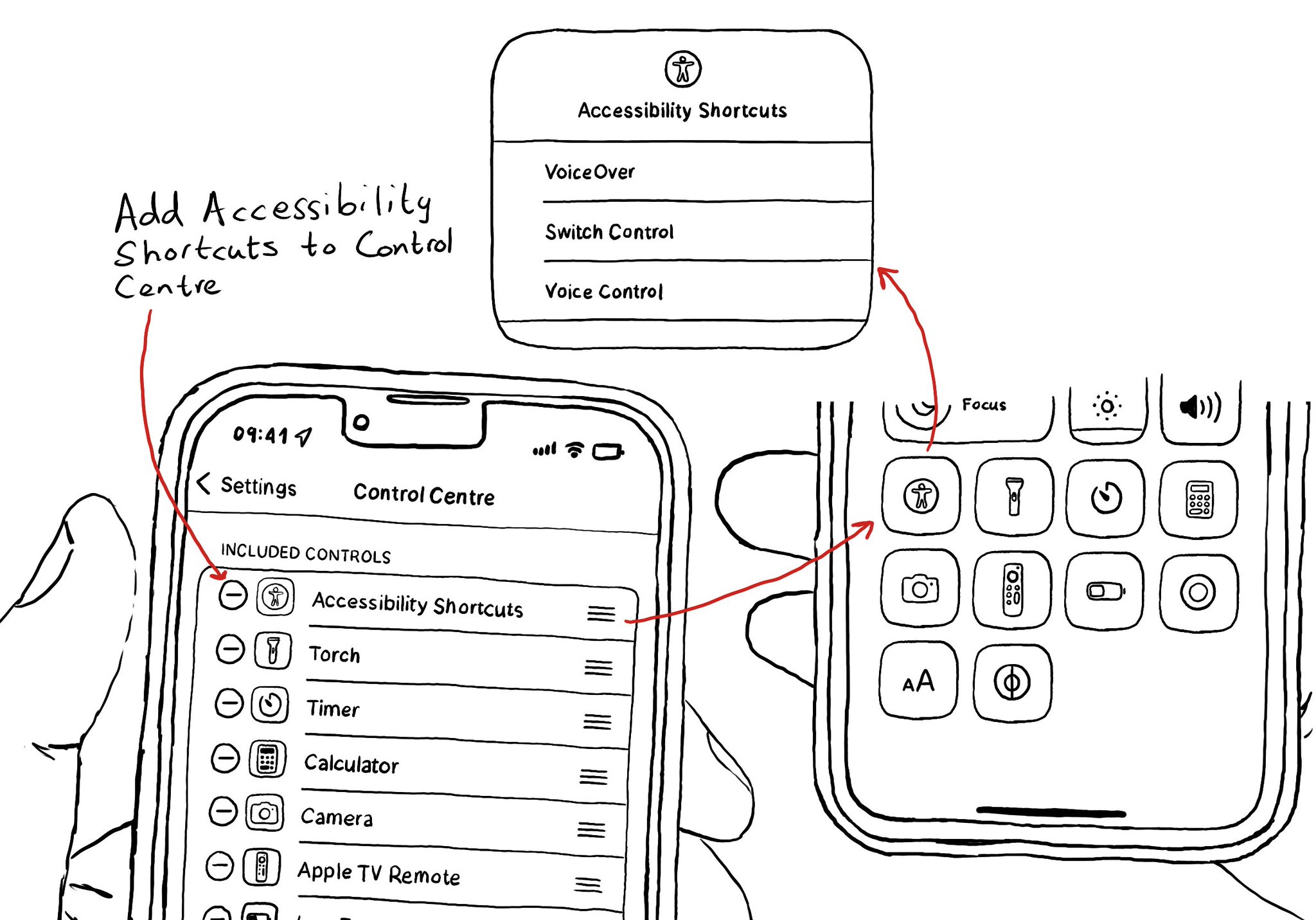
You can add your Accessibility Shortcuts to Control Centre too. One more quick access point and one more reminder to get you testing often and quickly. How to enable Accessibility shortcuts: https://x.com/dadederk/status/1583519154165800960?s=61&t=_fK9Muzu2MyFEeJLVQZcJg
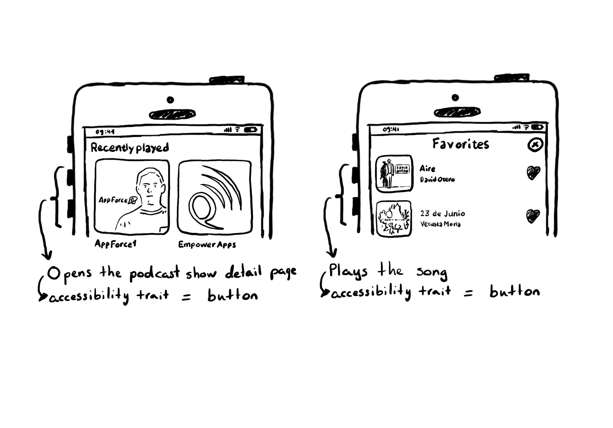
A common example where you need to manually configure the button accessibility trait is for some table/collection view cells. These tend to be “buttons” that perform an action, like playing music, or bring the user to a different screen.
Content © Daniel Devesa Derksen-Staats on Accessibility up to 11! is licensed under CC BY 4.0. License details