Configuring the header accessibility trait, when appropriate, is one of my favourite accessibility quick wins. In this example, you need a single swipe down, instead of 12 swipes to the right to get to from Podcasts to Artists, in the app.
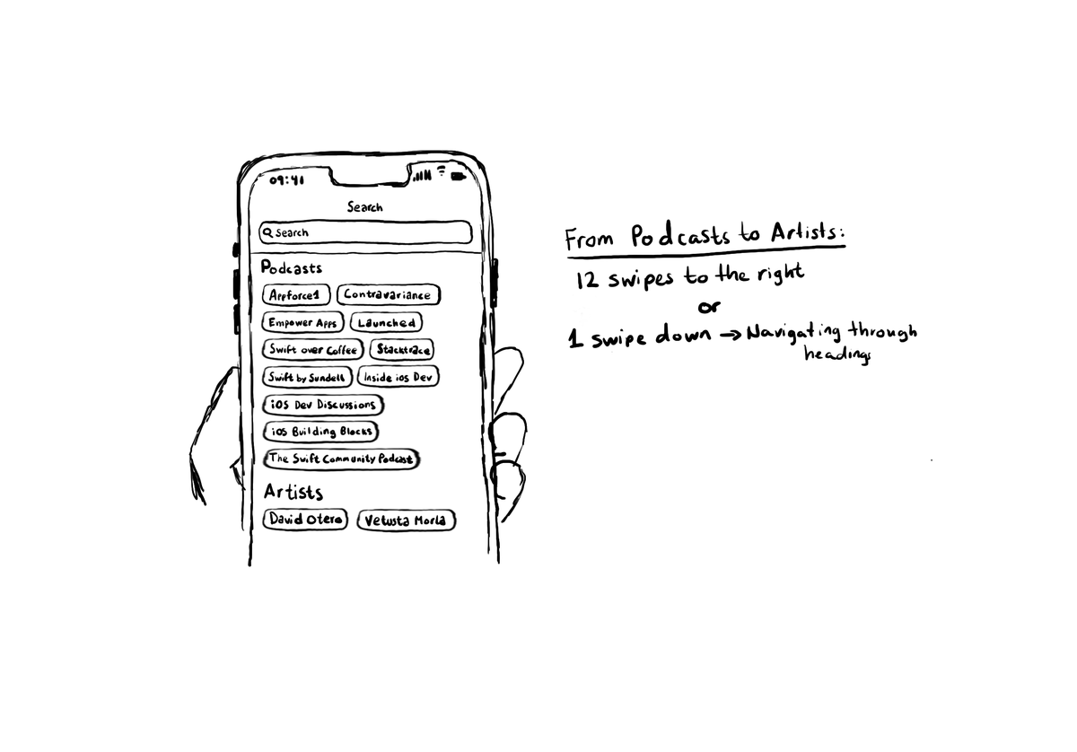
Configuring the header accessibility trait, when appropriate, is one of my favourite accessibility quick wins. In this example, you need a single swipe down, instead of 12 swipes to the right to get to from Podcasts to Artists, in the app.
Some of you have asked me how you can support what I do. This would really help, and would be hugely appreciated:
Find these posts useful? Share them at work, on social media, or with anyone that might find them interesting. Let's spread the word!
Check out any of my apps or games: Xarra!, RetroRapid!, or Mestre!.
A download and a review go a long way. They're free by default. On the App Store, ratings and reviews really help more people discover them.
Finding any of them useful? If so, and if you can afford it, purchasing lifetime access to all features or subscribing lets me buy the coffee that keeps me caffeinated. Caffeine keeps me going to maintain the apps, bring in new features that I hope you'll love, and keep writing.
To capture the gesture, you can override the accessibilityPerformEscape() function. In there you can dismiss your view, and return true if you could successfully handle it. https://developer.apple.com/documentation/objectivec/nsobject-swift.class/accessibilityperformescape()
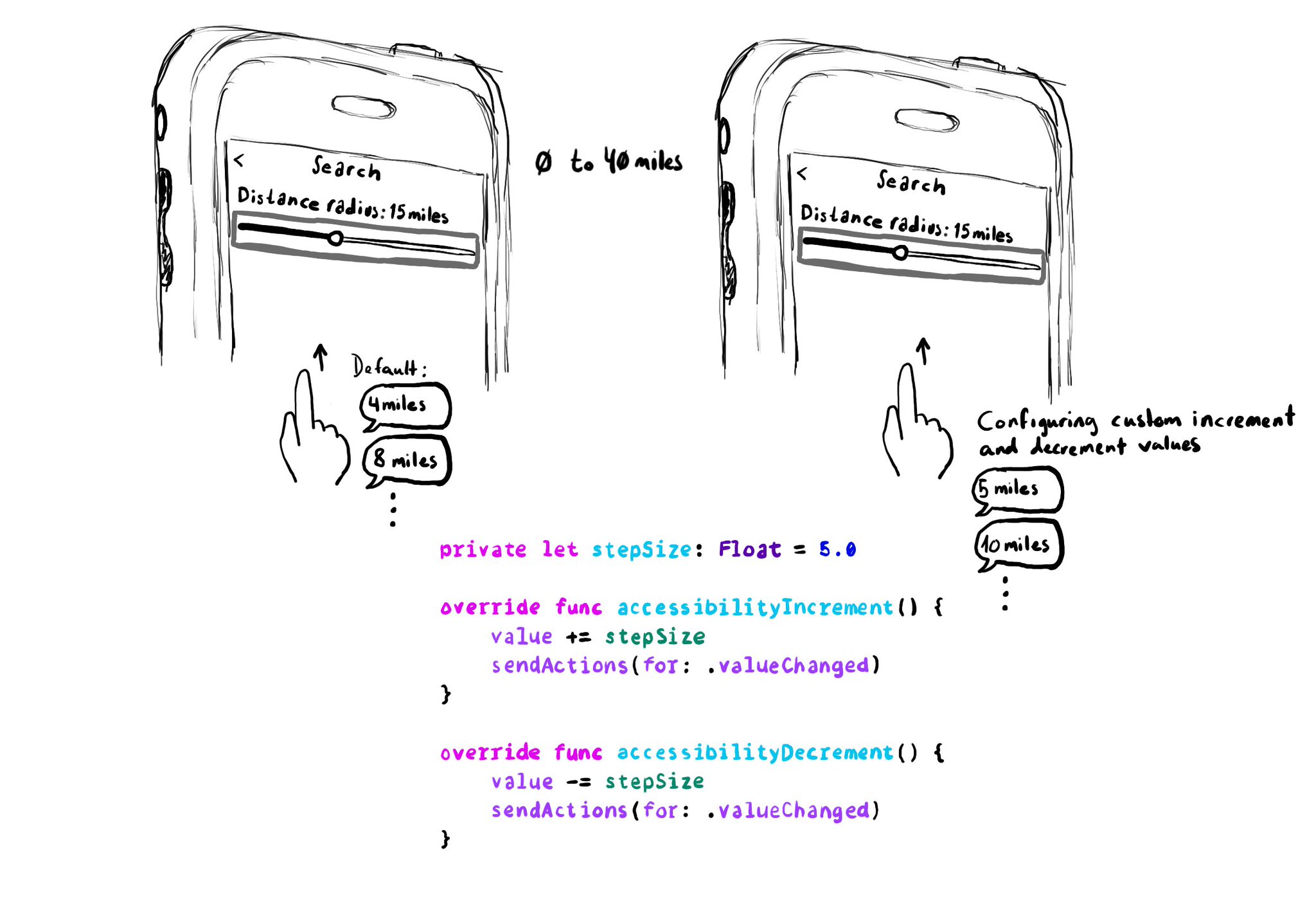
When implementing a UISlider, it is a good idea to consider how much the slider value should change when swiping up/down to adjust it. It might not always make sense to do it in 10% increments, which is the default behaviour. Could be because the value at those intervals doesn't make sense, or feel random, or because it wouldn't provide the user with a fine enough control being able to go through the whole slider in just 10 swipes. It user will still be able to adjust the slider to any value by double tapping and holding and then moving the finger left or right, bypassing VoiceOver gestures. VoiceOver announces the new value as it changes.
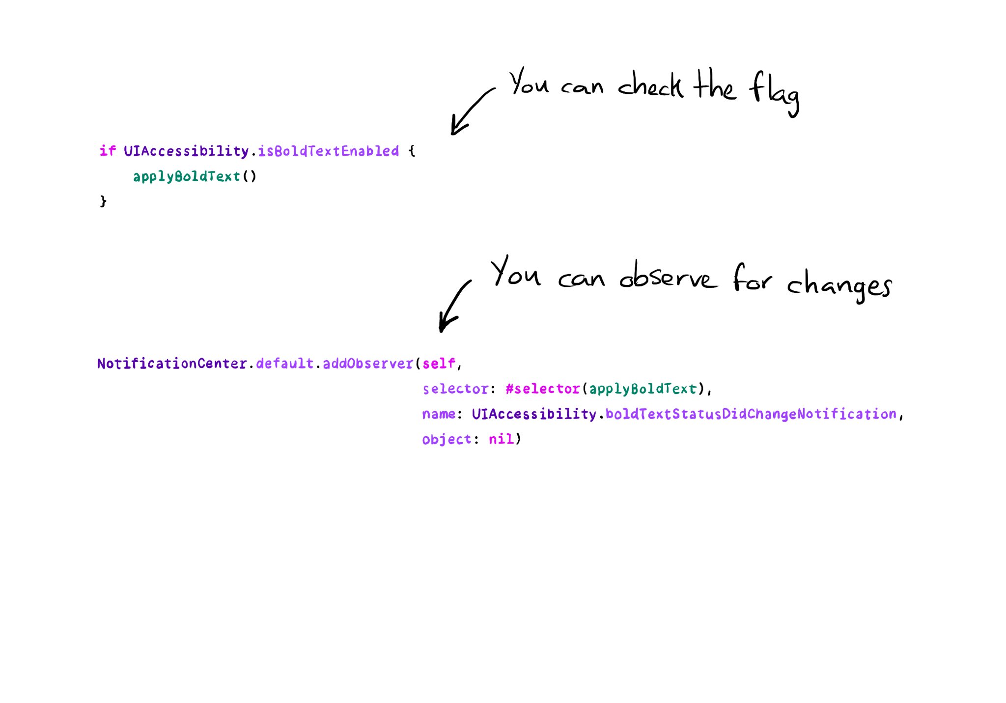
All the accessibility capabilities you can check for, have counterpart notification names you can observe in case the user changes its preferences while using your app. https://x.com/dadederk/status/1577435144129892352
Content © Daniel Devesa Derksen-Staats on Accessibility up to 11! is licensed under CC BY 4.0. License details