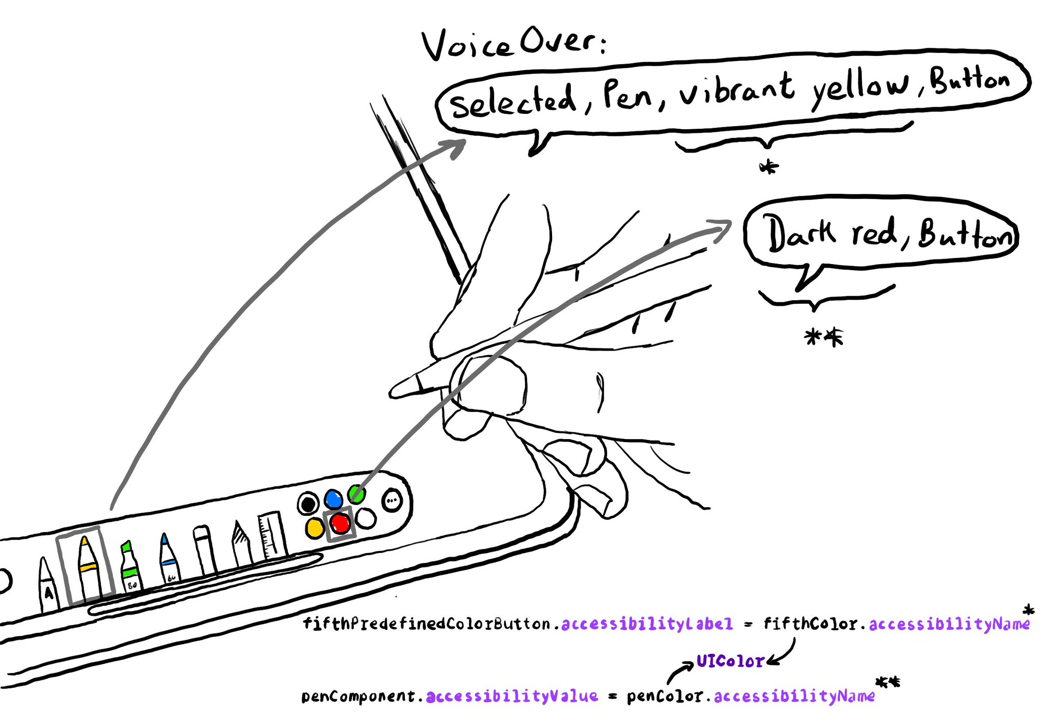
Since iOS 14, you can get a human readable localised name for a UIColor, with a very useful property called accessibilityName, that you can use in accessibility attributes like labels or values. How cool is that?

https://developer.apple.com/documentation/uikit/uicolor/accessibilityname

iPad app for drawing sketches. It has a tool panel. The selected tool is a pen with the yellow color. There are some predefined colors to choose from. The fifth one is red. Using the accessibilityName from UIColor, we could configure an accessibility value for the pen, so VoiceOver would announce something like:

You may also find interesting...

Guidelines from Apple: Begin with a verb that explains the results of the action. Avoid using the imperative form of a verb because that can make it sound like a command. Don’t include the action type. Don’t include the control. https://developer.apple.com/documentation/objectivec/nsobject-swift.class/accessibilityhint

Check isReduceTransparencyEnabled to lower transparency. A great example is Spotlight. Not only transparency is removed but it keeps the main color of the background, it feels personalized and contextual but reduces noise and improves contrast.

Support both orientations, if possible. I know not even iOS itself does it, but it hasn't always been like that. You'll create a more robust UI that will be easier to port to iPadOS. And especially, don't force your users to rotate their devices.

Created in Swift with Ignite.

Supporting Swift for Swifts