The header accessibility trait makes VoiceOver announce something as a header. More importantly, it lets the user navigate through headings, swiping up/down, significantly speeding up navigation and making it easier to explore/discover content.
Some of you have asked me how you can support what I do. This would really help, and would be hugely appreciated:
Find these posts useful? Share them at work, on social media, or with anyone that might find them interesting. Let's spread the word!
Check out any of my apps or games: Xarra!, RetroRapid!, or Mestre!.
A download and a review go a long way. They're free by default. On the App Store, ratings and reviews really help more people discover them.
Finding any of them useful? If so, and if you can afford it, purchasing lifetime access to all features or subscribing lets me buy the coffee that keeps me caffeinated. Caffeine keeps me going to maintain the apps, bring in new features that I hope you'll love, and keep writing.
You may also find interesting...
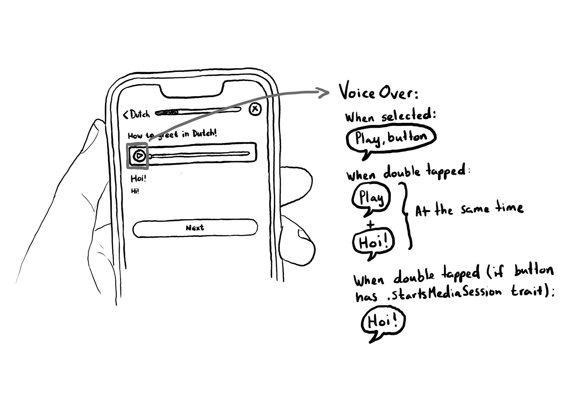
When interacting with a button with VoiceOver, the accessibility label is repeated to the user. If you are playing some audio, it could be difficult to listen to it properly. To avoid that, you can add the .startsMediaSession accessibility trait.
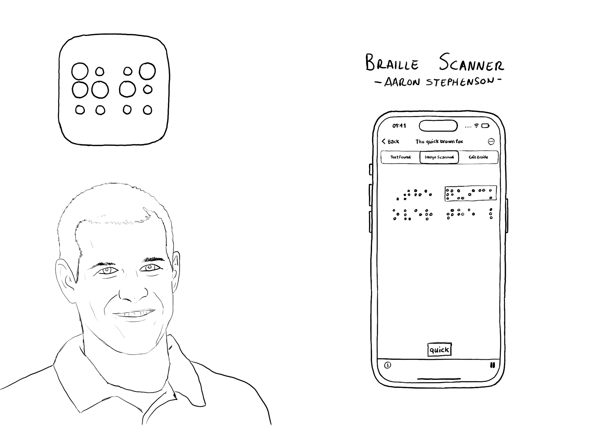
@azzoor is the developer of the Braille Scanner It uses computer vision to locate the page and Machine Learning to match Braille to letters. You can see English letters above the braille, convert them to speech, copy and paste it... so cool!
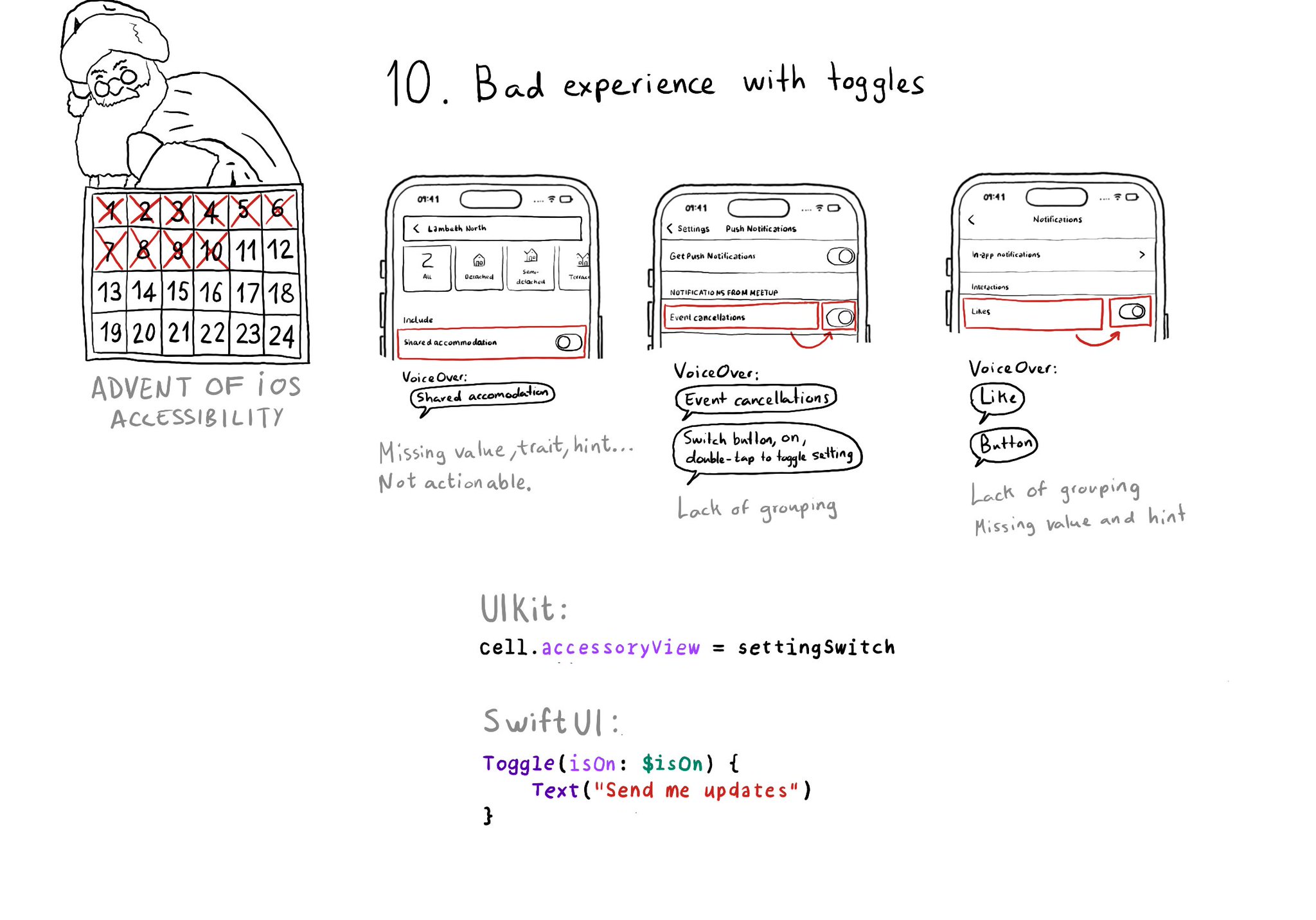
Toggles or UISwitches are often found separated from the label that precedes (and describes) them; with an unclear label; missing a value, trait, or hint; or even not being actionable at all.
Content © Daniel Devesa Derksen-Staats on Accessibility up to 11! is licensed under CC BY 4.0. License details