When thinking about accessibility labels and values, it is easy to miss adding information or state that are represented by little visual cues and icons: a checkmark indicating something has been played, a down arrow indicating a downward trend...
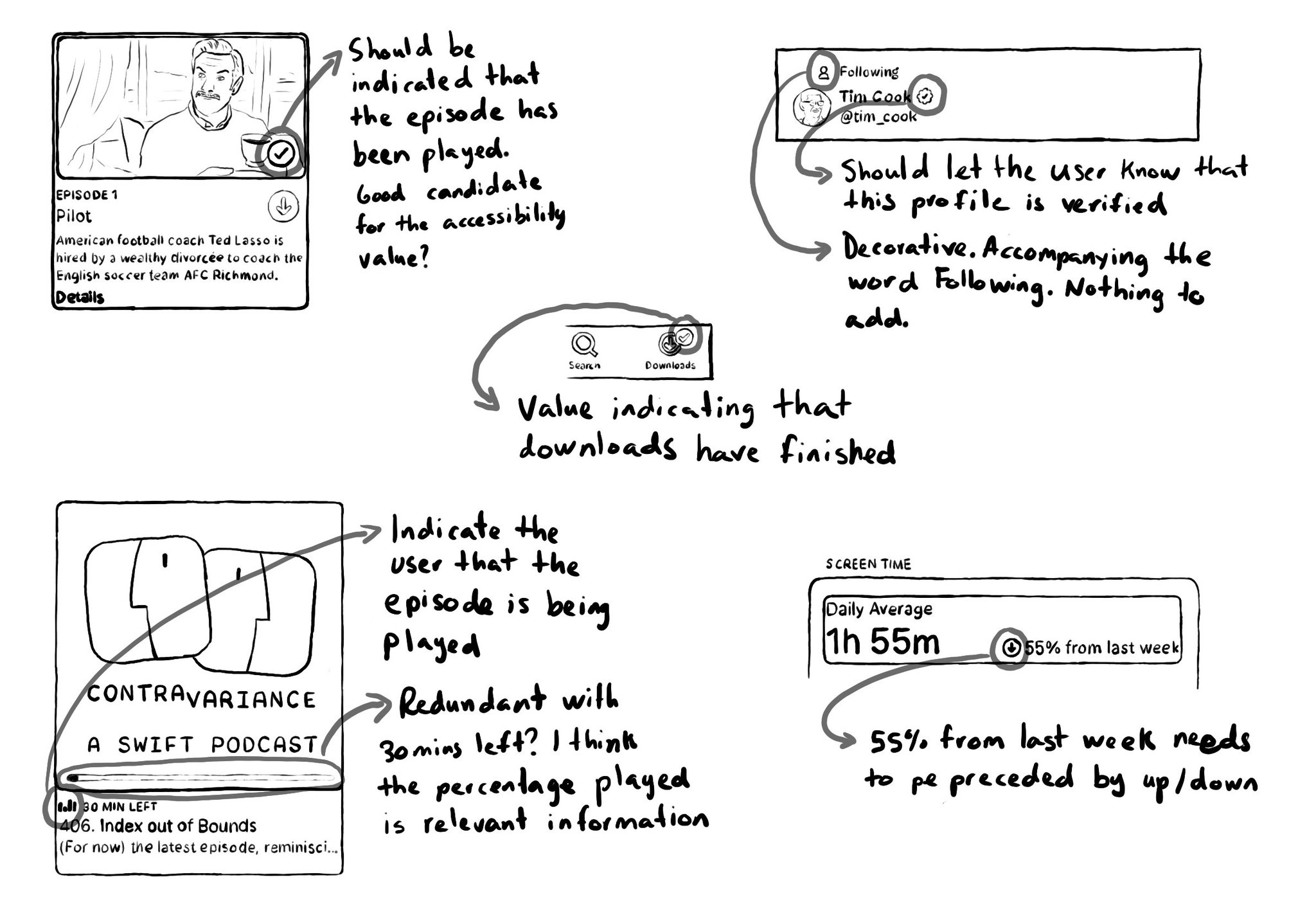
When thinking about accessibility labels and values, it is easy to miss adding information or state that are represented by little visual cues and icons: a checkmark indicating something has been played, a down arrow indicating a downward trend...
Some of you have asked me how you can support what I do. This would really help, and would be hugely appreciated:
Find these posts useful? Share them at work, on social media, or with anyone that might find them interesting. Let's spread the word!
Check out any of my apps or games: Xarra!, RetroRapid!, or Mestre!.
A download and a review go a long way. They're free by default. On the App Store, ratings and reviews really help more people discover them.
Finding any of them useful? If so, and if you can afford it, purchasing lifetime access to all features or subscribing lets me buy the coffee that keeps me caffeinated. Caffeine keeps me going to maintain the apps, bring in new features that I hope you'll love, and keep writing.
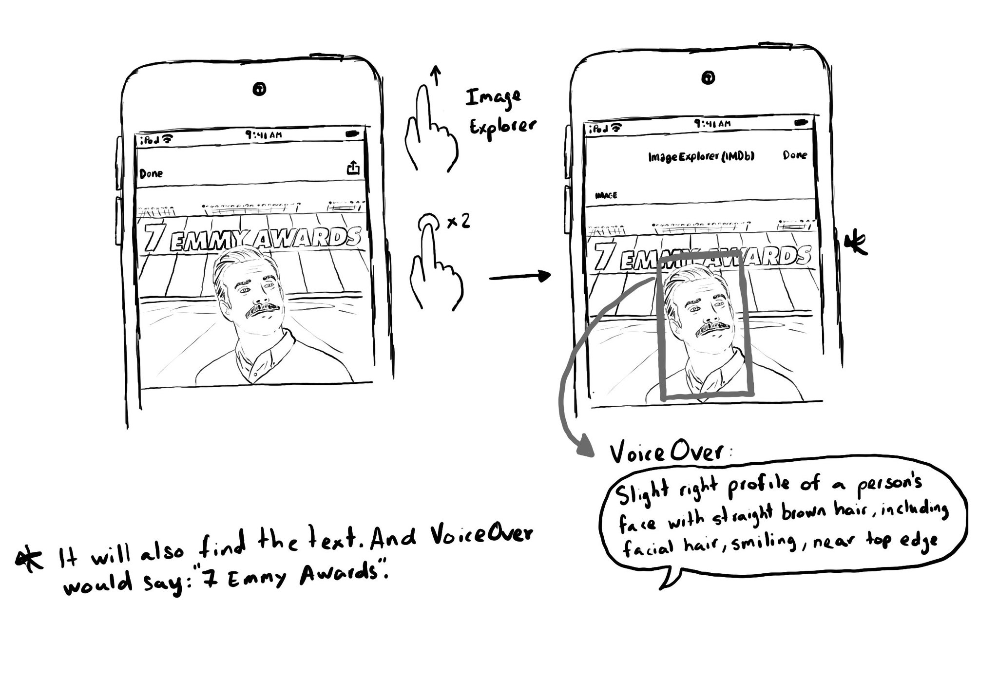
Images that convey important information should have the .image accessibility trait and provide an alternative text in the accessibility label. "Image" will be added to VoiceOver's utterance and the user will be able to use Image Explorer. Image Explorer is fairly new, introduced just a couple years ago. But if you were appropriately configuring the image trait, users suddenly got this new functionality for free. Isn't that awesome? With VoiceOver on, open Image Explorer by swiping up in an image and double tapping. It lets users find people (with a basic description and positioning in the photo), objects or text in images, using on-device intelligence. It is very cool!
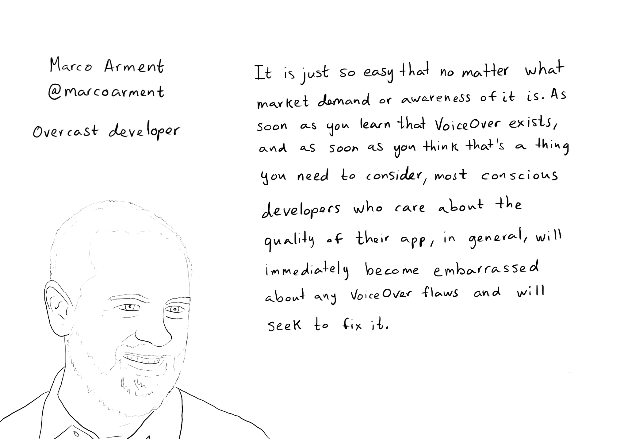
While you are at @shelly's "36 Seconds That Changed Everything", I would definitely also check out the Bonus Content. Including the full interview with @marcoarment. "Awareness is the biggest problem here." https://www.36seconds.org/behind-the-scenes/ "Cause iOS 7 was so inaccessible in so many ways (...) it started getting under developers’ radars this section of settings, called accessibility, that changes the way my app looks or works and I need to make sure that it doesn’t break under those settings.” "There’s so much variation out there. We no longer have just one size phone, we no longer have just one font size. It is easier for us as developers not to fall into bad assumptions of how I see it is how everyone is going to see it.” "The good thing about VoiceOver is that the accessibility framework is pretty well built-in the standard controls. For a given app you can fix any VoiceOver problems it has in one day or less. Even if it is a complex app. Even if it has a lot of custom controls." "What developers now do, if they care, is they treat that (accessibility issues) as if it was any other design flaw. If any other screen in your app broke visually or functionally you’d consider that a bug and you would try to fix it in the next update.” "I think the more that we can do as a developer community to talk about these features even existing, and these problems existing, and to tell people how easy it is to fix. That is the best any of us can do to help. Awareness is the biggest problem here."
@azzoor has this great video with some advice on how to set up your device for testing accessibility and a ton of tips will get you testing effectively in no time. https://m.youtube.com/watch?v=Ca1H6wF348g&feature=youtu.be
Content © Daniel Devesa Derksen-Staats on Accessibility up to 11! is licensed under CC BY 4.0. License details