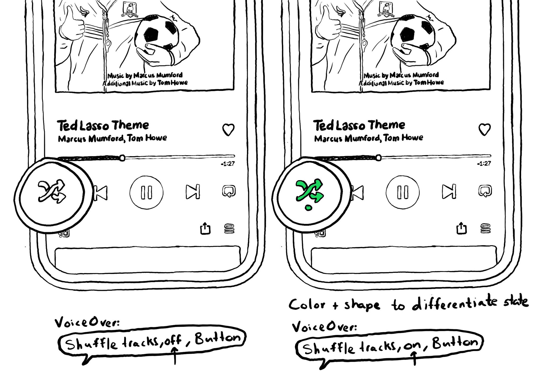
Convey important information in multiple modes (sounds, haptics, colour, iconography, messaging...) so no-one misses it. Take Spotify's shuffle button. It is green when on, white when off, but it has also a dot indicator.

https://wearecolorblind.com/examples/spotify-shuffle-and-repeat-buttons/

Two sketches of the Spotify app. One of them has the shuffle button off and the other one is on. For the on state, it has a different colour, green, and it is also adding a dot indicator underneath the icon. It also shows how VoiceOver announces different states, on or off.

You may also find interesting...

A reminder that the more modes we use to convey important information, the more sure we'll be that it will be perceived by all our users. Consider a combination. of color, icons, messages, sound, haptics, animations, etc.

When configuring a largeContentImage or adjustsImageSizeForAccessibilityContentSizeCategory, it is important to use a pdf asset and preserve the vector data so the icons are crisp at any size.

Potential benefits from grouping logical pieces of information and moving buttons to custom actions: reduce redundancy (by removing repetitive controls) and reduce cognitive load (by making easier to know what item will be affected by each action)

Created in Swift with Ignite.

Supporting Swift for Swifts