It is very important to label switches properly and avoid duplication when you find them in table views, like in settings. One way it's usually done, and probably the simplest solution, is by adding the UISwitch in the accessory view of the cell.
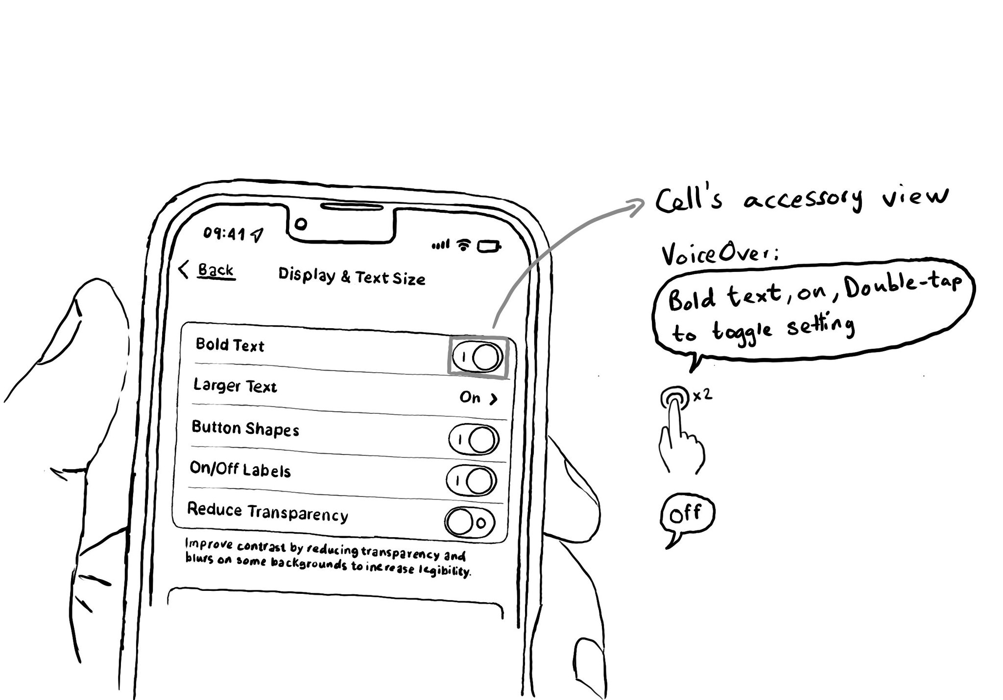
It is very important to label switches properly and avoid duplication when you find them in table views, like in settings. One way it's usually done, and probably the simplest solution, is by adding the UISwitch in the accessory view of the cell.
Some of you have asked me how you can support what I do. This would really help, and would be hugely appreciated:
Find these posts useful? Share them at work, on social media, or with anyone that might find them interesting. Let's spread the word!
Check out any of my apps or games: Xarra!, RetroRapid!, or Mestre!.
A download and a review go a long way. They're free by default. On the App Store, ratings and reviews really help more people discover them.
Finding any of them useful? If so, and if you can afford it, purchasing lifetime access to all features or subscribing lets me buy the coffee that keeps me caffeinated. Caffeine keeps me going to maintain the apps, bring in new features that I hope you'll love, and keep writing.
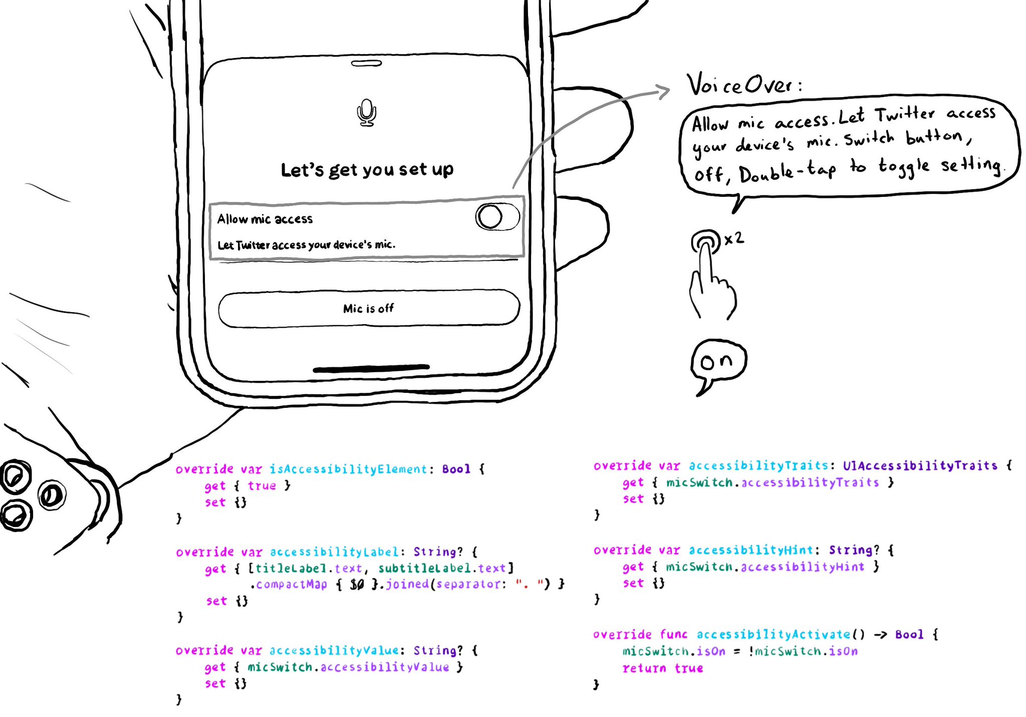
Very often we need to show a UISwitch preceded with a UILabel that explains what it does. The text in the label is basically the accessibility label for the switch. Ideally we want for both components to be grouped behave as a UISwitch. It makes much easier to understand what the switch does, compared to having two separate accessible components. There is a number of ways you can do that. One of them is to use a container view and proxy the switch accessibility attributes.
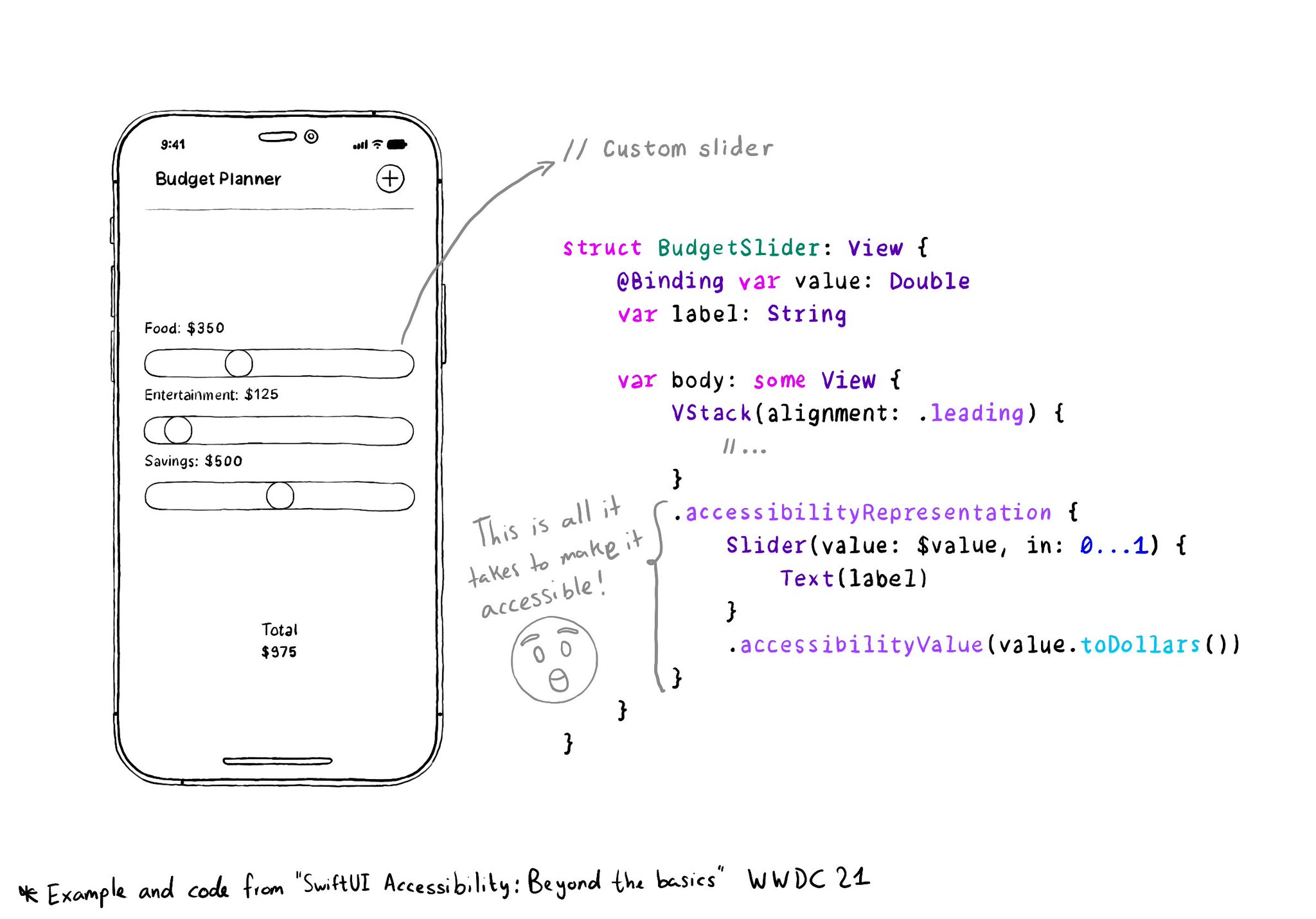
With accessibilityRepresentation(representation:), you can create a custom component and it can be perceived by assistive technologies as the view you pass as representation. No need to manually configure accessibility attributes. It is one of the most interesting additions to SwiftUI to help you develop accessible UI components. If your custom component behaves similarly to a native one, this is the way to go. https://developer.apple.com/documentation/swiftui/view/accessibilityrepresentation(representation:)
@NSSpain has a great history of having amazing accessibility talks in their schedule! “Accessibility in the Real World”, by @Sommer: https://vimeo.com/235317172 “How to build an app for everyone”, by @NovallSwift: https://vimeo.com/362163043 The super fun "Choose your own SwiftUI adventure - 3 Accessibility", by @twostraws and @PinkerStraws: https://vimeo.com/481768105 And, of course, this year's great "Bas: My Accessibility Story", by @basthomas: https://vimeo.com/751176747
Content © Daniel Devesa Derksen-Staats on Accessibility up to 11! is licensed under CC BY 4.0. License details