Very often we need to show a UISwitch preceded with a UILabel that explains what it does. The text in the label is basically the accessibility label for the switch. Ideally we want for both components to be grouped behave as a UISwitch.

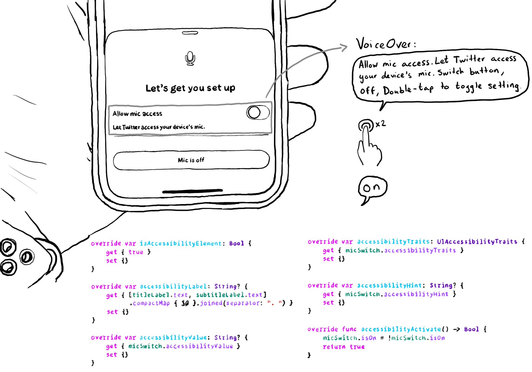
It makes much easier to understand what the switch does, compared to having two separate accessible components. There is a number of ways you can do that. One of them is to use a container view and proxy the switch accessibility attributes.
You may also find interesting...
Believe it or not, one of the most common accessibility pitfalls I see in iOS apps, is forgetting to configure a suitable accessibility label for buttons with just an image (no title), resulting in VoiceOver saying just: "button". Why for buttons with just an image? If it has a title, the accessibility label gets inferred from it. So here's one that should be very easy for you to find and fix in your app. No more apps that just say: button, button, button, button...! If you are looking for the best explanation on what makes, not good, but great accessibility labels, I really recommend “Writing Great Accessibility Labels” by @jordyn2493 at WWDC. The difference between someone using/loving/deleting your app. https://developer.apple.com/videos/play/wwdc2019/254/

It is very important to label switches properly and avoid duplication when you find them in table views, like in settings. One way it's usually done, and probably the simplest solution, is by adding the UISwitch in the accessory view of the cell.

Too much data can overwhelm users. Very little is an incomplete experience. It is hard to find a balance on verbosity and the users may have different preferences. To help with this issue, the AXCustomContent APIs let you mark data as optional.