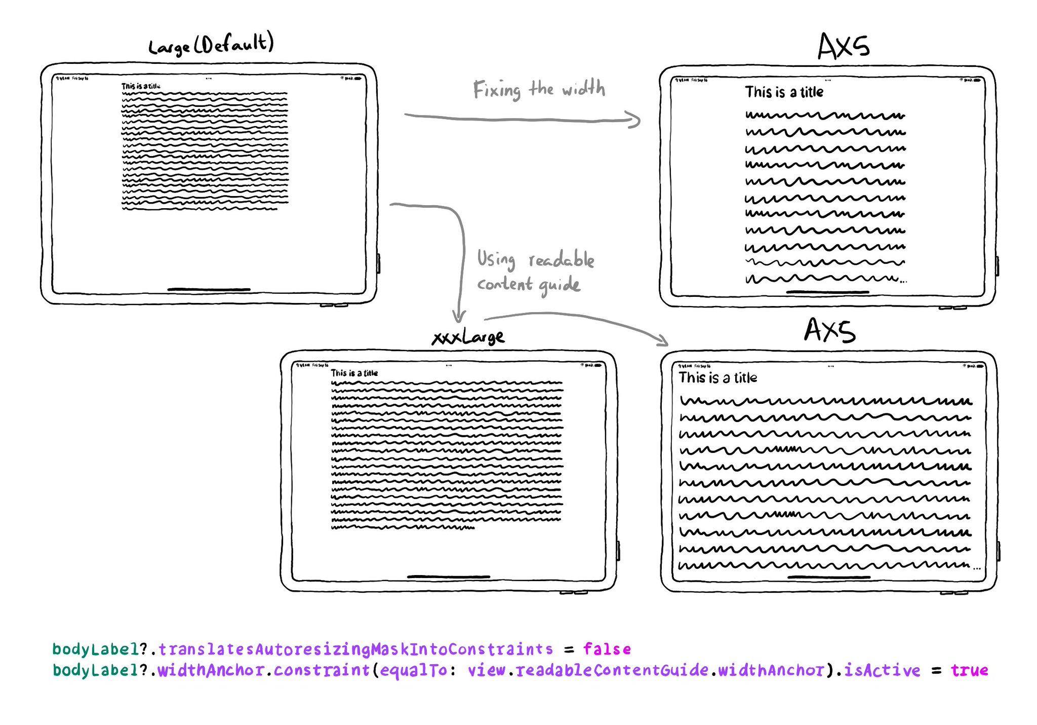
Ever wondered what the ideal width is for labels so the text is readable? Well, it depends. But readableContentGuide has you covered. You can configure the optimal width independently of Dynamic Type size or Size Classes.

https://developer.apple.com/documentation/uikit/uiview/readablecontentguide

There is an iPad with a title and some text. It has the default text size and the text has fairly large margins on both sides so the text can be read without having to move your head too much. You could fix the width, but then for large sizes, it wouldn't work that well. Instead, you can configure the width anchor of your labels to be equal to the width anchor of the readable content guide. That way, the width of the label will be optimised for the dynamic type text size chosen. Another example shows how margins are smaller for extra-extra-extra large sizes, and for AX5, there are barely any margins and the text goes almost side to side of the iPad.

You may also find interesting...

There are a ton of things to love about SwiftUI. But one of my favorites it's got to be the possibility of previewing Variants: the possibility of seeing your UI in dark/light modes, all dynamic type sizes, and orientations, side-by-side.

Check isReduceTransparencyEnabled to lower transparency. A great example is Spotlight. Not only transparency is removed but it keeps the main color of the background, it feels personalized and contextual but reduces noise and improves contrast.

You can add your Accessibility Shortcuts to Control Centre too. One more quick access point and one more reminder to get you testing often and quickly. How to enable Accessibility shortcuts: https://x.com/dadederk/status/1583519154165800960?s=61&t=_fK9Muzu2MyFEeJLVQZcJg

Created in Swift with Ignite.

Supporting Swift for Swifts