@azzoor has this great video with some advice on how to set up your device for testing accessibility and a ton of tips will get you testing effectively in no time.
You may also find interesting...

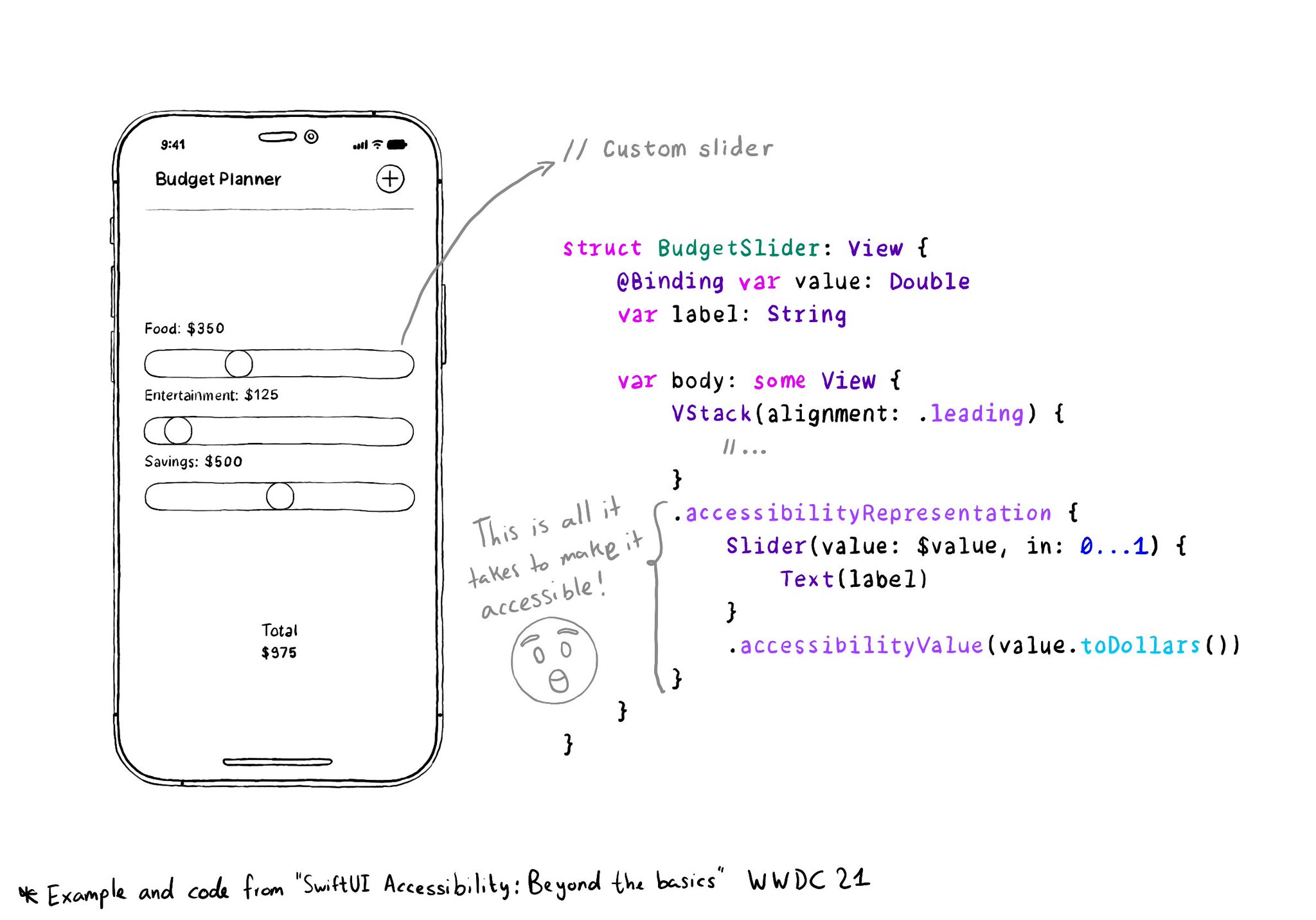
With accessibilityRepresentation(representation:), you can create a custom component and it can be perceived by assistive technologies as the view you pass as representation. No need to manually configure accessibility attributes. It is one of the most interesting additions to SwiftUI to help you develop accessible UI components. If your custom component behaves similarly to a native one, this is the way to go. https://developer.apple.com/documentation/swiftui/view/accessibilityrepresentation(representation:)

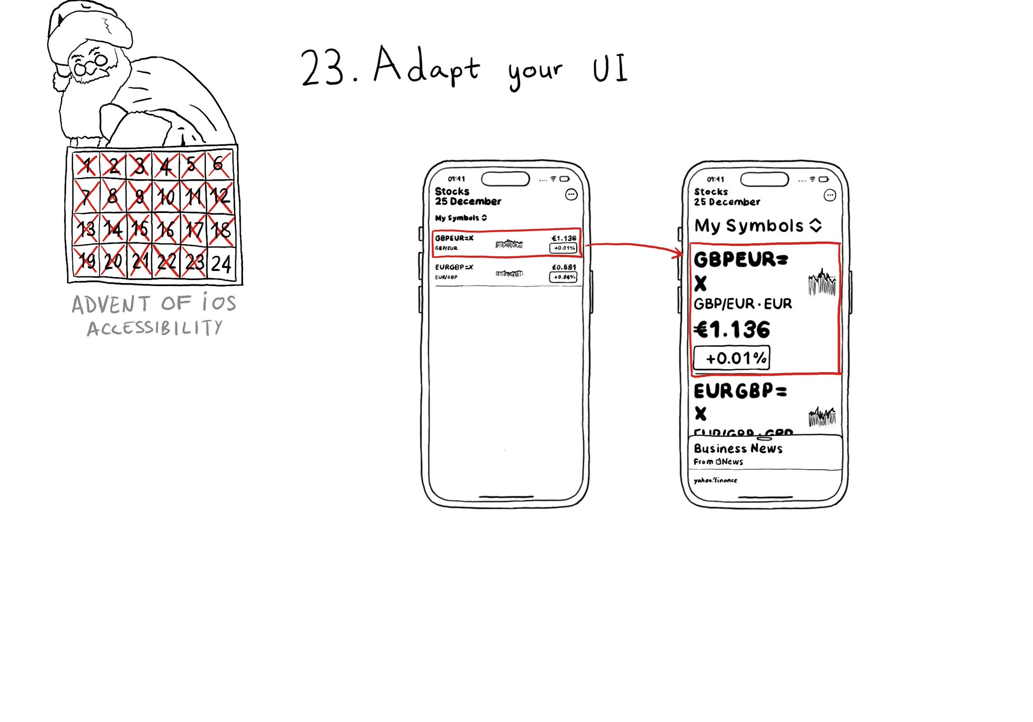
Sometimes your UI will just not scale for large text sizes. Simple changes, for large sizes, like disposing elements vertically instead of horizontally, reducing the number of columns, and allowing more lines of text, can do the trick most times.

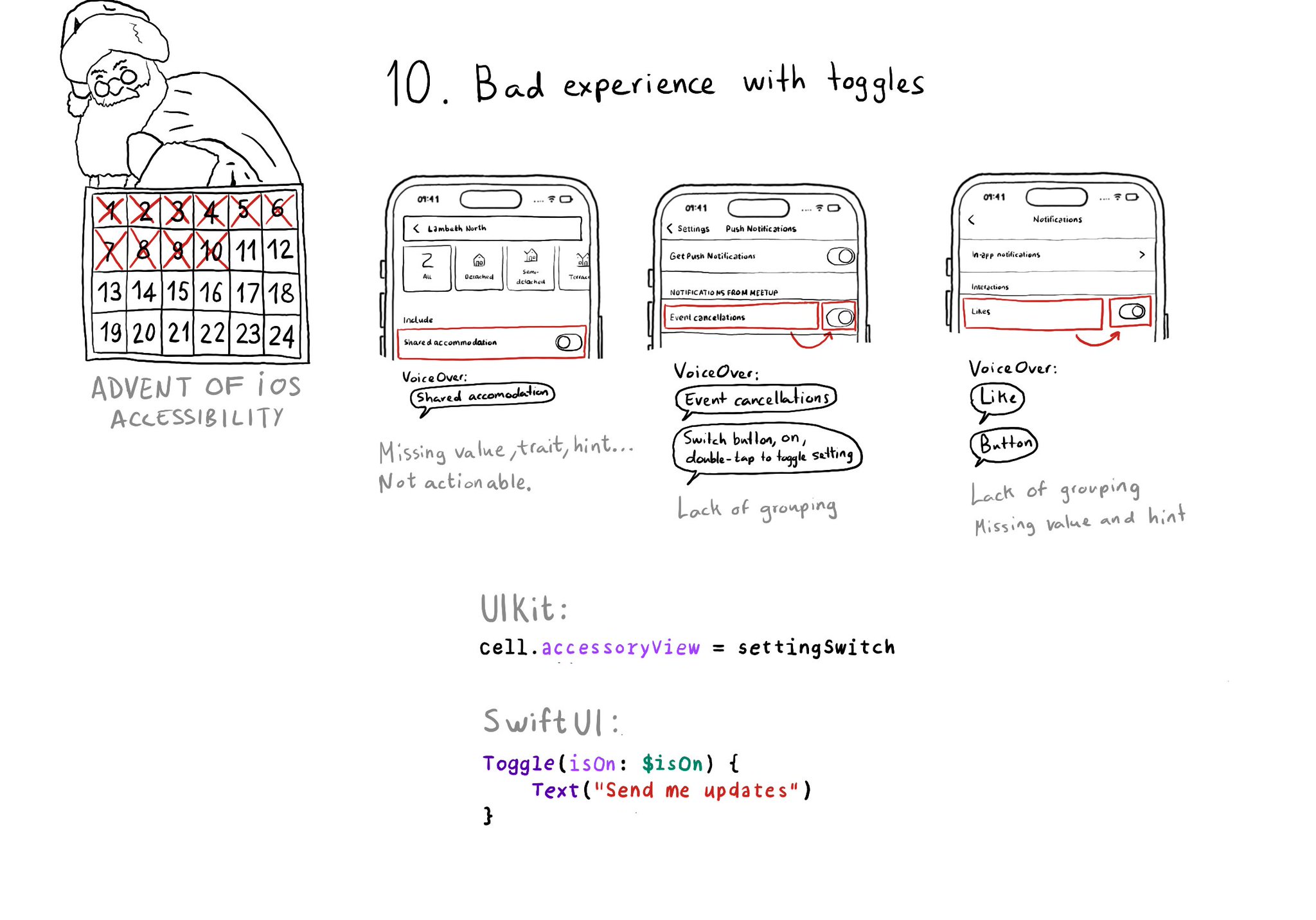
Toggles or UISwitches are often found separated from the label that precedes (and describes) them; with an unclear label; missing a value, trait, or hint; or even not being actionable at all.
Content © Daniel Devesa Derksen-Staats on Accessibility up to 11! is licensed under CC BY 4.0. License details