In SwiftUI there is a very useful modifier accessibilityElement(children:), that will do very different things depending on the AccessibilityChildBehavior passed as a parameter. There are three options: ignore (default), contain, and combine.
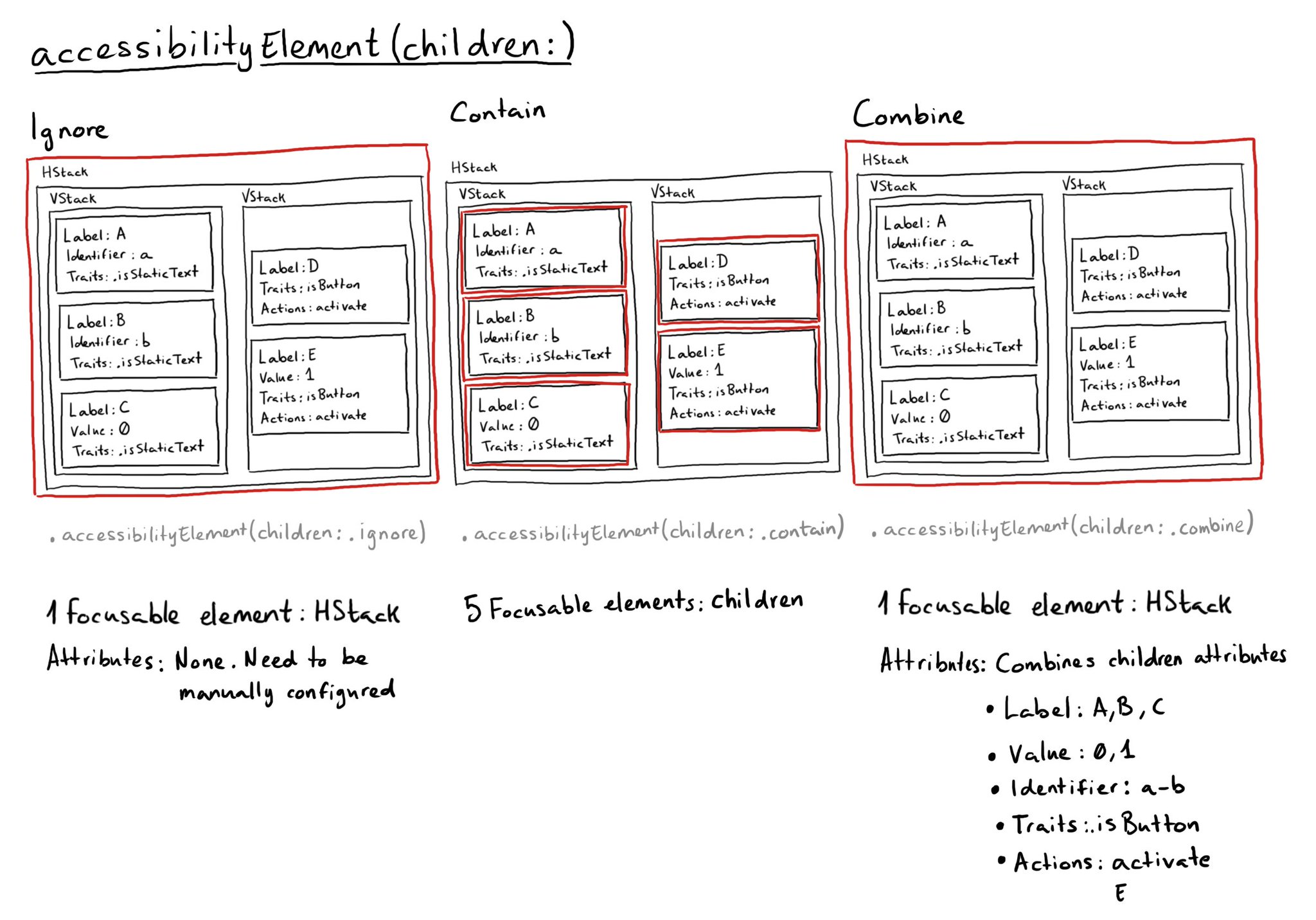
In SwiftUI there is a very useful modifier accessibilityElement(children:), that will do very different things depending on the AccessibilityChildBehavior passed as a parameter. There are three options: ignore (default), contain, and combine.
Some of you have asked me how you can support what I do. This would really help, and would be hugely appreciated:
Find these posts useful? Share them at work, on social media, or with anyone that might find them interesting. Let's spread the word!
Check out any of my apps or games: Xarra!, RetroRapid!, or Mestre!.
A download and a review go a long way. They're free by default. On the App Store, ratings and reviews really help more people discover them.
Finding any of them useful? If so, and if you can afford it, purchasing lifetime access to all features or subscribing lets me buy the coffee that keeps me caffeinated. Caffeine keeps me going to maintain the apps, bring in new features that I hope you'll love, and keep writing.
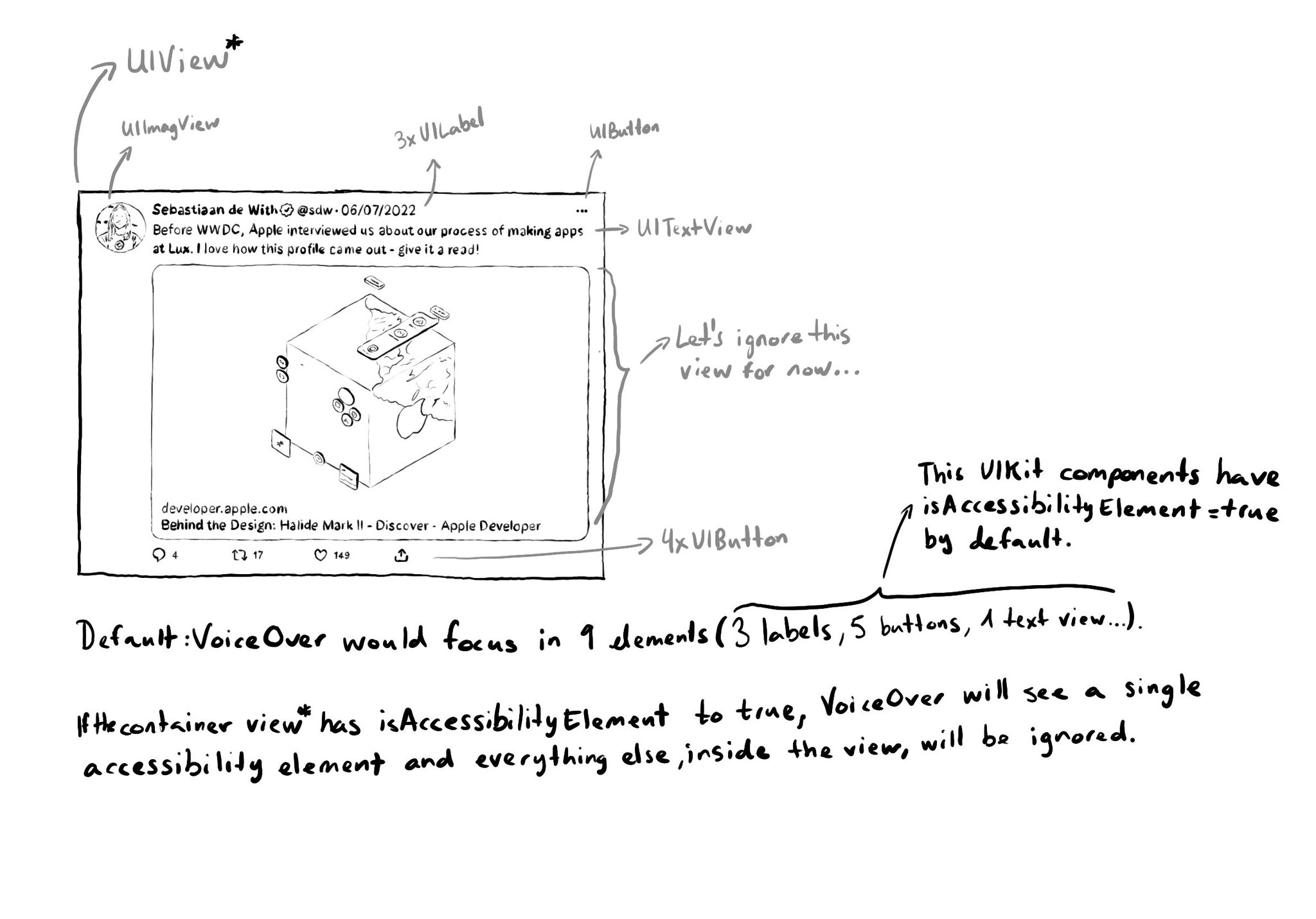
When setting isAccessibilityElement to true, assistive tech like VoiceOver will stop looking for other accessible elements in that view hierarchy. So if we make a view accessible, its subviews, including buttons and labels won't be accessible.
You can pass the .escape AccessibilityActionKind to the accessibilityAction(_:_:) modifier, to implement the perform escape gesture in SwiftUI. A reminder of how perform escape works: https://x.com/dadederk/status/1549066893377830913?s=20&t=Aog7ojR4E4eG4M3hd-cn3w
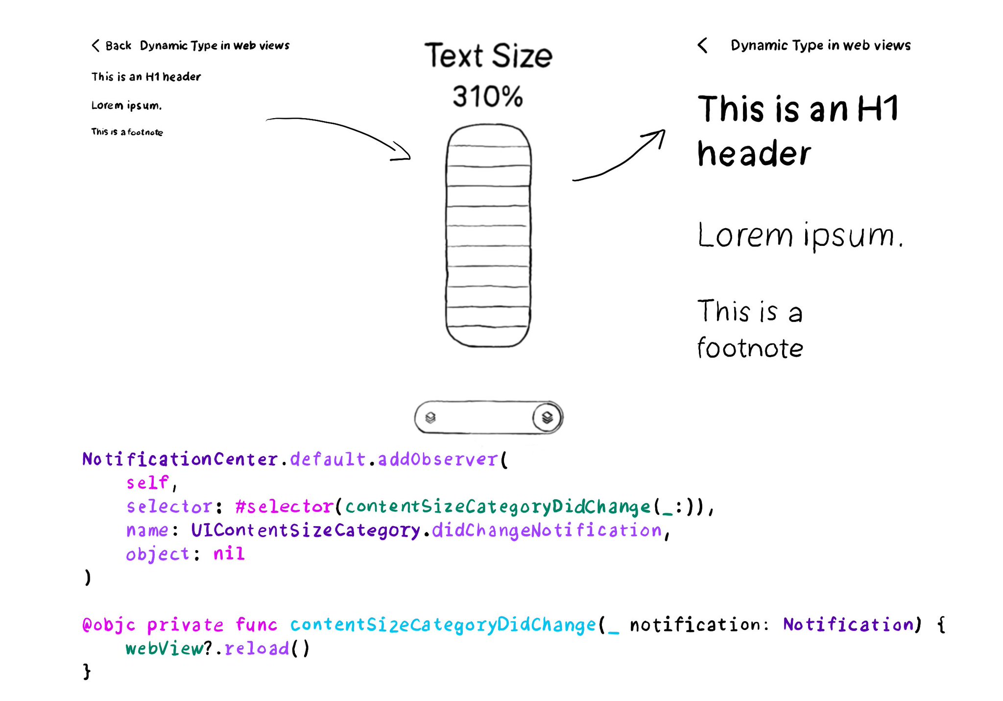
You can add an observer to listen for changes in the content size category, in case it is more convenient than overriding traitCollectionDidChange(_:).
Content © Daniel Devesa Derksen-Staats on Accessibility up to 11! is licensed under CC BY 4.0. License details