Tag: UIKit
13 posts
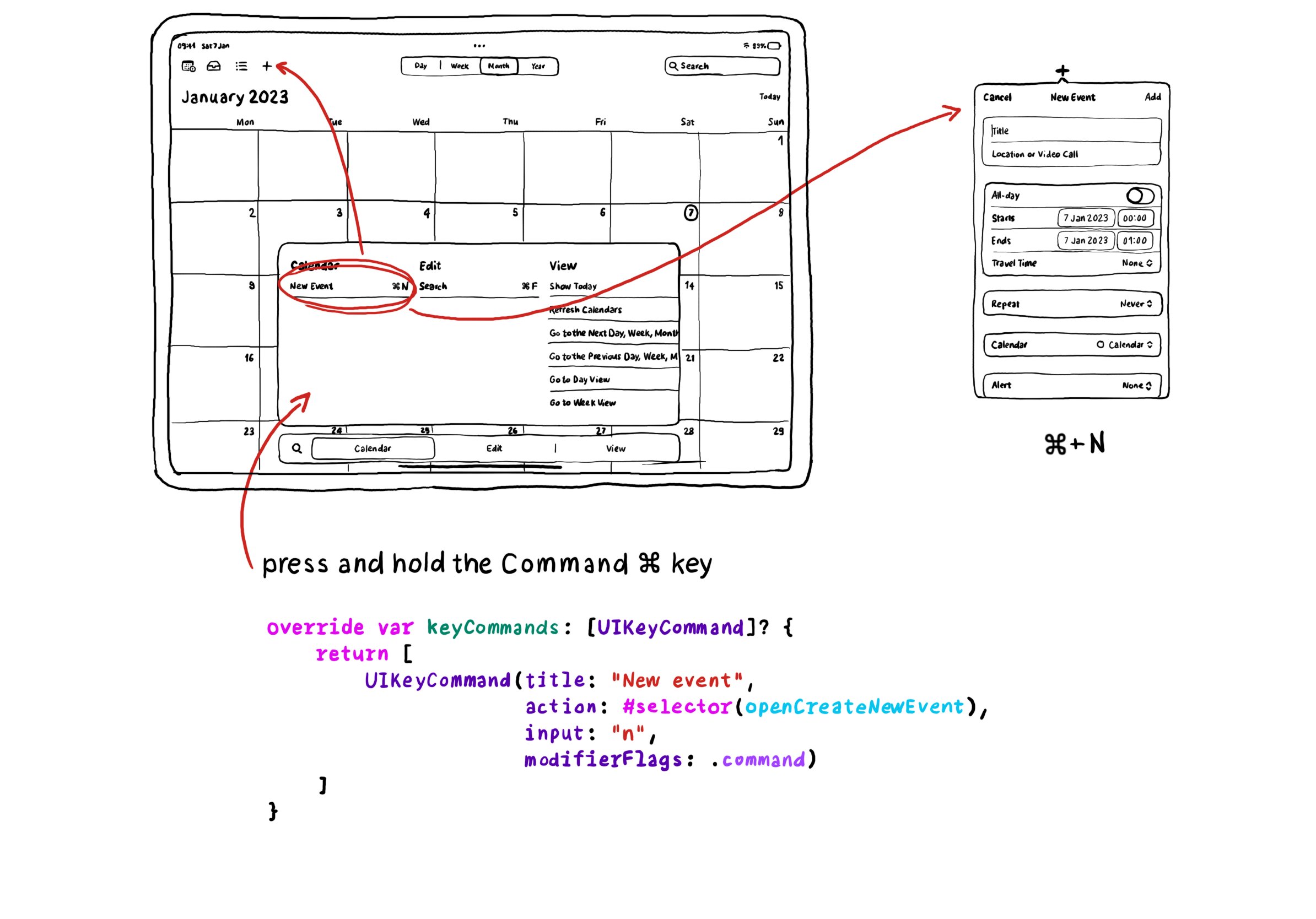
In UIKit you can create keyboard shortcuts by overriding the keyCommands for your view controller, which is an array of UIKeyCommand. A bit of a different approach to how you'd do it with SwiftUI.
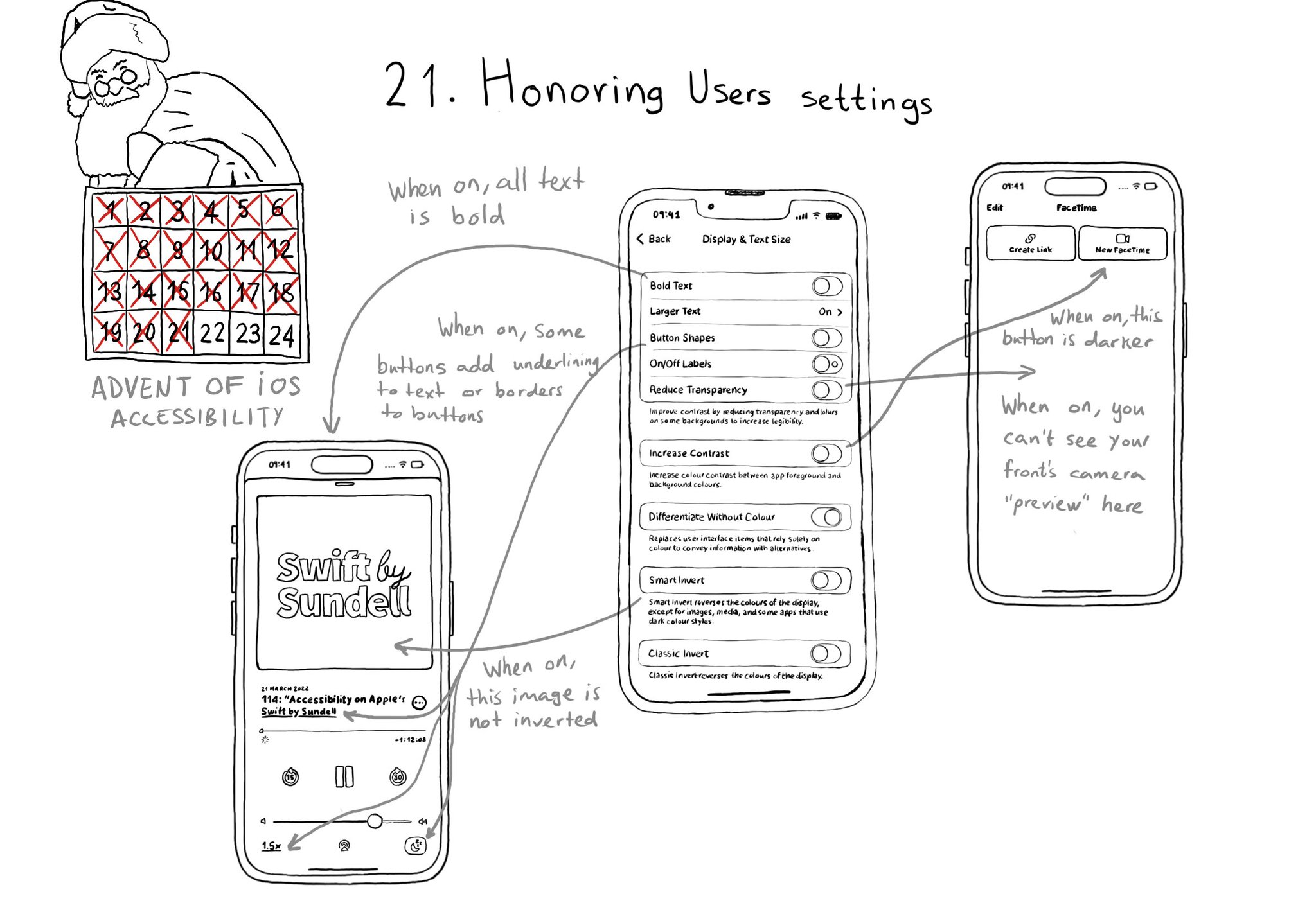
There are a few accessibility settings you can check for, or get notifications in case these preferences change. This is especially important when developing custom components as they will mostly work with UIKit controls.
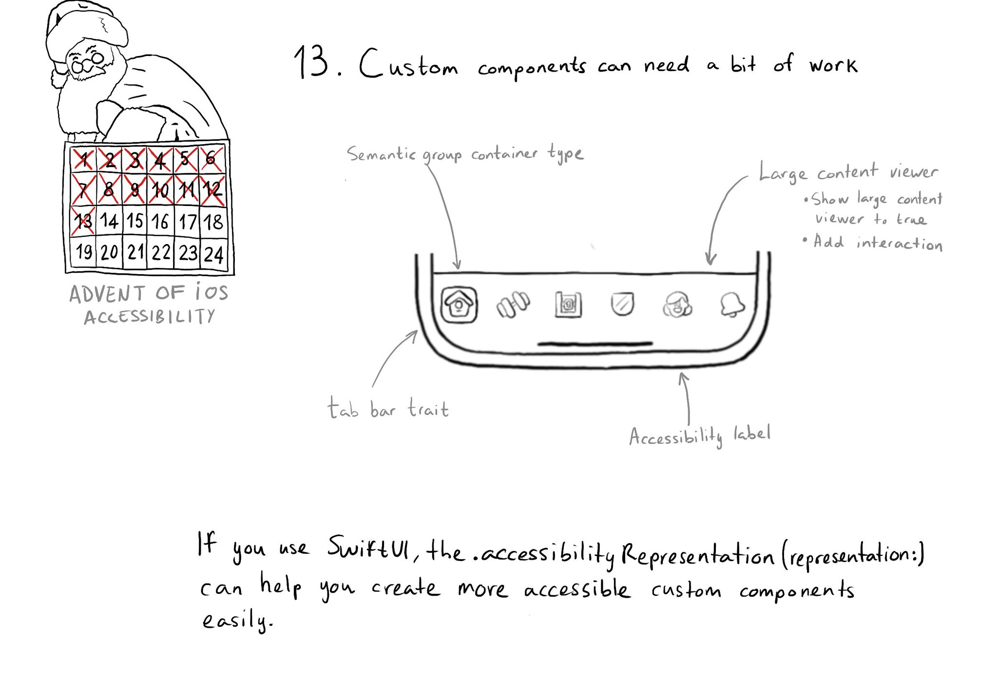
Sometimes, you may want to create a custom component, even if there is a similar one in UIKit because you want to style it in a way that the default one won't let you. That's fine, just take into account that you'll need to make it accessible.
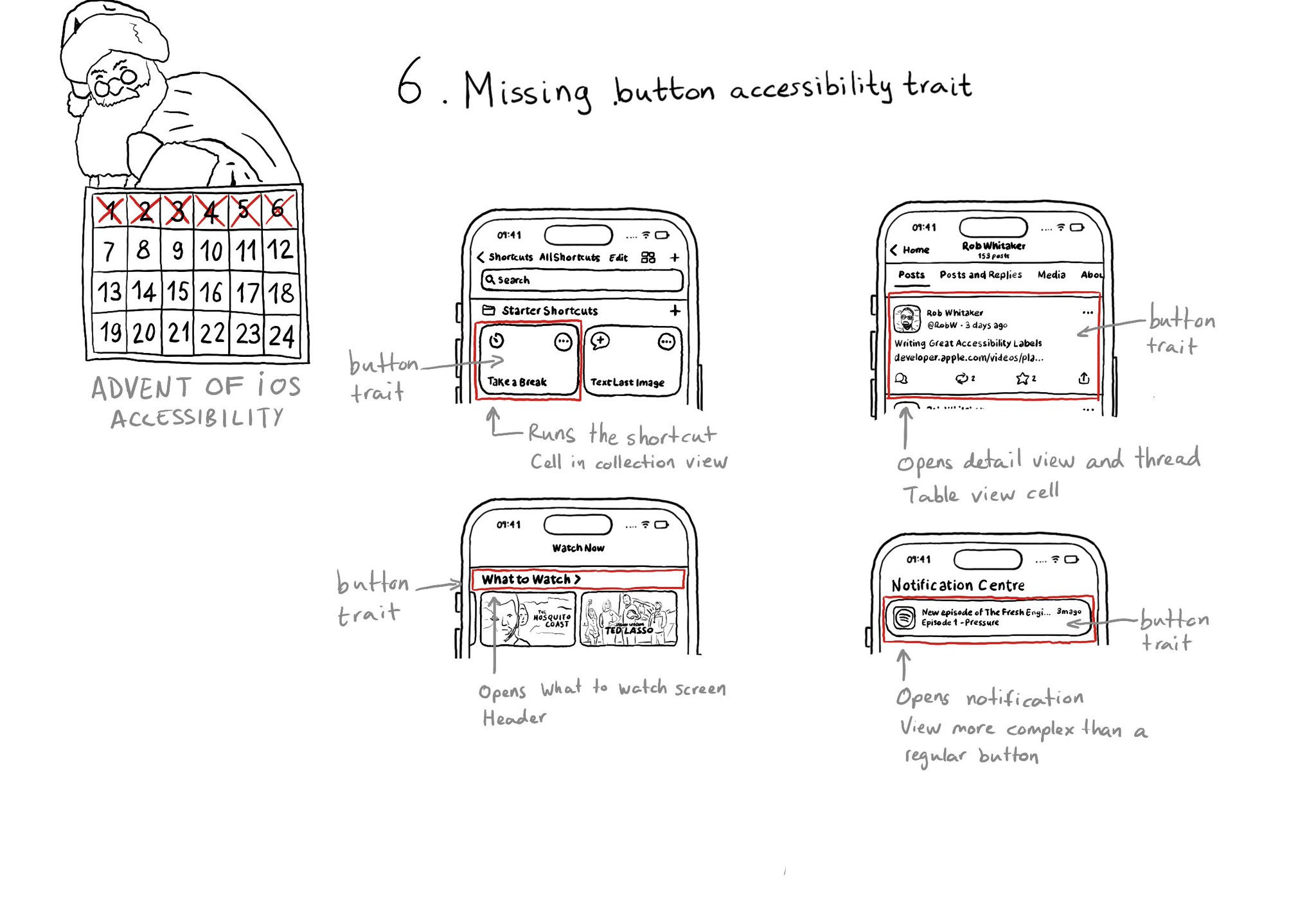
With regular buttons from UIKit or SwiftUI, you are all set. With complex views, headings, or table/collection view cells that, when selected, bring the user somewhere else in the app or perform an action, you'll have to add the button trait.
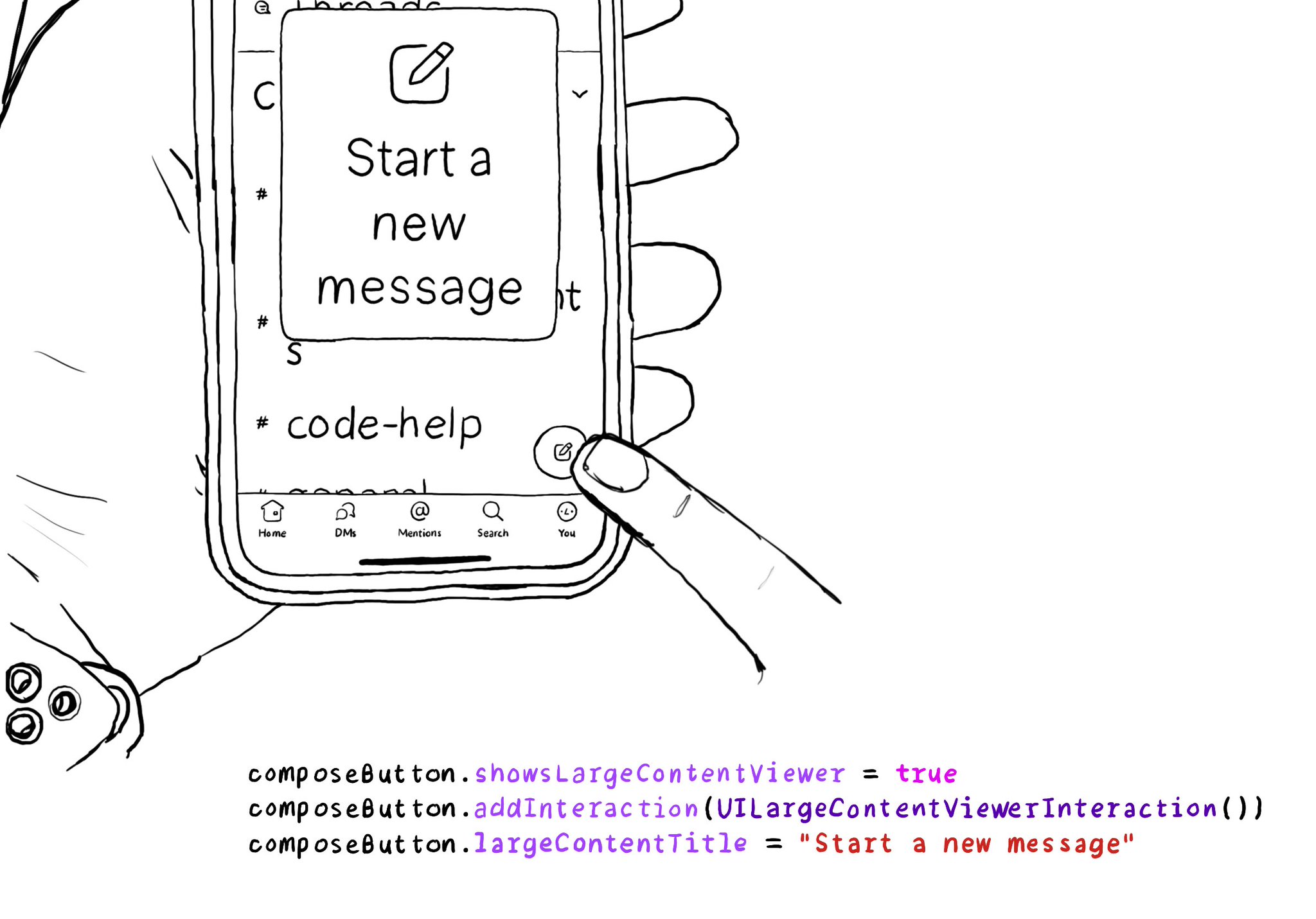
When implementing the large content viewer, UIKit components will usually have a large content title and image configured for you. But if you are developing a custom component, or you want to add info to a native component, you can do so.
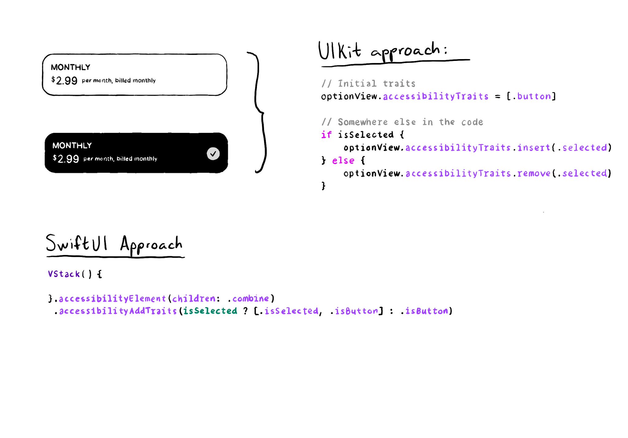
As with UIKit, in SwiftUI you can also add/remove a11y traits. But because of its declarative nature, you'll have to approach it in a slightly different way. A little nuance, but something that made me scratch my UIKit head when learning SwitUI.
The equivalent of using a .semanticGroup accessibilityContainerType in UIKit, would be to use the .accessibilityElement(children: ) modifier with the .contain option in SwiftUI. Here's a refresher with some use-cases: https://x.com/dadederk/status/1558790851496742914
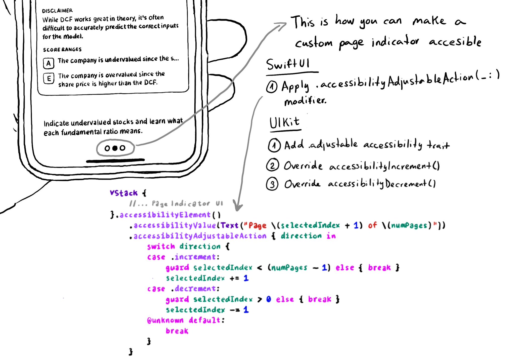
In UIKit, to create an adjustable component we need to add the adjustable trait and override both accessibilityIncrement() and accessibilityDecrement(). In SwiftUI, everything you need is bundled in the accessibilityAdjustableAction(_:) modifier.
The .accessibilityElement(children: ) modifier with the .ignore argument does a similar thing to set the container view to be an accessibility element in UIKit. It is the default argument, so you can just say .accessibilityElement(). Because of this, you'll need to use other modifiers to make it accessible and manually configure an accessibility label and value, traits... when necessary. https://developer.apple.com/documentation/swiftui/view/accessibilityelement(children:) https://developer.apple.com/documentation/swiftui/accessibilitychildbehavior/ignore
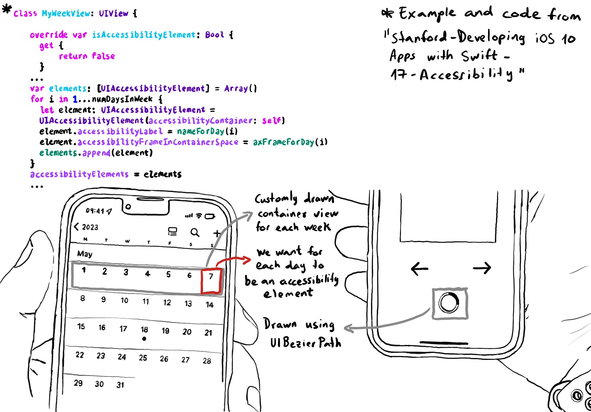
You can create your own accessibility elements from scratch. One use-case for doing that is when you do some custom drawing instead of building your UI using or relying on UIKit components. A circular progress bar, could be an example.
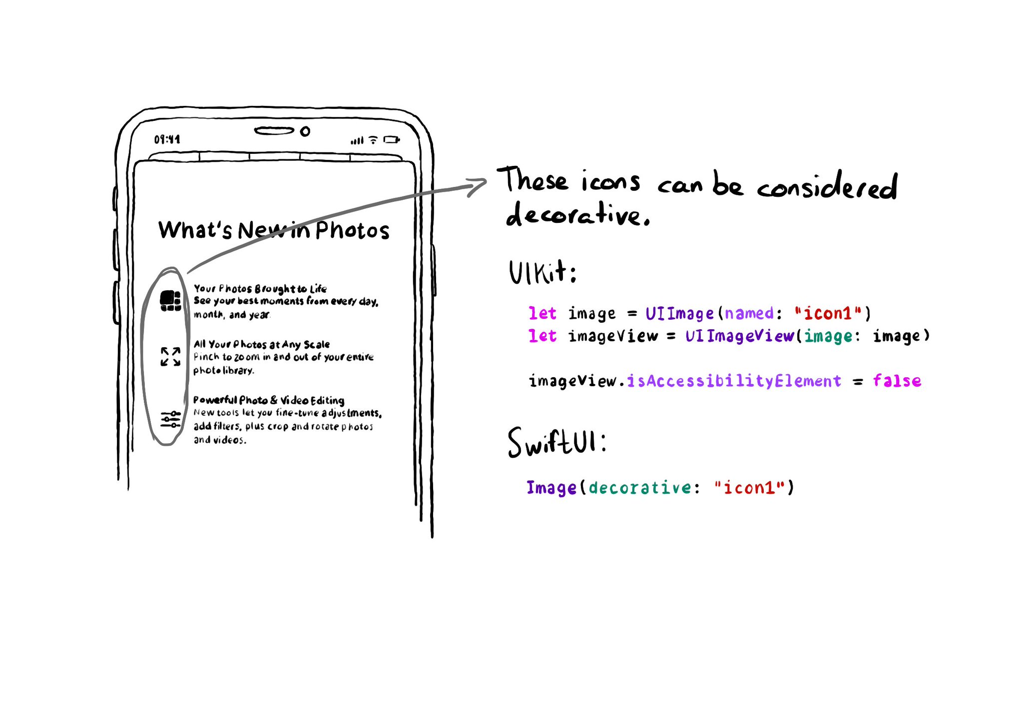
If an image does not convey additional information, maybe it's just used to make the UI look more attractive, it makes sense for VoiceOver to skip it. UIKit: set isAccessibilityElement to false. SwiftUI: create a decorative image explicitly.
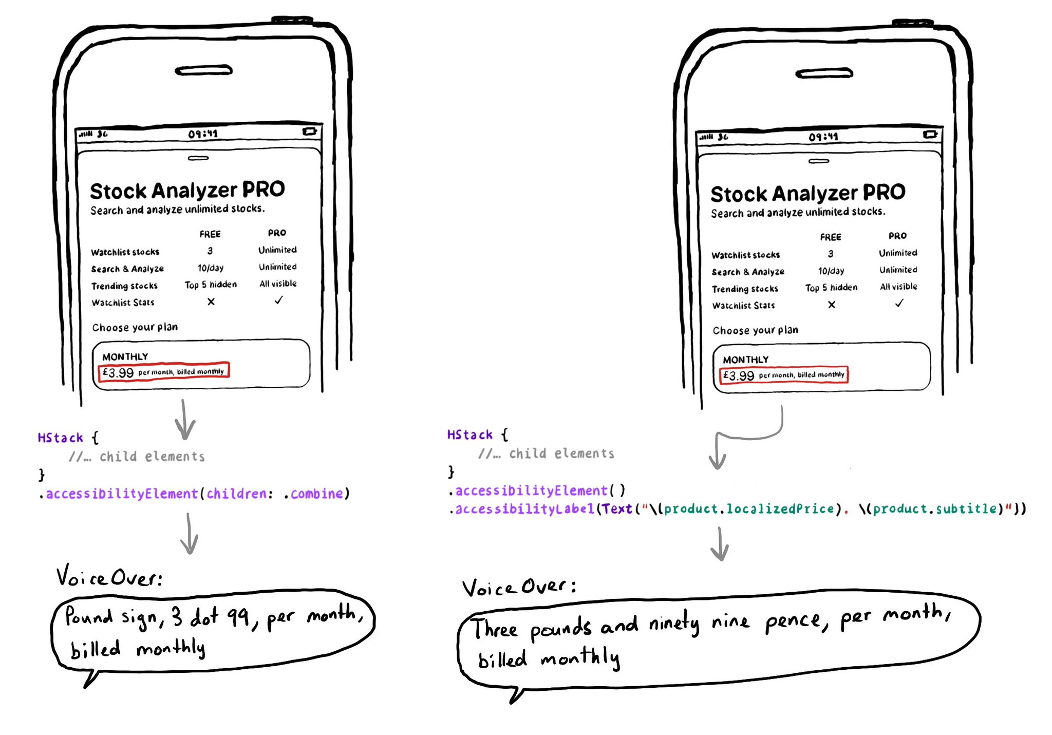
SwiftUI has equivalent accessibility modifiers for some of UIAccessibility's properties in UIKit. Same basic concepts apply. Label: https://developer.apple.com/documentation/swiftui/view/accessibilitylabel(_:)-9ek2h Value: https://developer.apple.com/documentation/swiftui/view/accessibilityvalue(_:)-8esl7 Traits: https://developer.apple.com/documentation/swiftui/view/accessibilityaddtraits(_:) Hint: https://developer.apple.com/documentation/swiftui/view/accessibilityhint(_:)-3i2vu
Showing 12 of 13 posts