In general, blog posts tend to be about teaching a specific topic, technology, or API… But I love it when devs talk about how they’ve built something or share their personal experiences. So I thought I’d write about some of the things I found interesting while trying to make Xarra (an app that lets you import text to listen to it) as accessible as possible. Little case studies, if you will, and the train of thought behind each decision. I’m not claiming I got every decision right, and I’d love to hear if you would have approached any of these differently. But hopefully you’ll still find this interesting, and I’m going to try to share at least one thing you didn’t know about iOS accessibility. Challenge accepted? Let’s go!

1. Multi-modality: reading, listening, and optionally, highlighting words
This might be quite Xarra-specific, but I still think it is a good opener. I started this app because reading long pieces of text, especially in digital format, was becoming more and more difficult for me. I would lose focus, have to go back, or simply get bored… I figured that listening helped me hugely with that. And adding highlighting, karaoke style, helped me even more.
I’m very happy I’ve been able to build an app that doesn’t ‘just’ need to be accessible but that its purpose itself is accessibility, making reading more accessible.
What we can take from this is that conveying information in multiple modes can make a real difference. Even if the modes feel redundant, they can reinforce the same piece of information. You want to read? Perfect. Prefer to listen? Go for it. Both? No problem!
If you need one more example of this concept, take Apple Music. Its Music Haptics feature plays haptic tracks alongside supported songs, enhancing the experience for deaf and hard of hearing music fans. And even cooler, Apple provides an API for apps that play supported songs!
Takeaways:
- Offer important information through more than one mode when possible: text, audio, haptics, or a combination.
- Let people choose and combine the modes that work for them.
2. Speech utterances and speech preferences
Now that you know what Xarra is about, a little detail on what’s at its core: it uses Speech Synthesis from the AVFoundation framework to produce audio from text. You can create an AVSpeechUtterance with a string, optionally set its speaking rate or pitch and choose an AVSpeechSynthesisVoice for a specific language, then pass the utterance to an AVSpeechSynthesizer to speak it. It really is shockingly easy to synthesize audio on-device. Xarra’s use case is pretty straightforward, but if your users could benefit from spoken text without having to turn on VoiceOver necessarily, this is an option.
Here is the basic setup:
final class Speaker {
    private let synthesizer = AVSpeechSynthesizer()

    func speak(_ line: String, languageCode: String, rate: Float) {
        let utterance = AVSpeechUtterance(string: line)
        utterance.voice = AVSpeechSynthesisVoice(language: languageCode)
        utterance.rate = rate
        synthesizer.speak(utterance)
    }
}
The languageCode parameter is a BCP 47 code such as "it-IT". The rate here is an AVSpeechUtterance rate, not a 1× playback multiplier; Xarra converts its playback speed to that scale.
While building Xarra, I discovered prefersAssistiveTechnologySettings. When a user has enabled an assistive technology, such as VoiceOver, this property lets its speech settings (voice, speaking rate…) take precedence over the utterance’s own settings. How cool is that? One of those moments when you think Apple’s accessibility team thinks of everything.
let utterance = AVSpeechUtterance(string: line)
if prefersAssistiveTechnologySettings {
    utterance.voice = nil
}
utterance.rate = Self.speechRate(forPlaybackSpeed: speed)
utterance.prefersAssistiveTechnologySettings = prefersAssistiveTechnologySettings
I wanted to give people control, so I added a setting that lets them choose between Xarra’s voice and speed controls and their assistive technology’s speech settings. Users can also set preferred voices for different languages in the app.
Takeaways:
- Consider on-device speech synthesis when spoken content could help people use your app without having to enable VoiceOver. Need another example of in-app listening? Shoutout to Slack’s iPhone app: long-press a message and you can listen to it.
- If your app speaks, consider matching the user’s assistive technology settings, or give people the option to use their voice and speaking preferences when an assistive technology is active.
3. Text in different languages
Because iOS can synthesize speech in multiple languages, Xarra lets you choose from the voices available for your document’s language. There are lots of on-device voices in different languages, and you can download more, including higher-quality Enhanced and Premium voices. When navigating what I call Audio Documents in Xarra, I also wanted VoiceOver to pronounce the imported text in the right language.
My first approach was a one-liner on the SwiftUI button for each transcript line:
transcriptButton
    .environment(\.locale, Locale(identifier: languageCode))
In my testing, this helped VoiceOver pronounce imported text in its own language, but it is not a perfect solution. Back when I worked in UIKit, I used an attributed accessibility label (an NSAttributedString with the accessibilitySpeechLanguage attribute) to tell VoiceOver the language of the text itself. Hopefully Apple is working on a SwiftUI-style API for this.
It is not the end of the world, but quite strange to get VoiceOver to read something in a voice that is different than the content, like a Spanish voice reading English content.
Takeaways:
- Tell assistive technologies the language of text when you know it, especially when it differs from the app’s/system language.
4. Customization is king: word highlighting
We’ve talked about how the app sounds when reading the text; now let’s see how it looks. I discovered how much listening while reading, with word highlighting, helps me through Speak Selection, available on iPhone, iPad, and Mac. Highlighting might not be for everyone (customization options are great for accessibility!), so I made it optional. I also provided two styles: background and underline.
So let’s see how another core feature of Xarra is built. I first implemented background highlighting, which adds a rectangle behind the word being spoken. To ensure color contrast, in light mode I had to change the text inside it to white. It works really well for me, but I thought: one, the rectangle highlight might be a lot for some people; and two, some may use light or dark mode precisely because they prefer, or need, light text on a dark background, or the other way around. It is, after all, a reading app, so I wanted to offer more than one way to follow along. An underline felt like a good solution for those two concerns.
Xarra speaks each transcript line as its own utterance. That makes the range from AVSpeechSynthesizerDelegate relative to the line we display:
synthesizer.delegate = speechModel
synthesizer.speak(AVSpeechUtterance(string: line))
The delegate stores the range in observable state. When it changes, the transcript row redraws:
@MainActor @Observable
final class SpeechModel: NSObject, AVSpeechSynthesizerDelegate {
    var spokenRange: NSRange?

    nonisolated func speechSynthesizer(
        _ synthesizer: AVSpeechSynthesizer,
        willSpeakRangeOfSpeechString range: NSRange,
        utterance: AVSpeechUtterance
    ) {
        Task { @MainActor in self.spokenRange = range }
    }
}
The transcript row reads that same property when creating its text:
Text(highlightedText(
    line,
    range: speechModel.spokenRange,
    mode: wordHighlightMode
))
The callback gives us an NSRange, and we apply the selected style to the spoken word in an AttributedString:
private func highlightedText(
    _ line: String,
    range: NSRange?,
    mode: WordHighlightMode
) -> AttributedString {
    var result = AttributedString(line)
    // Omitted: validate range and convert it to an AttributedString range named word.

    switch mode {
    case .none:
        break
    case .underline:
        result[word].underlineStyle = .single
    case .background:
        result[word].backgroundColor = .accentColor
        result[word].foregroundColor = highlightedWordForegroundColor
    }
    return result
}
This also got me thinking about reading colors and color schemes. A dark background can be more comfortable for someone with light sensitivity. Others find dark text on a light background easier to read. For some people with astigmatism, bright text on a dark background can appear to glow or blur, sometimes called halation.
Color contrast is very important too, especially for text. In the future, I’d like to give people the option to customize the colors. For now, I chose .systemIndigo as the app’s accent color. Against the main background, it offered some of the strongest contrast among the system colors I checked across light and dark mode, with Increase Contrast on and off.
Takeaways:
- Support both light and dark modes. Dark mode is often considered an accessibility option; light mode can be one too. Again, customisation is king.
- Make visual aids optional and offer alternatives; a treatment that helps one person may make reading harder for another.
5. Is SwiftUI accessible by default?
Speaking of color contrast… that’s what this last story for today is about.
So, is SwiftUI accessible by default? The short answer is no. Rob Whitaker wrote a great article with exactly that title: “No, SwiftUI is not ‘Accessible by default’”. It does help massively to use native components as much as possible. It certainly made my life much easier with Xarra. But as you can see, that’s not the whole job. And on top of that, the system doesn’t always behave as one would expect. Another way of saying this is that even trillion-dollar companies like Apple sometimes have bugs in their software… I think I found one of them.
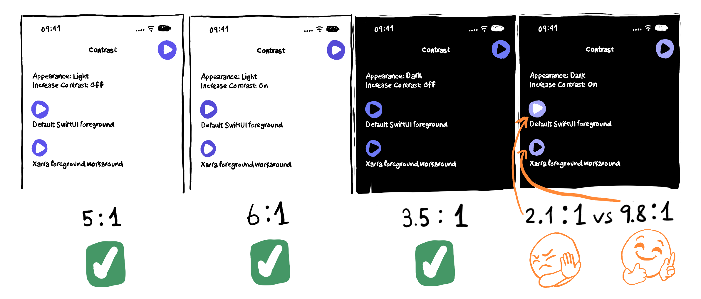
My first reaction when I find something like that is to try not to fight the system. If you add a workaround, Apple might later fix the original issue and you could inadvertently make things worse. But in this case, I thought the fix was small and safe enough and worth it. With a .borderedProminent icon button in content, Dark Mode and Increase Contrast leave the symbol white on a light indigo fill; it is even harder to see than when Increase Contrast is off. Put the same button in a top navigation toolbar, though, and the symbol gets the dark foreground I would expect. I reproduced this on iOS 26.5 and iOS 27.0 simulators.

View the illustration at full size
Here is a stripped-down version of the workaround using the .borderedProminent style from my minimal reproducer:
@Environment(\.colorScheme) private var colorScheme
@Environment(\.colorSchemeContrast) private var contrast

Button("Play", systemImage: "play.fill", action: play)
    .labelStyle(.iconOnly)
    .buttonStyle(.borderedProminent)
    .buttonBorderShape(.circle)
    .tint(.indigo)
    .foregroundStyle(
        colorScheme == .dark && contrast == .increased
            ? Color(uiColor: .systemBackground)
            : .white
    )
But one thing you should always do if you find anything that works unexpectedly is to provide feedback to Apple so they’re aware of an issue and can fix it in the future. This one is filed under FB24927103. Anyone from Apple reading? Wink, wink.
Takeaways:
- Prefer semantic system colors where possible; they adapt to light and dark appearances and Increase Contrast.
- Check text and control contrast in all combinations of light and dark mode, with Increase Contrast both on and off. And Increase Contrast should ideally offer a better ratio when enabled than when it is not.
- Start with native controls, then test them with the appearance and accessibility settings people may actually use together.
- If something doesn’t look right, submit feedback to Apple.
Wrapping up
That was a lot for one blog post… 😅 so let’s wrap it up for now. We’ve talked about conveying information in multiple modes: text, audio, haptics… We have APIs to synthesize text into speech and to tell VoiceOver how to speak other languages for a particular piece of text. We’ve also talked about supporting light and dark mode for accessible reading, checking the contrast of functional elements, and giving Apple feedback when the system gets something wrong.
What do you say? Did I achieve the goal? Was there anything in there that was new to you? Please let me know, including if you’ve faced a similar situation but approached it differently. And if you found this interesting, I’m happy to start writing the next part of this series. Who knows, if successful, I might make a trilogy of it.
Thanks for reading! All the best!