Tomorrow is @gbla11yday! And I'm going to start a challenge, tweeting everyday, for a whole year, about tips, resources, and other useful info on how to develop accessible iOS apps. Are you up for the challenge? #GAAD
Some of you have asked me how you can support what I do. This would really help, and would be hugely appreciated:
Find these posts useful? Share them at work, on social media, or with anyone that might find them interesting. Let's spread the word!
Check out any of my apps or games: Xarra!, RetroRapid!, or Mestre!.
A download and a review go a long way. They're free by default. On the App Store, ratings and reviews really help more people discover them.
Finding any of them useful? If so, and if you can afford it, purchasing lifetime access to all features or subscribing lets me buy the coffee that keeps me caffeinated. Caffeine keeps me going to maintain the apps, bring in new features that I hope you'll love, and keep writing.
You may also find interesting...
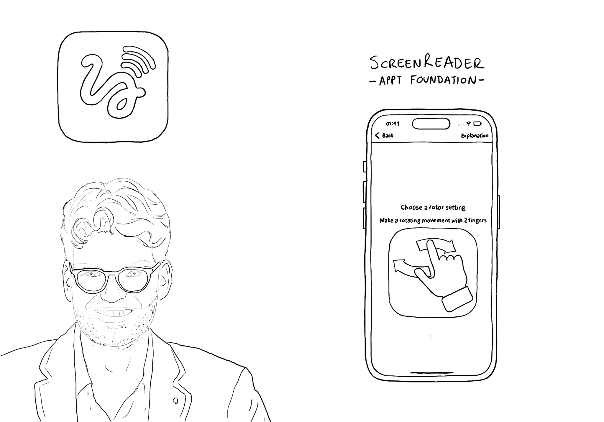
@JanJaapdeGroot presented the ScreenReader app for #GAAD2022. An app to help anyone learn VoiceOver's gestures in a very creative and playful way.
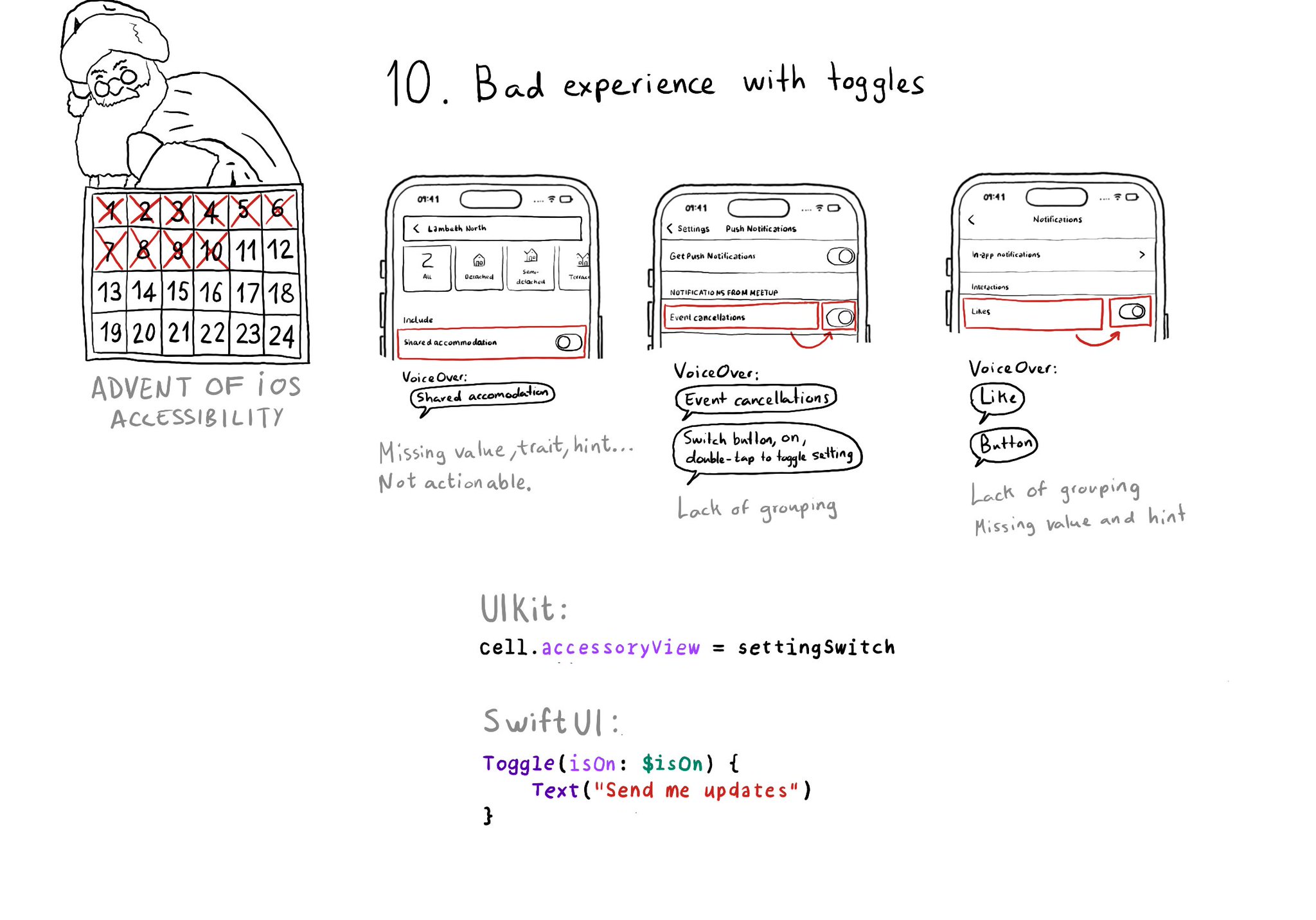
Toggles or UISwitches are often found separated from the label that precedes (and describes) them; with an unclear label; missing a value, trait, or hint; or even not being actionable at all.
@NSSpain has a great history of having amazing accessibility talks in their schedule! “Accessibility in the Real World”, by @Sommer: https://vimeo.com/235317172 “How to build an app for everyone”, by @NovallSwift: https://vimeo.com/362163043 The super fun "Choose your own SwiftUI adventure - 3 Accessibility", by @twostraws and @PinkerStraws: https://vimeo.com/481768105 And, of course, this year's great "Bas: My Accessibility Story", by @basthomas: https://vimeo.com/751176747
Content © Daniel Devesa Derksen-Staats on Accessibility up to 11! is licensed under CC BY 4.0. License details