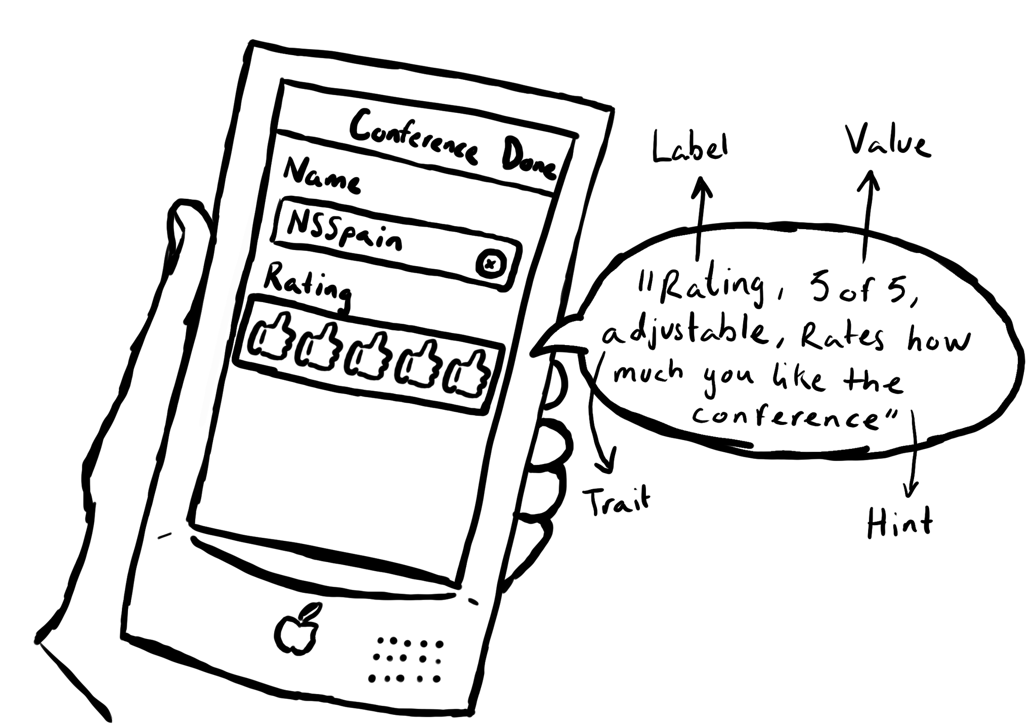
SwiftUI has equivalent accessibility modifiers for some of UIAccessibility's properties in UIKit. Same basic concepts apply.
Label: https://developer.apple.com/documentation/swiftui/view/accessibilitylabel(:)-9ek2h
Value: https://developer.apple.com/documentation/swiftui/view/accessibilityvalue(:)-8esl7
Traits: https://developer.apple.com/documentation/swiftui/view/accessibilityaddtraits(:)
Hint: https://developer.apple.com/documentation/swiftui/view/accessibilityhint(:)-3i2vu
You may also find interesting...

Creating UIAccessibilityElements, combined with a semanticGroup accessibilityContainerType, can also help you make components as complex as charts accessible. Example from "Bring Accessibility to Charts" WWDC21: https://developer.apple.com/videos/play/wwdc2021/10122/

With regular buttons from UIKit or SwiftUI, you are all set. With complex views, headings, or table/collection view cells that, when selected, bring the user somewhere else in the app or perform an action, you'll have to add the button trait.

When implementing the large content viewer, UIKit components will usually have a large content title and image configured for you. But if you are developing a custom component, or you want to add info to a native component, you can do so.