Good accessibility labels are at the core of good accessible apps. It should be a localized succinct string that tells as much as possible about the component (without including its type) and provides context avoiding verbosity and redundancy.
Some of you have asked me how you can support what I do. This would really help, and would be hugely appreciated:
Find these posts useful? Share them at work, on social media, or with anyone that might find them interesting. Let's spread the word!
Check out any of my apps or games: Xarra!, RetroRapid!, or Mestre!.
A download and a review go a long way. They're free by default. On the App Store, ratings and reviews really help more people discover them.
Finding any of them useful? If so, and if you can afford it, purchasing lifetime access to all features or subscribing lets me buy the coffee that keeps me caffeinated. Caffeine keeps me going to maintain the apps, bring in new features that I hope you'll love, and keep writing.
You may also find interesting...
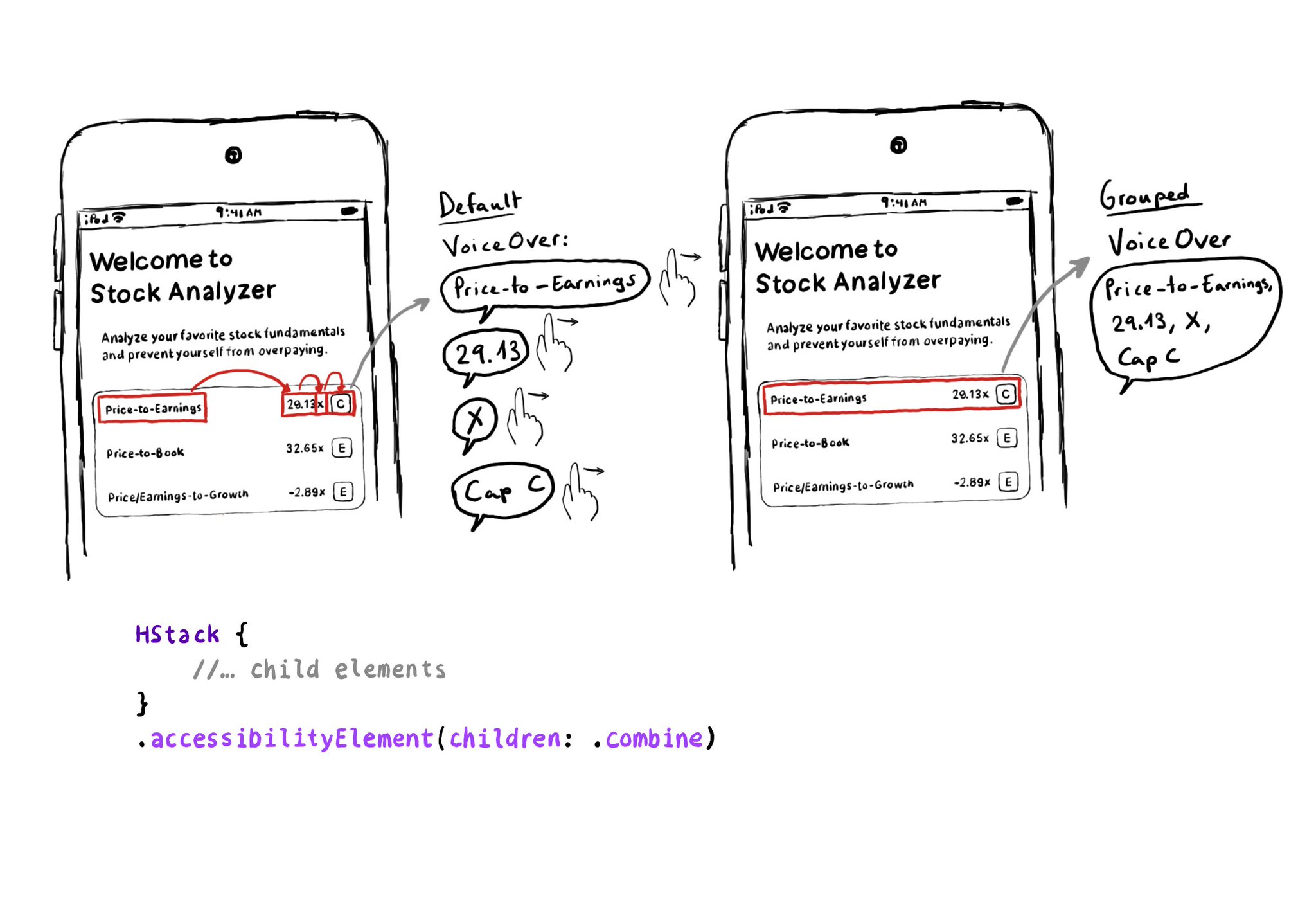
Grouping elements in SwiftUI is extremely easy! You can use the .accessibility(children: .combine) modifier. And that's it! It merges properties. For example, generating an accessibility label by joining the children's ones, separated by commas.
Check isReduceTransparencyEnabled to lower transparency. A great example is Spotlight. Not only transparency is removed but it keeps the main color of the background, it feels personalized and contextual but reduces noise and improves contrast.
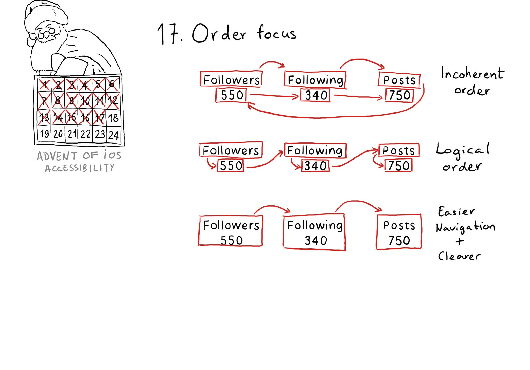
Check for the traversal order of elements in your app. Sometimes, the default top-left to bottom-right order might not be the most logical one. Sometimes, you may consciously want to tweak the order. Some other times, grouping is the answer.
Content © Daniel Devesa Derksen-Staats on Accessibility up to 11! is licensed under CC BY 4.0. License details