Sometimes you want to prioritise ease of navigation, and that's when configuring isAccessibilityElement to true on a container view makes sense. This is especially true in table/collection views and with complex cells with lots of elements.
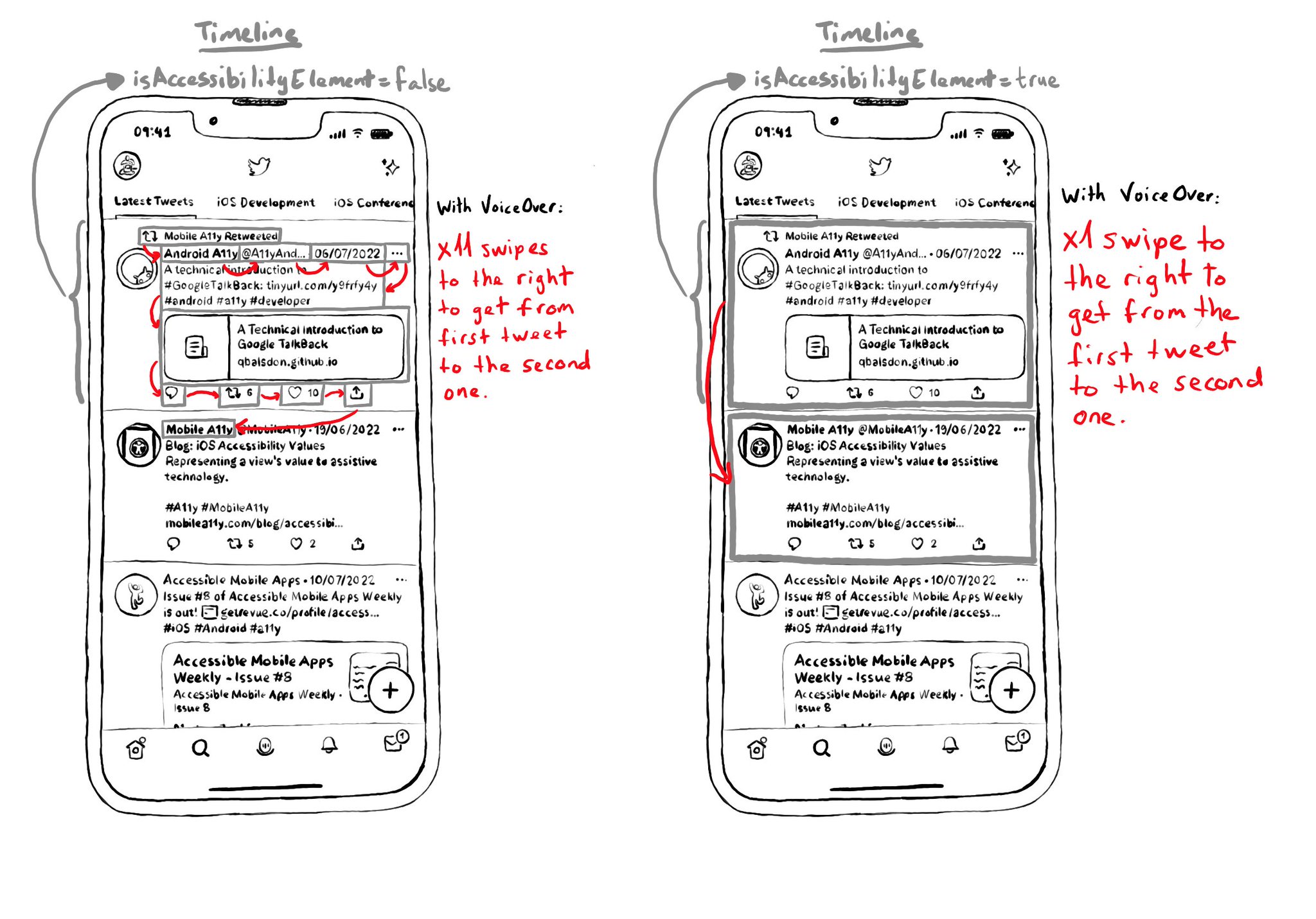
Take the example from a tweet (from Day 62's tweet). If the tweet has 9 accessible elements, you'd need 9 swipes to the right to go to the next tweet in the list. But ideally, I single swipe should be enough.
https://x.com/dadederk/status/1549417799746994177
On the other hand, for the detail screen for a single tweet, you want to optimise for ease of access to each one of the elements, instead of navigation. In that case it would be better for the tweet view not to be an accessibility element.