Buttons with a title, use it as its default accessibility label. Most cases, that's just perfect. But there's a few times that you might want to tweak it. Maybe the image is part of what the button does, or the text in the title is not very clear.
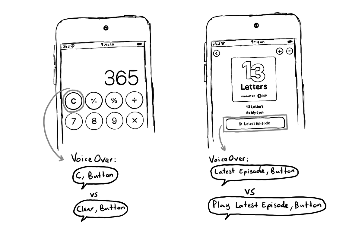
Buttons with a title, use it as its default accessibility label. Most cases, that's just perfect. But there's a few times that you might want to tweak it. Maybe the image is part of what the button does, or the text in the title is not very clear.
Some of you have asked me how you can support what I do. This would really help, and would be hugely appreciated:
Find these posts useful? Share them at work, on social media, or with anyone that might find them interesting. Let's spread the word!
Check out any of my apps or games: Xarra!, RetroRapid!, or Mestre!.
A download and a review go a long way. They're free by default. On the App Store, ratings and reviews really help more people discover them.
Finding any of them useful? If so, and if you can afford it, purchasing lifetime access to all features or subscribing lets me buy the coffee that keeps me caffeinated. Caffeine keeps me going to maintain the apps, bring in new features that I hope you'll love, and keep writing.
If you use SwiftLint in your SwiftUI project, there is a rule, by @rerycole34, for making sure that your images have either an accessibility label or are hidden for assistive tech because they might be decorative. Rule: https://realm.github.io/SwiftLint/accessibility_label_for_image.html
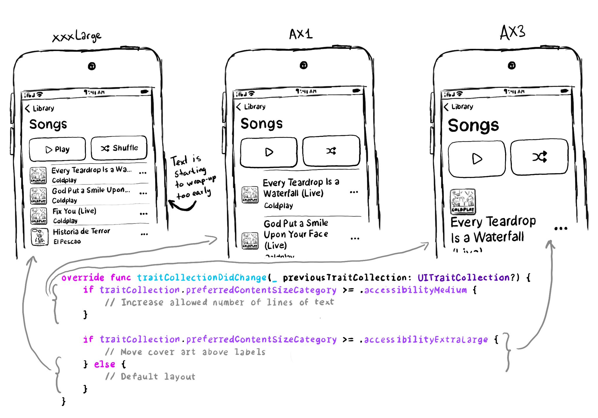
You don't have to offer an alternative layout just for the accessibility category. You can actually compare content size categories. So you could tweak the UI already for anything equal to or larger than .extraExtraLarge, for example.
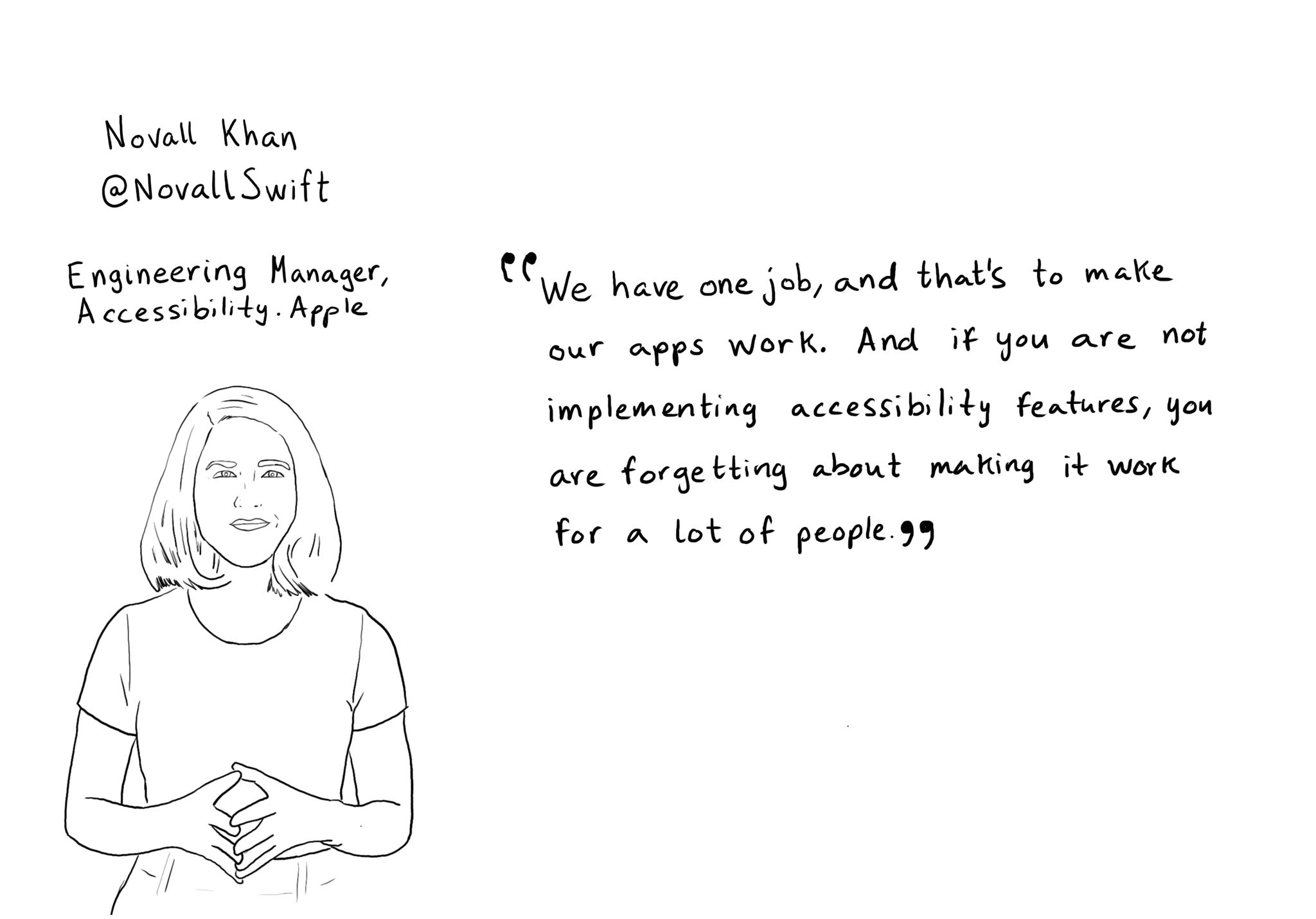
"We have one job, and that's to make our apps work. And if you are not implementing accessibility features, you are forgetting about making it work for a lot of people" @NovallSwift Couldn't have said it better! https://x.com/novallswift/status/1328387659744505856
Content © Daniel Devesa Derksen-Staats on Accessibility up to 11! is licensed under CC BY 4.0. License details