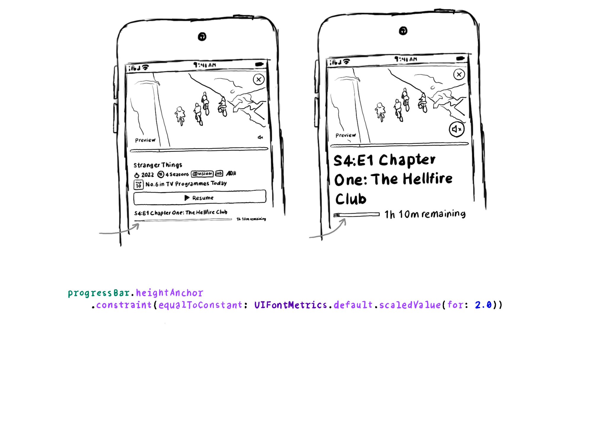
For other UI elements that could also benefit from being scaled when using Dynamic Type, you can use UIFontMetrics's scaledValue(for:). Some good examples are progress bar components, which tend to be quite slim.

https://developer.apple.com/documentation/uikit/uifontmetrics/scaledvalue(for:)

Two examples of the Netflix app, one with the default text size and another one with the largest accessibility text size. The progress bar for the first one is very thin. The second one is noticeably thicker. One way of doing this would be by setting the height anchor constraint of the bar to a value returned by the scaledValue function, passing the default height, in this case, 2.0, called from the default UIFontMetrics.

You may also find interesting...

What is the ideal distance between labels? It depends on styles for both of them and the dynamic type size, right? You wouldn't want to have the same distance for small and large text sizes. We can configure a standard distance between baselines.

UINotificationFeedbackGenerator has a “success” feedback type. Consider using it when a task was performed successfully together with any other visuals or sound. The use of multiple modes just makes it easier for everyone to understand your app.

If you want to keep yourself up to date with what’s going on, or what has been published lately, on how to develop more accessible mobile apps, make sure you subscribe to Accessible Mobile Apps Weekly by @RobinKanatzar from @accessible_apps.

Created in Swift with Ignite.

Supporting Swift for Swifts