With regular buttons from UIKit or SwiftUI, you are all set. With complex views, headings, or table/collection view cells that, when selected, bring the user somewhere else in the app or perform an action, you'll have to add the button trait.
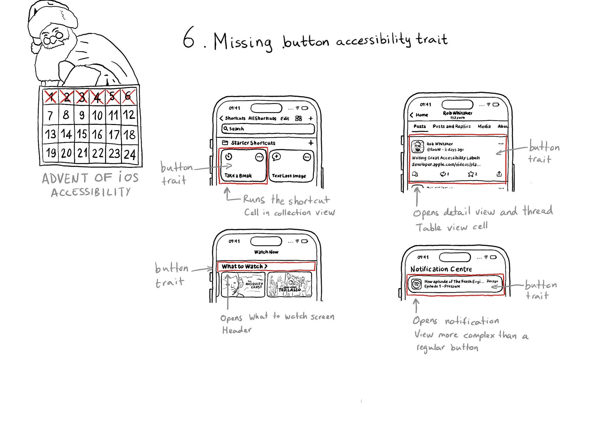
With regular buttons from UIKit or SwiftUI, you are all set. With complex views, headings, or table/collection view cells that, when selected, bring the user somewhere else in the app or perform an action, you'll have to add the button trait.
Some of you have asked me how you can support what I do. This would really help, and would be hugely appreciated:
Find these posts useful? Share them at work, on social media, or with anyone that might find them interesting. Let's spread the word!
Check out any of my apps or games: Xarra!, RetroRapid!, or Mestre!.
A download and a review go a long way. They're free by default. On the App Store, ratings and reviews really help more people discover them.
Finding any of them useful? If so, and if you can afford it, purchasing lifetime access to all features or subscribing lets me buy the coffee that keeps me caffeinated. Caffeine keeps me going to maintain the apps, bring in new features that I hope you'll love, and keep writing.
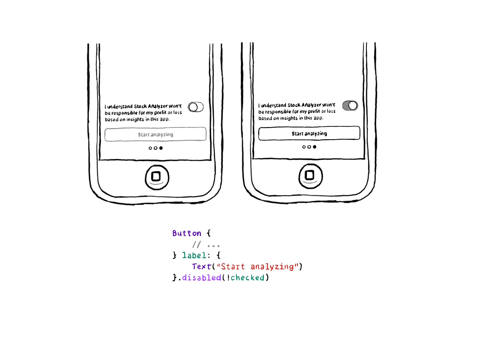
In SwiftUI you won't find the .notEnabled accessibility trait. Instead, you can just configure a view as such with .disabled(true), and pass false to enable it. VoiceOver will announce it as "dimmed". https://developer.apple.com/documentation/swiftui/view/disabled(_:)
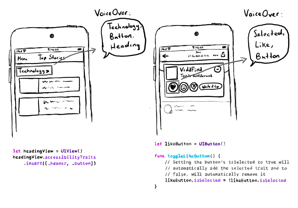
A component can have more than one accessibility trait, they can be combined. A heading can be a button too, for example. Or a button could be selected. You can insert or remove the selected trait to the button, when needed.
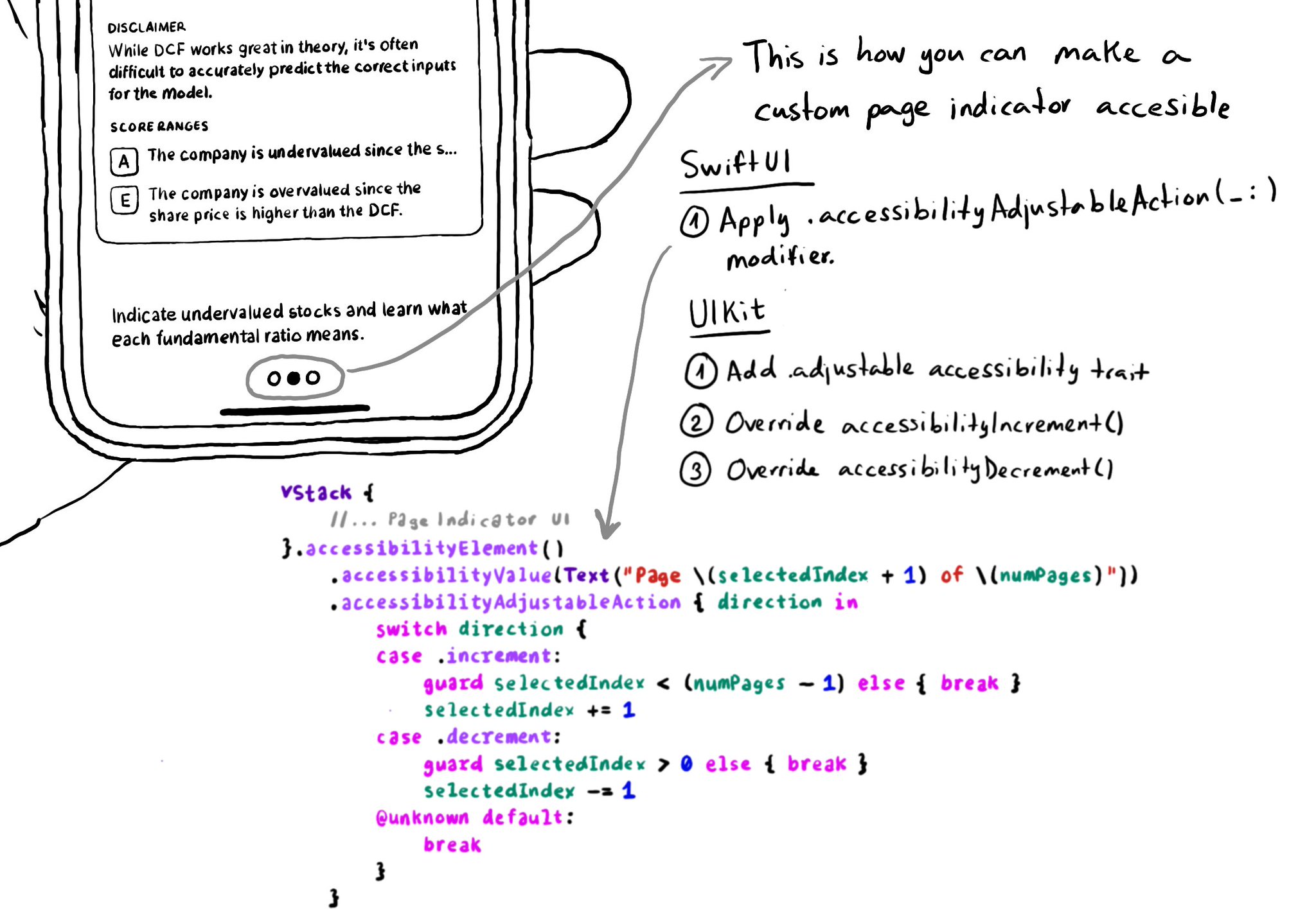
In UIKit, to create an adjustable component we need to add the adjustable trait and override both accessibilityIncrement() and accessibilityDecrement(). In SwiftUI, everything you need is bundled in the accessibilityAdjustableAction(_:) modifier.
Content © Daniel Devesa Derksen-Staats on Accessibility up to 11! is licensed under CC BY 4.0. License details