The equivalent of using a .semanticGroup accessibilityContainerType in UIKit, would be to use the .accessibilityElement(children: ) modifier with the .contain option in SwiftUI.
Here's a refresher with some use-cases:
The equivalent of using a .semanticGroup accessibilityContainerType in UIKit, would be to use the .accessibilityElement(children: ) modifier with the .contain option in SwiftUI.
Here's a refresher with some use-cases:
Some of you have asked me how you can support what I do. This would really help, and would be hugely appreciated:
Find these posts useful? Share them at work, on social media, or with anyone that might find them interesting. Let's spread the word!
Check out any of my apps or games: Xarra!, RetroRapid!, or Mestre!.
A download and a review go a long way. They're free by default. On the App Store, ratings and reviews really help more people discover them.
Finding any of them useful? If so, and if you can afford it, purchasing lifetime access to all features or subscribing lets me buy the coffee that keeps me caffeinated. Caffeine keeps me going to maintain the apps, bring in new features that I hope you'll love, and keep writing.
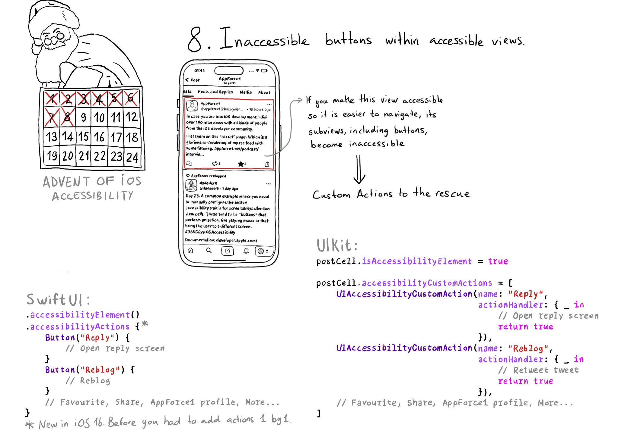
If a view has isAccessibilityElement to true, assistive tech won't look for any of its subviews. That means that if there are any buttons inside, they won't be accessible. You can add custom actions to that element though.
If you use SwiftLint in your SwiftUI project, there is a rule, by @rerycole34, for making sure that your images have either an accessibility label or are hidden for assistive tech because they might be decorative. Rule: https://realm.github.io/SwiftLint/accessibility_label_for_image.html
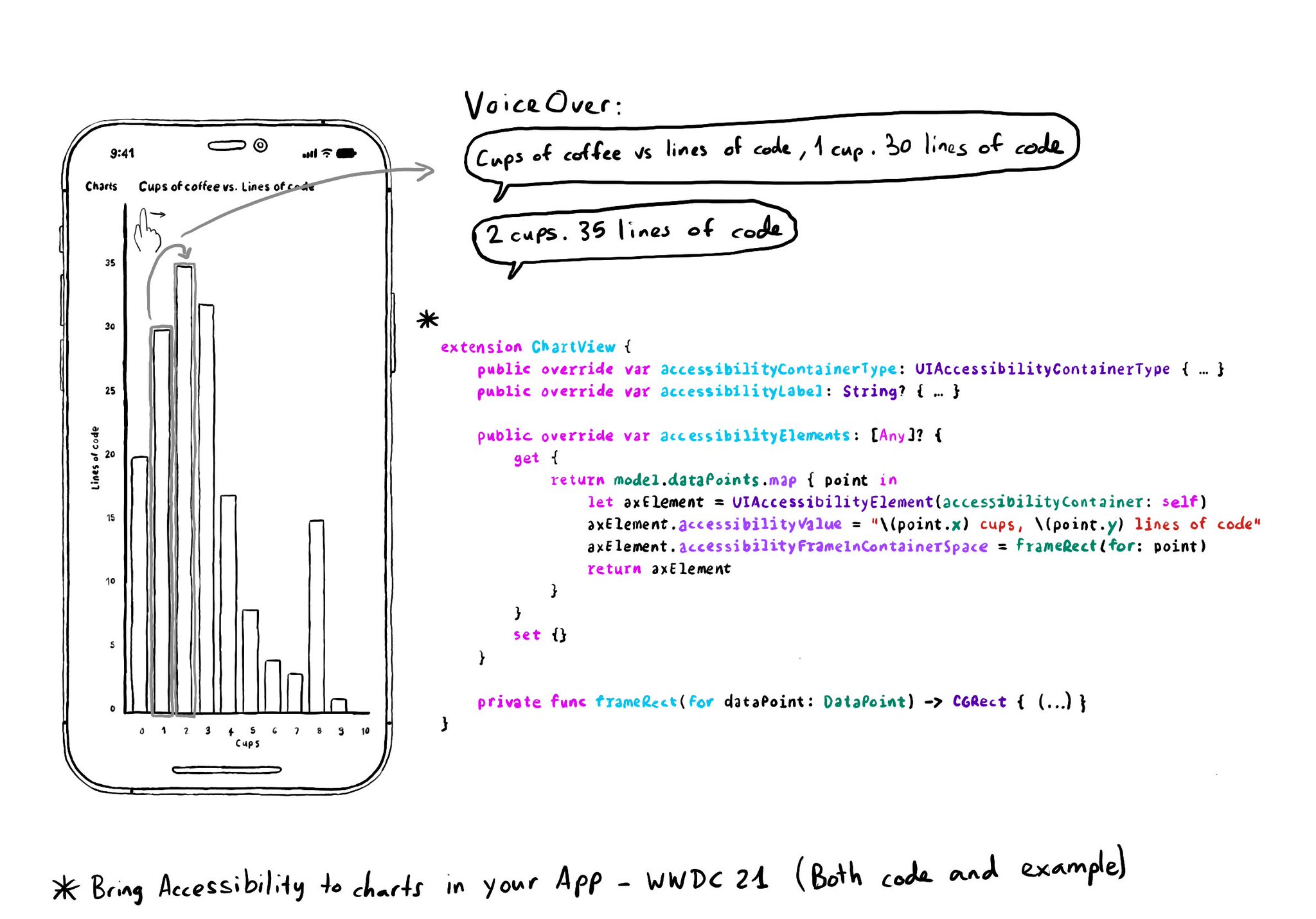
Creating UIAccessibilityElements, combined with a semanticGroup accessibilityContainerType, can also help you make components as complex as charts accessible. Example from "Bring Accessibility to Charts" WWDC21: https://developer.apple.com/videos/play/wwdc2021/10122/
Content © Daniel Devesa Derksen-Staats on Accessibility up to 11! is licensed under CC BY 4.0. License details