With attributed accessibility labels, your app could now, for example, greet your users in different languages. Note that it will change to the voice of the corresponding language you are switching to.

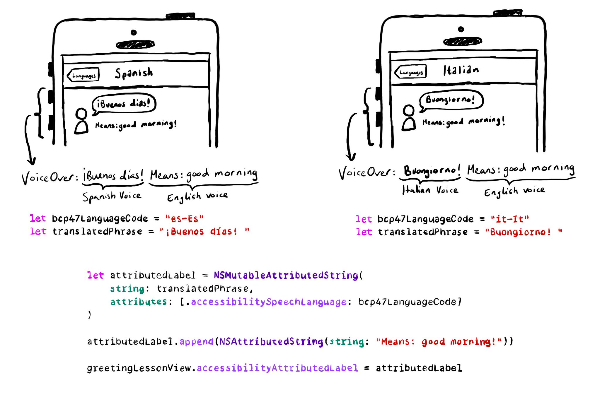
let greetingLessonView = UIView()
let bcp47LanguageCode = "es-Es"
let translatedPhrase = "¡Buenos días! "
let attributedLabel = NSMutableAttributedString(string: translatedPhrase,attributes: [.accessibilitySpeechLanguage: bcp47LanguageCode])
attributedLabel.append(NSAttributedString(string: "Means: good morning!"))
greetingLessonView.accessibilityAttributedLabel = attributedLabelYou may also find interesting...

Buttons with a title, use it as its default accessibility label. Most cases, that's just perfect. But there's a few times that you might want to tweak it. Maybe the image is part of what the button does, or the text in the title is not very clear.

Color contrast between text and background is very important for perceivability. As colors come closer to each other, they’re more difficult to distinguish. Notice that colors that work well with big font sizes may not for smaller text.

Sometimes we may fail to convey to the user of things changing on the screen in a perceivable way. Toasts and similar should be announced. We may want to make clear that some content on the screen changed. Or we might want to update on progress.