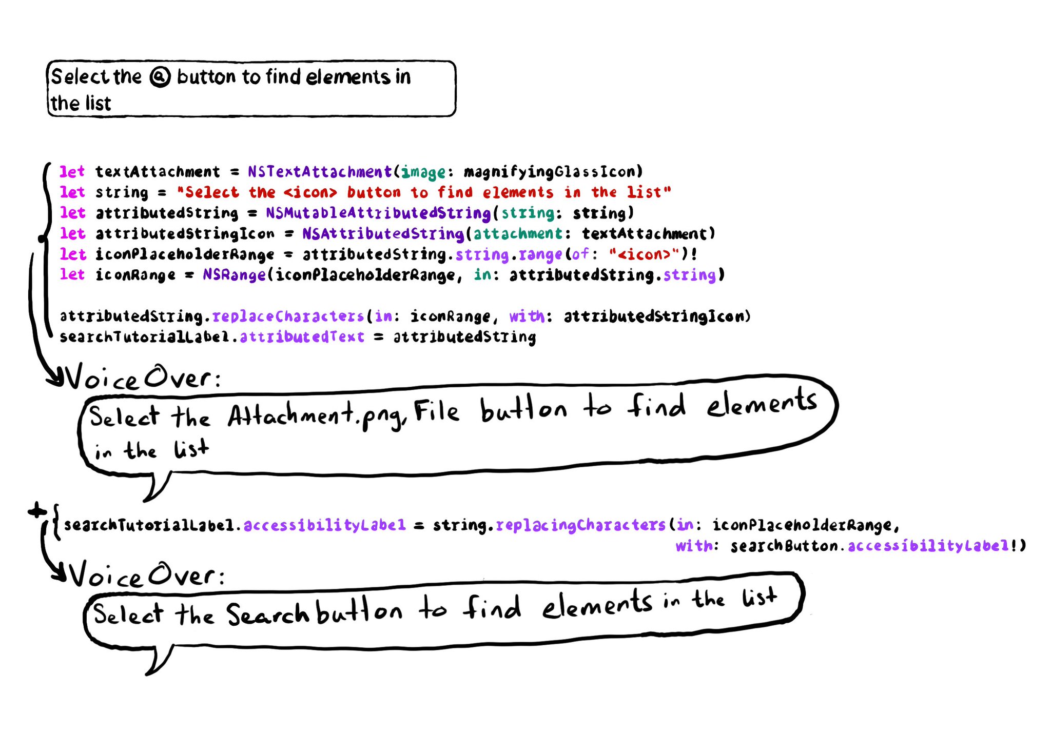
It is possible to embed icons within text using NSTextAttachment and NSAttributedString. If you do, please remember to override the accessibility label, otherwise VoiceOver will announce it as "Attachment.png File".
Example code in the image:
```swift
let magnifyingGlassIcon = UIImage(systemName: "magnifyingglass")!
let searchButton = UIButton()
let searchTutorialLabel = UILabel()
searchButton.accessibilityLabel = "search"
let textAttachment = NSTextAttachment(image: magnifyingGlassIcon)
let string = "Select the button to find elements in the list"
let attributedString = NSMutableAttributedString(string: string)
let attributedStringIcon = NSAttributedString(attachment: textAttachment)
let iconPlaceholderRange = attributedString.string.range(of: "")!
let iconRange = NSRange(iconPlaceholderRange, in: attributedString.string)
attributedString.replaceCharacters(in: iconRange, with: attributedStringIcon)
searchTutorialLabel.attributedText = attributedString
searchTutorialLabel.accessibilityLabel = string.replacingCharacters(in: iconPlaceholderRange,
with: searchButton.accessibilityLabel!)
```