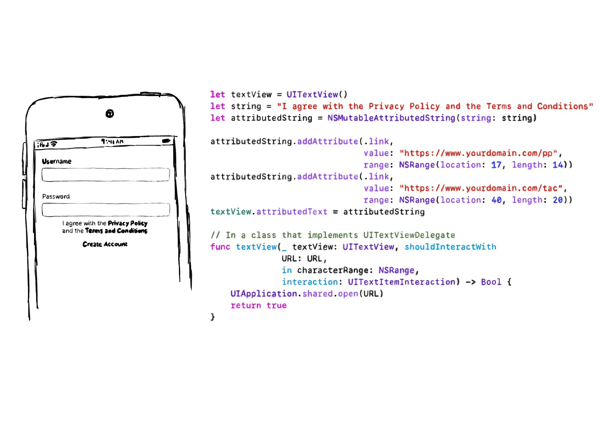
If you need multiple links embedded in some text (like the classic T&Cs and Privacy policy), the easiest is to use a UITextView & Attributed Strings, and it will work beautifully with VoiceOver. You'll be even able to navigate through links.
In the example, VoiceOver would say: “I agree with the Privacy Policy and the Terms and Conditions, link”. Swipe down, should announce: “Privacy Policy, link” and you can double tap to open it. Swiping down one more time announces: “Terms and Conditions, link”.
Example code in the image:
```swift
let textView = UITextView()
let string = "I agree with the Privacy Policy and the Terms and Conditions"
let attributedString = NSMutableAttributedString(string: string)
attributedString.addAttribute(.link,
value: "https://www.yourdomain.com/pp",
range: NSRange(location: 17, length: 14))
attributedString.addAttribute(.link,
value: "https://www.yourdomain.com/tac",
range: NSRange(location: 40, length: 20))
textView.attributedText = attributedString
extension ViewController: UITextViewDelegate {
func textView(_ textView: UITextView, shouldInteractWith URL: URL, in characterRange: NSRange, interaction: UITextItemInteraction) -> Bool {
UIApplication.shared.open(URL)
return true
}
}
```