UISliders are adjustable, and its default accessibility value is represented in percentages. But that's not always the best format to express a value. Consider a slider to select a distance radius. Miles or km seem a more appropriate unit.

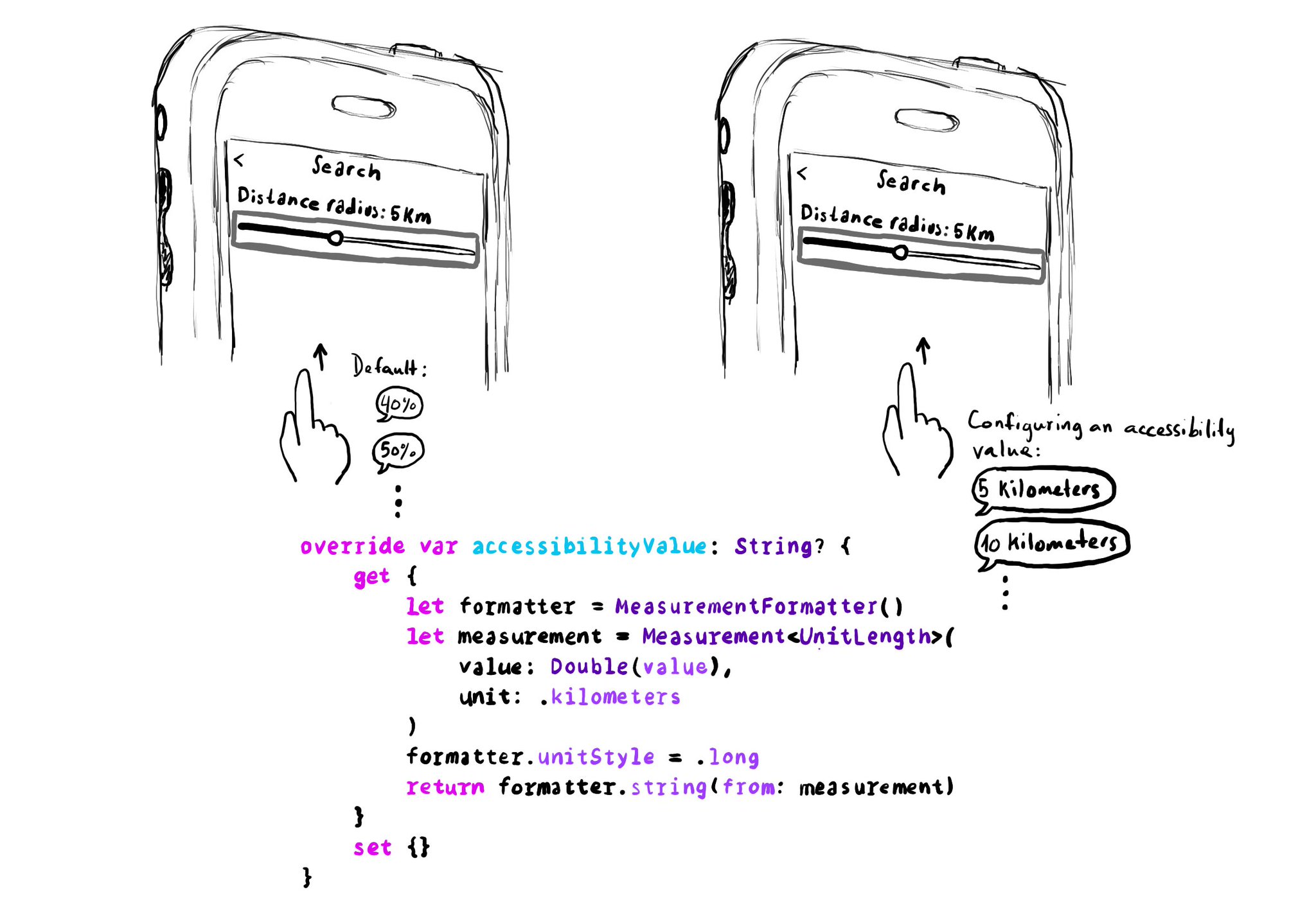
override var accessibilityValue: String? {
get {
let formatter = MeasurementFormatter()
let measurement = Measurement(
value: Double(value),
unit: .kilometers
)
formatter.unitStyle = .long
return formatter.string(from: measurement)
}
set {}
} You may also find interesting...

With VoiceOver, you can swipe up/down to increase/decrease the value of adjustable components. You need to implement accessibilityIncrement() and accessibilityDecrement() accordingly, and configure an accessibility value that makes sense. Example code in the image: ```swift override func accessibilityIncrement() { guard value < 5 else { return } value += 1 accessibilityValue = "\(value) of 5" sendActions(for: .valueChanged) } override func accessibilityDecrement() { guard value > 1 else { return } value -= 1 accessibilityValue = "\(value) of 5" sendActions(for: .valueChanged) } ``` Links to the official documentation: * accessibilityincrement() * accessibilitydecrement()

Accessibility values are about state. Using them appropriately will make the experience better for Voice Control users. Think of a repeat button (values could be: off, one or all songs) or a notifications tab (value could be: x new items). For more on accessibility values, check out this fantastic blog post from @MobileA11y with info on the APIs (UIKit, SwiftUI), accessibility attributed values, WCAG, or some more examples (text in a text field, value on a stepper or slider). https://mobilea11y.com/blog/accessibility-values/

Hacks are accessibility’s worst enemy. An example. There is a ‘trick’ floating on the internet: if you want a button with an icon to the right of the text, set the semantic content attribute to force right to left. Great way to create focus traps.