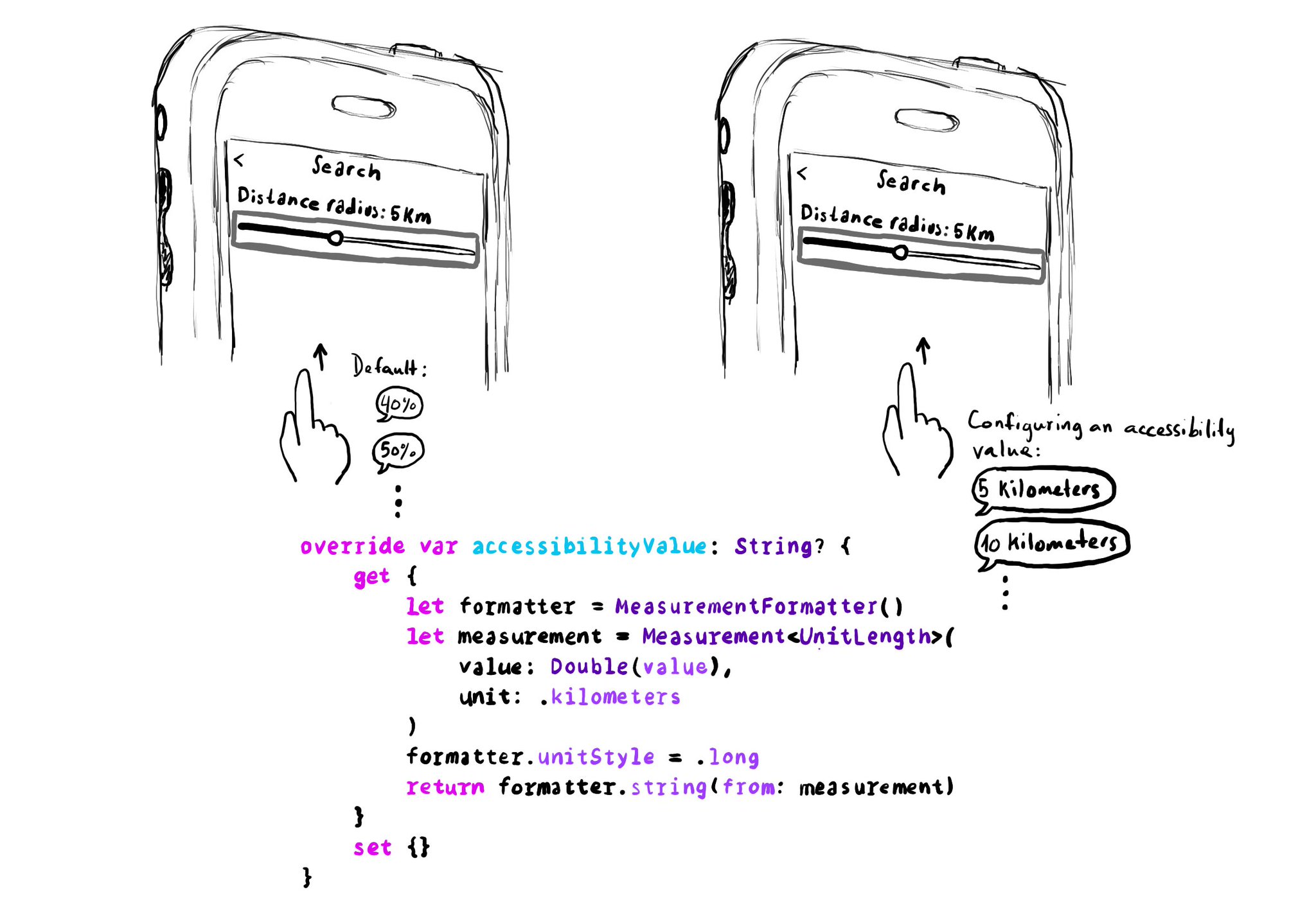
Accessibility values are about state. Using them appropriately will make the experience better for Voice Control users. Think of a repeat button (values could be: off, one or all songs) or a notifications tab (value could be: x new items).

A notifications button with a “Notifications

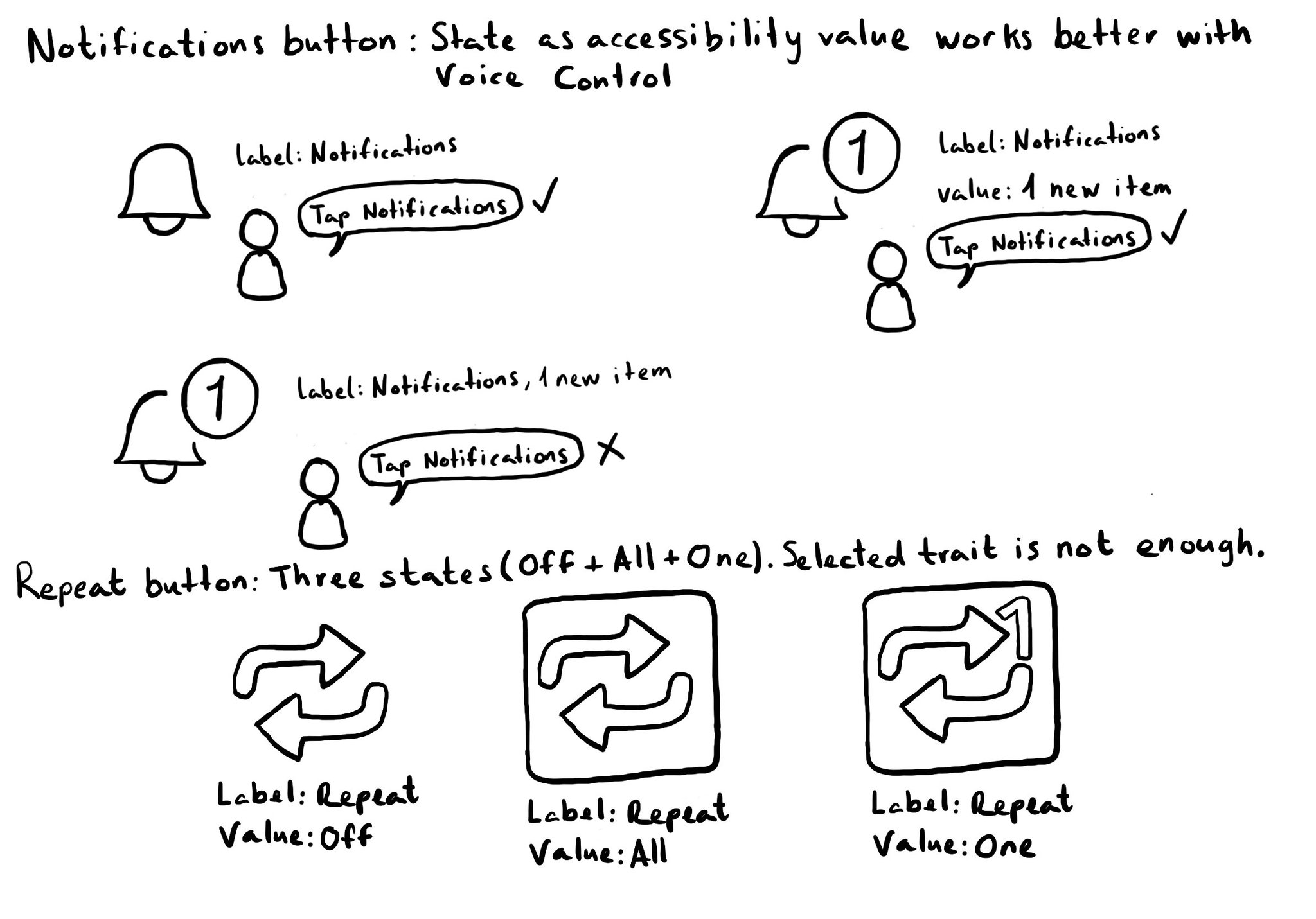
For more on accessibility values, check out this fantastic blog post from @MobileA11y with info on the APIs (UIKit, SwiftUI), accessibility attributed values, WCAG, or some more examples (text in a text field, value on a stepper or slider).

https://mobilea11y.com/blog/accessibility-values/

You may also find interesting...

Accessibility Labels are not just for VoiceOver, and Accessibility User Input Labels are not just for Voice Control. The latter will also help Full Keyboard Access users to find elements on the screen by different names. Good API design!

UISliders are adjustable, and its default accessibility value is represented in percentages. But that's not always the best format to express a value. Consider a slider to select a distance radius. Miles or km seem a more appropriate unit. Example code in the image: ```swift override var accessibilityValue: String? { get { let formatter = MeasurementFormatter() let measurement = Measurement( value: Double(value), unit: .kilometers ) formatter.unitStyle = .long return formatter.string(from: measurement) } set {} } ```

Color contrast between text and background is very important for perceivability. As colors come closer to each other, they’re more difficult to distinguish. Notice that colors that work well with big font sizes may not for smaller text.

Created in Swift with Ignite.

Supporting Swift for Swifts