Tag: adjustable
5 posts
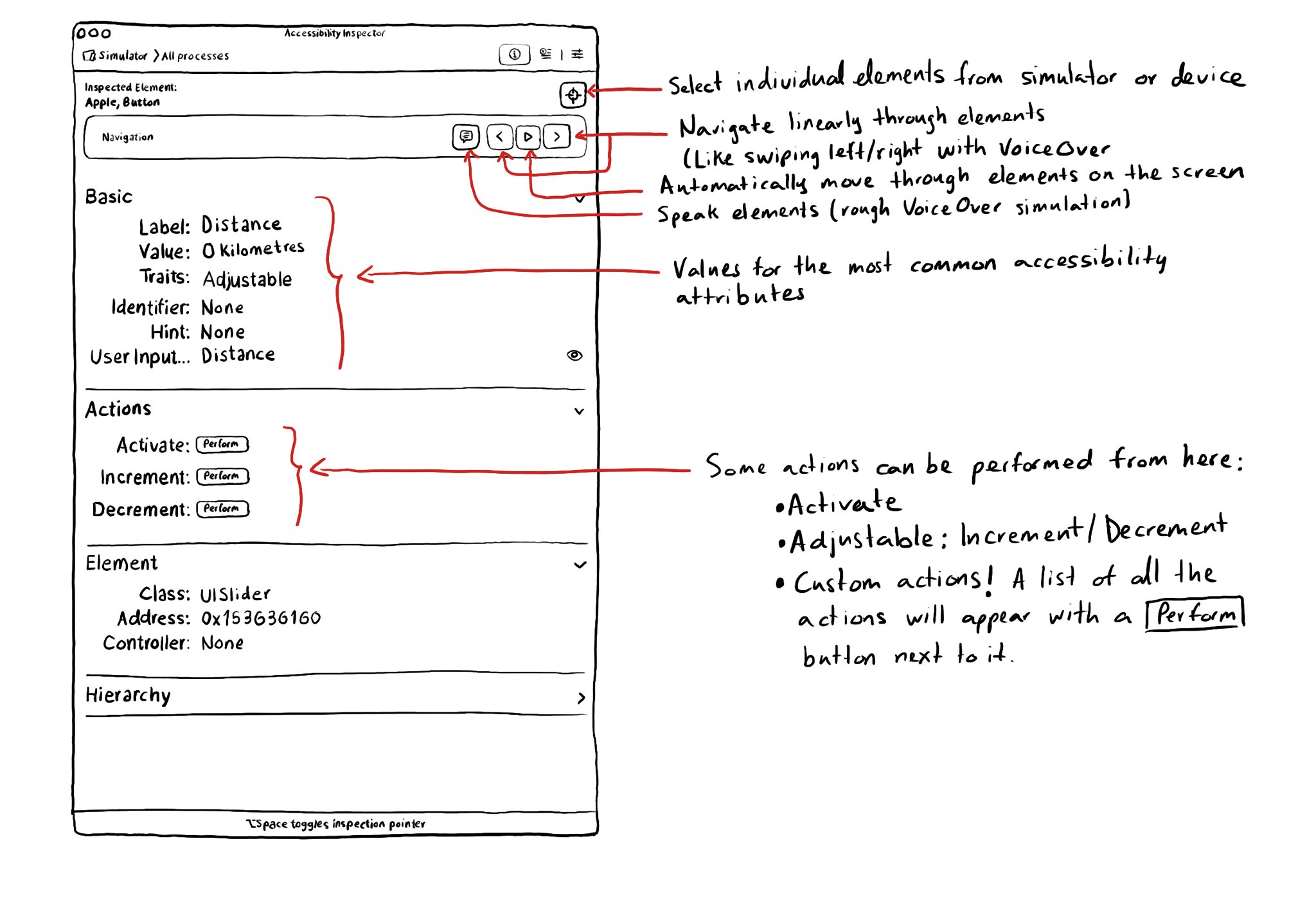
With the Accessibility Inspector you can check the value for the most common accessibility attributes for individual elements, do some basic navigation, and even perform actions if the component is adjustable or if it has custom actions.
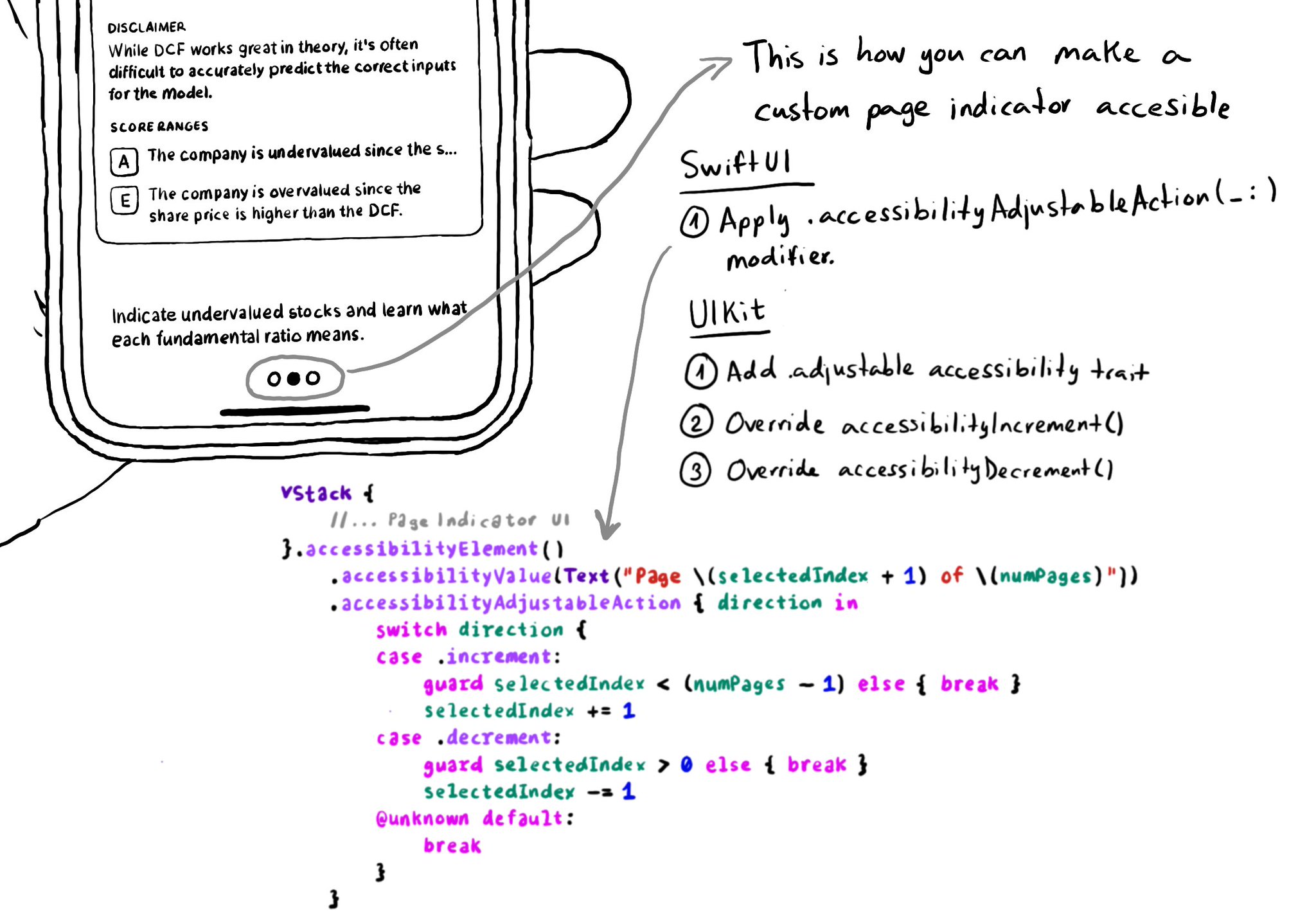
In UIKit, to create an adjustable component we need to add the adjustable trait and override both accessibilityIncrement() and accessibilityDecrement(). In SwiftUI, everything you need is bundled in the accessibilityAdjustableAction(_:) modifier.
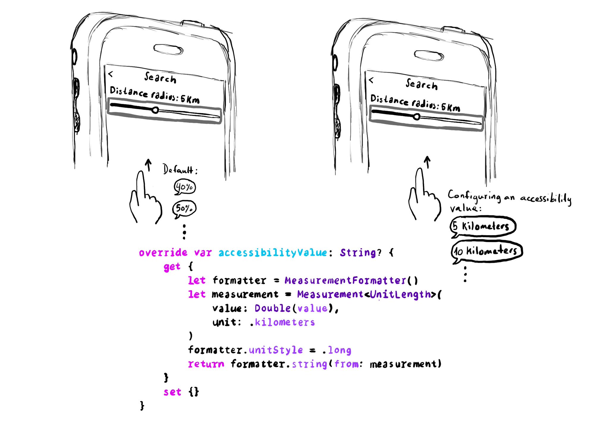
UISliders are adjustable, and its default accessibility value is represented in percentages. But that's not always the best format to express a value. Consider a slider to select a distance radius. Miles or km seem a more appropriate unit.
Example code in the image:
```swift
override var accessibilityValue: String? {
get {
let formatter = MeasurementFormatter()
let measurement = Measurement
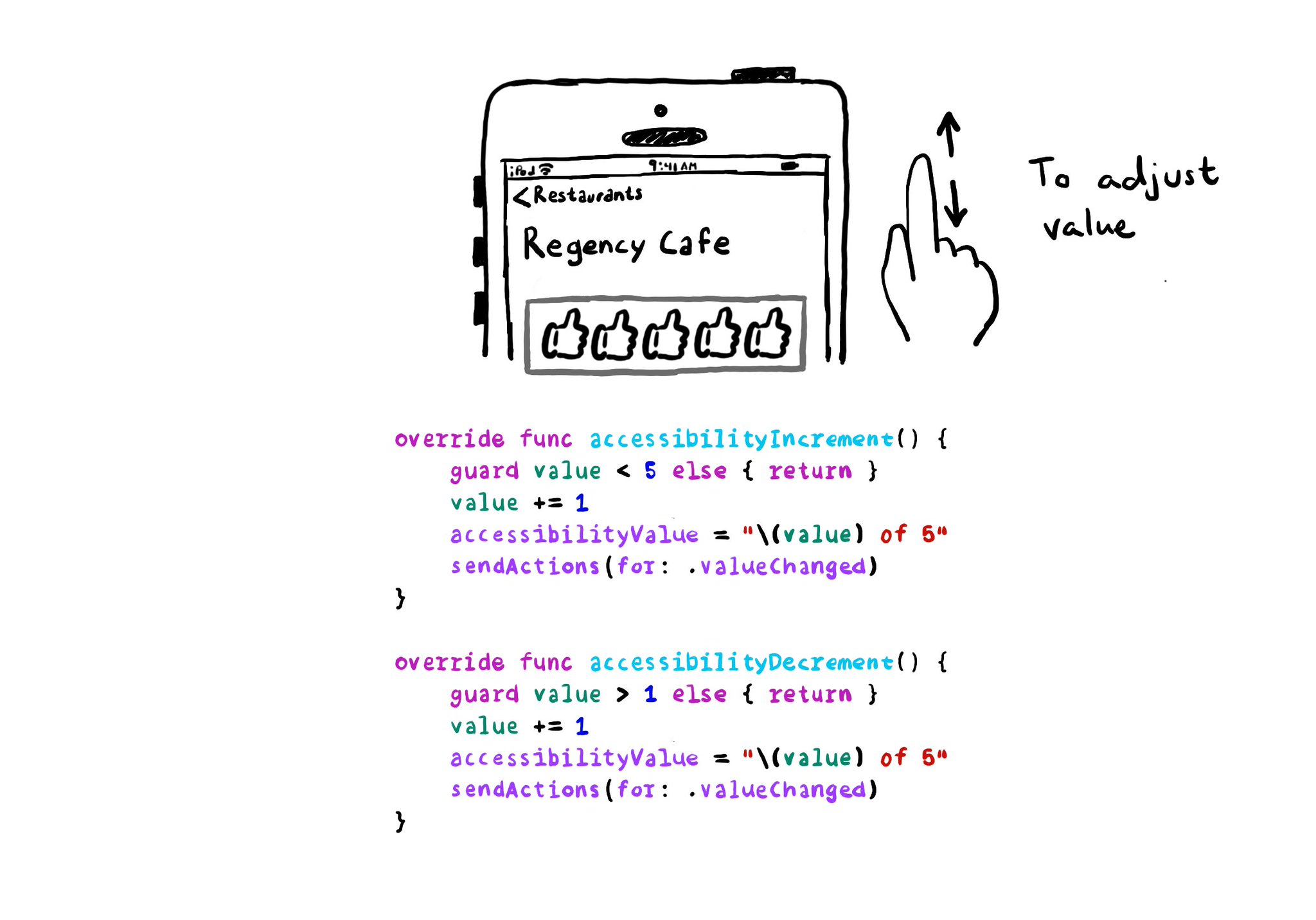
With VoiceOver, you can swipe up/down to increase/decrease the value of adjustable components. You need to implement accessibilityIncrement() and accessibilityDecrement() accordingly, and configure an accessibility value that makes sense. Example code in the image: ```swift override func accessibilityIncrement() { guard value < 5 else { return } value += 1 accessibilityValue = "\(value) of 5" sendActions(for: .valueChanged) } override func accessibilityDecrement() { guard value > 1 else { return } value -= 1 accessibilityValue = "\(value) of 5" sendActions(for: .valueChanged) } ``` Links to the official documentation: * accessibilityincrement() * accessibilitydecrement()
If you are developing a custom component, that can change value, chances are that it will need the adjustable accessibility trait (VoiceOver will say: "Adjustable"). Think of a component that lets you rate from one to five thumbs up (or stars).