The .selected accessibility trait indicates when an element has been selected. You’ll notice that VoiceOver announces “selected” before the accessibility label. You can find that in the system for the selected tab in the tab bar, for example.
The .selected accessibility trait indicates when an element has been selected. You’ll notice that VoiceOver announces “selected” before the accessibility label. You can find that in the system for the selected tab in the tab bar, for example.
Some of you have asked me how you can support what I do. This would really help, and would be hugely appreciated:
Find these posts useful? Share them at work, on social media, or with anyone that might find them interesting. Let's spread the word!
Check out any of my apps or games: Xarra!, RetroRapid!, or Mestre!.
A download and a review go a long way. They're free by default. On the App Store, ratings and reviews really help more people discover them.
Finding any of them useful? If so, and if you can afford it, purchasing lifetime access to all features or subscribing lets me buy the coffee that keeps me caffeinated. Caffeine keeps me going to maintain the apps, bring in new features that I hope you'll love, and keep writing.
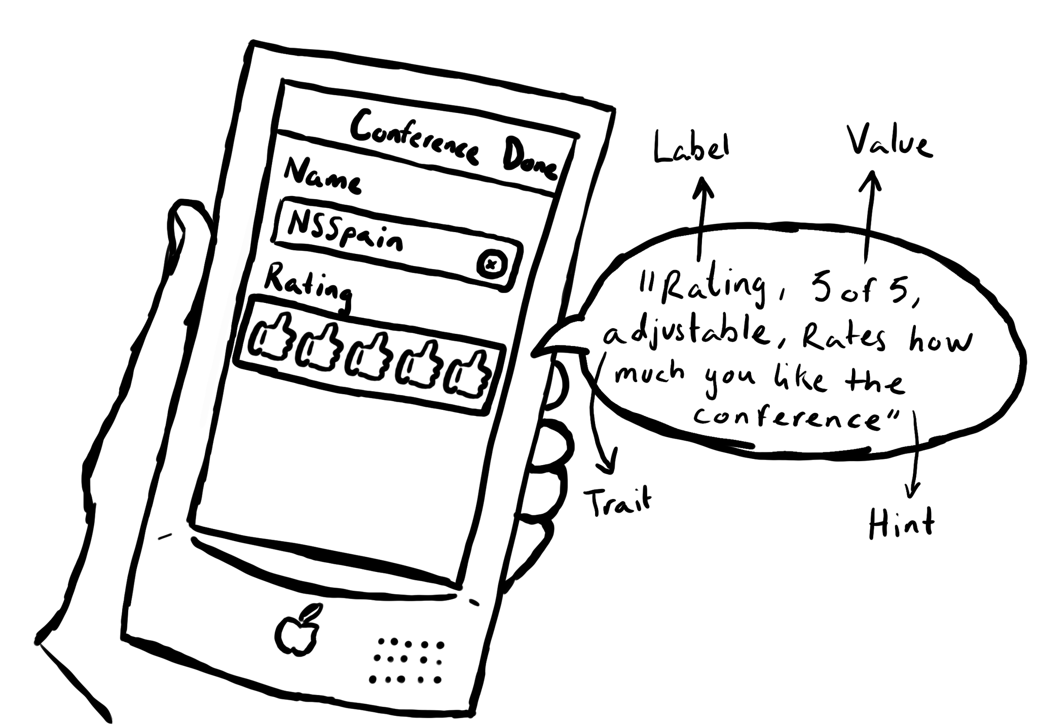
UIAccessibility is the cornerstone of any accessible UIKit app. Among others, understanding what an accessibility label, value, trait or hint are, is key. This is an example of how they could be configured for a custom rating component. #GAAD2022
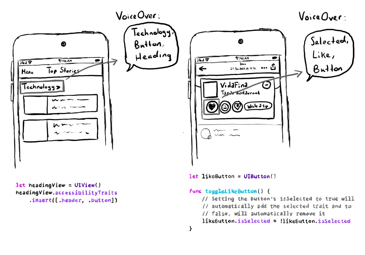
A component can have more than one accessibility trait, they can be combined. A heading can be a button too, for example. Or a button could be selected. You can insert or remove the selected trait to the button, when needed.
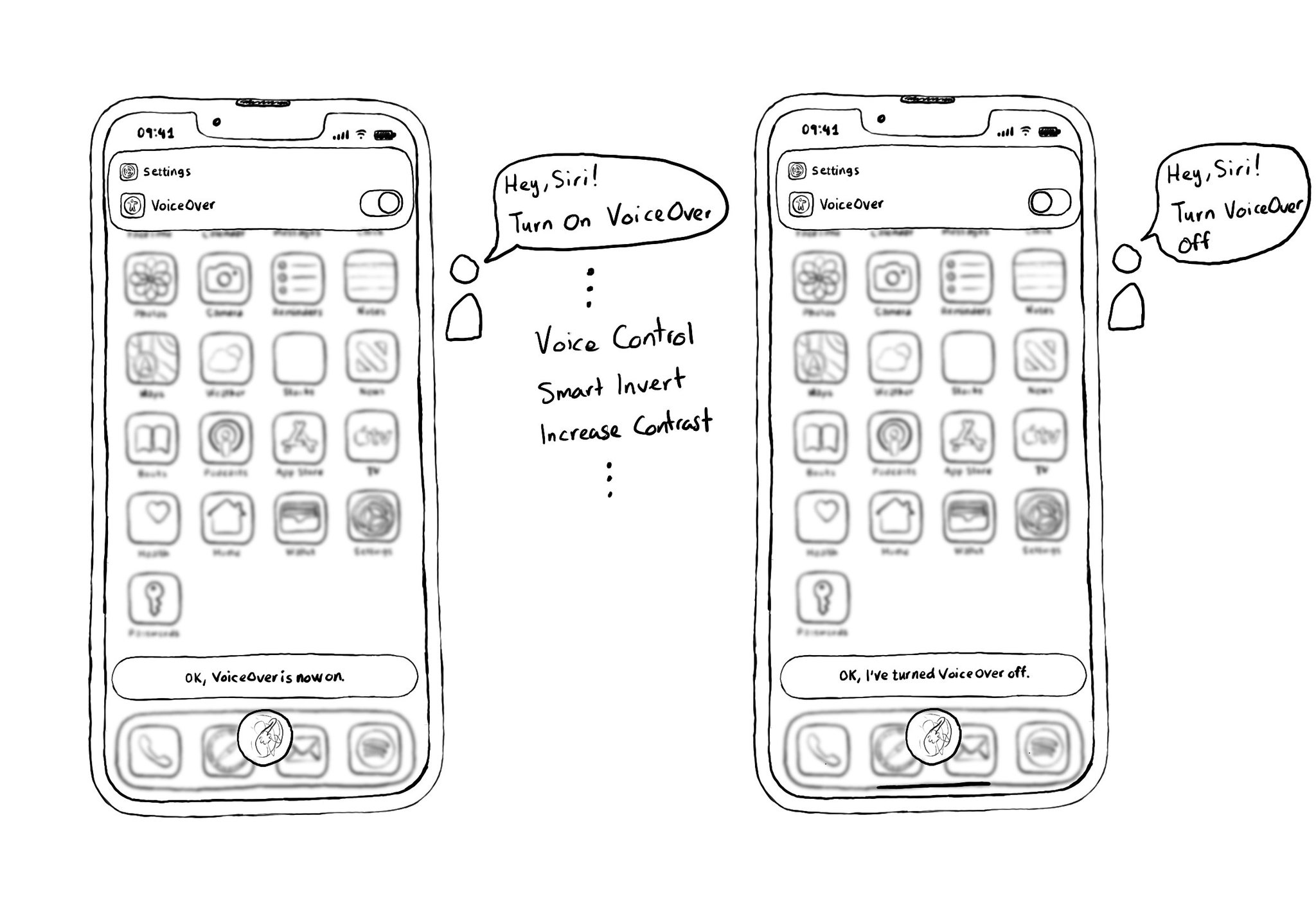
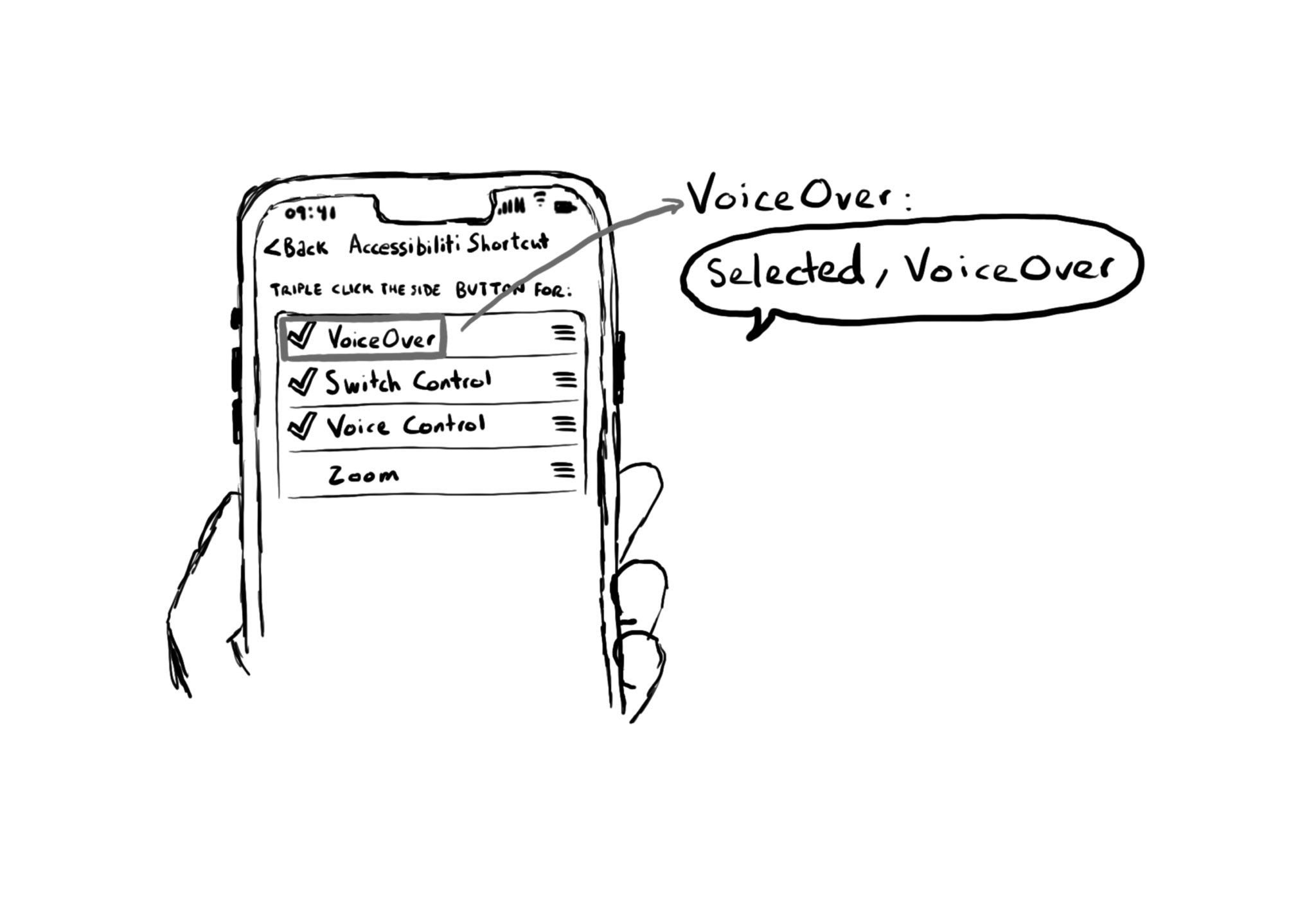
A quick way for turning on, or off, VoiceOver is by using Siri. Say something like: "Hey, Siri! Turn on VoiceOver", and you'll find yourself using VoiceOver in no time. You can also do the same with other technologies like Voice Control.
Content © Daniel Devesa Derksen-Staats on Accessibility up to 11! is licensed under CC BY 4.0. License details