Have you noticed that the first time you select an element on Apple Podcast's mini player, VoiceOver says "Mini player", and then, it describes the selected element? It gives the user more context on what "feature" those elements belong to.

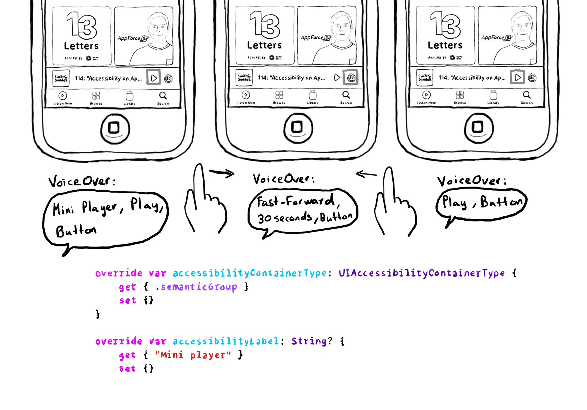
This can be achieved in UIKit by configuring the accessibility container type of the mini player with .semanticGroup and giving it an accessibility label, in this case: "Mini player".
https://developer.apple.com/documentation/objectivec/nsobject-swift.class/accessibilitycontainertype
https://developer.apple.com/documentation/uikit/uiaccessibilitycontainertype/semanticgroup
You may also find interesting...

This is my favorite way of testing VoiceOver. Pick a flow in your app. Turn VoiceOver on. Triple tap with three fingers on the screen to enable Screen Curtain. The screen goes off but you can still navigate your device with VoiceOver.

With regular buttons from UIKit or SwiftUI, you are all set. With complex views, headings, or table/collection view cells that, when selected, bring the user somewhere else in the app or perform an action, you'll have to add the button trait.

When configuring a largeContentImage or adjustsImageSizeForAccessibilityContentSizeCategory, it is important to use a pdf asset and preserve the vector data so the icons are crisp at any size.