When implementing the large content viewer, UIKit components will usually have a large content title and image configured for you. But if you are developing a custom component, or you want to add info to a native component, you can do so.
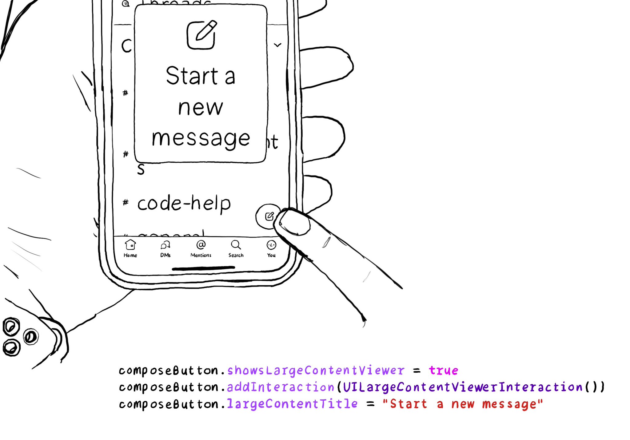
When implementing the large content viewer, UIKit components will usually have a large content title and image configured for you. But if you are developing a custom component, or you want to add info to a native component, you can do so.
Some of you have asked me how you can support what I do. This would really help, and would be hugely appreciated:
Find these posts useful? Share them at work, on social media, or with anyone that might find them interesting. Let's spread the word!
Check out any of my apps or games: Xarra!, RetroRapid!, or Mestre!.
A download and a review go a long way. They're free by default. On the App Store, ratings and reviews really help more people discover them.
Finding any of them useful? If so, and if you can afford it, purchasing lifetime access to all features or subscribing lets me buy the coffee that keeps me caffeinated. Caffeine keeps me going to maintain the apps, bring in new features that I hope you'll love, and keep writing.
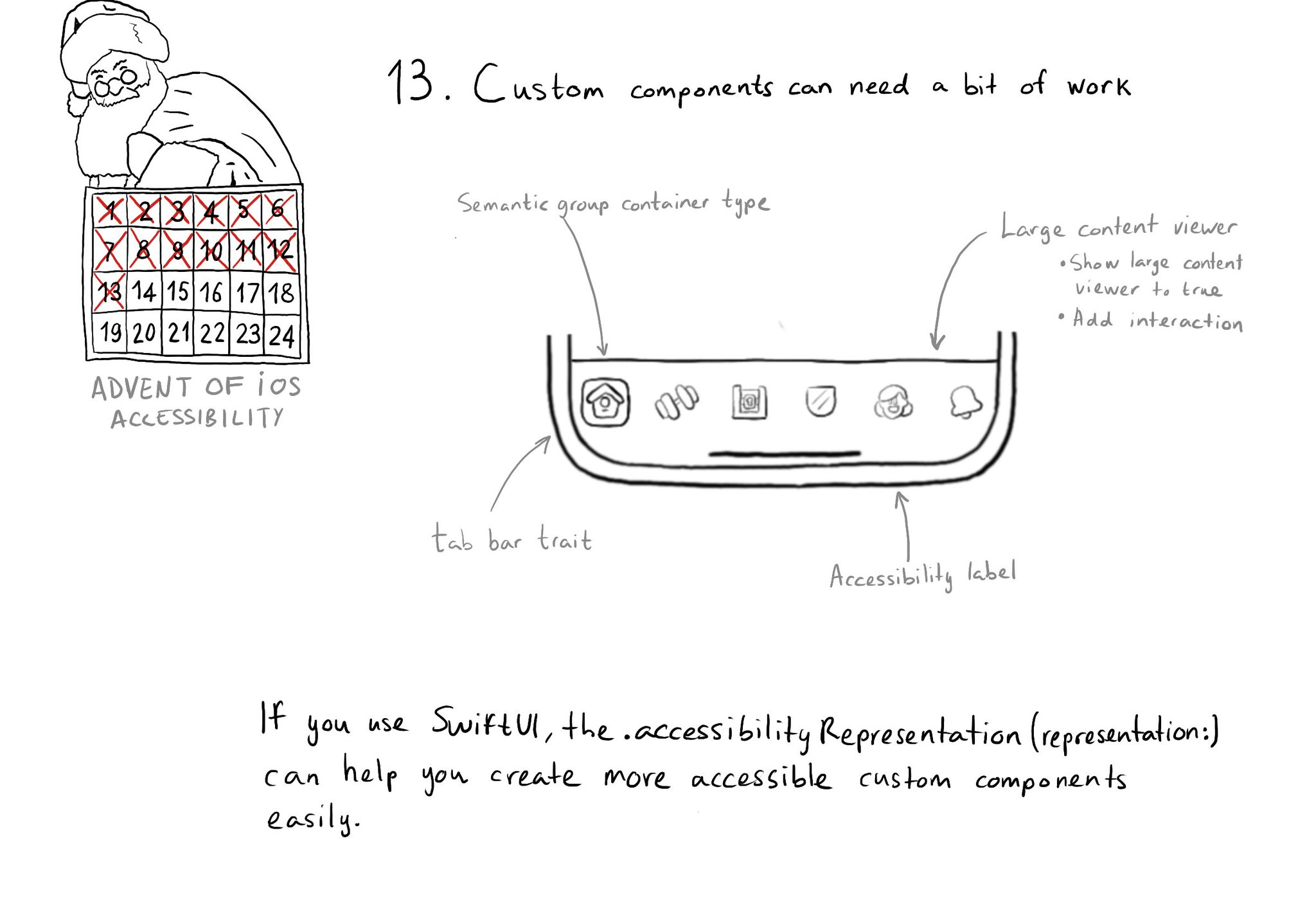
Sometimes, you may want to create a custom component, even if there is a similar one in UIKit because you want to style it in a way that the default one won't let you. That's fine, just take into account that you'll need to make it accessible.
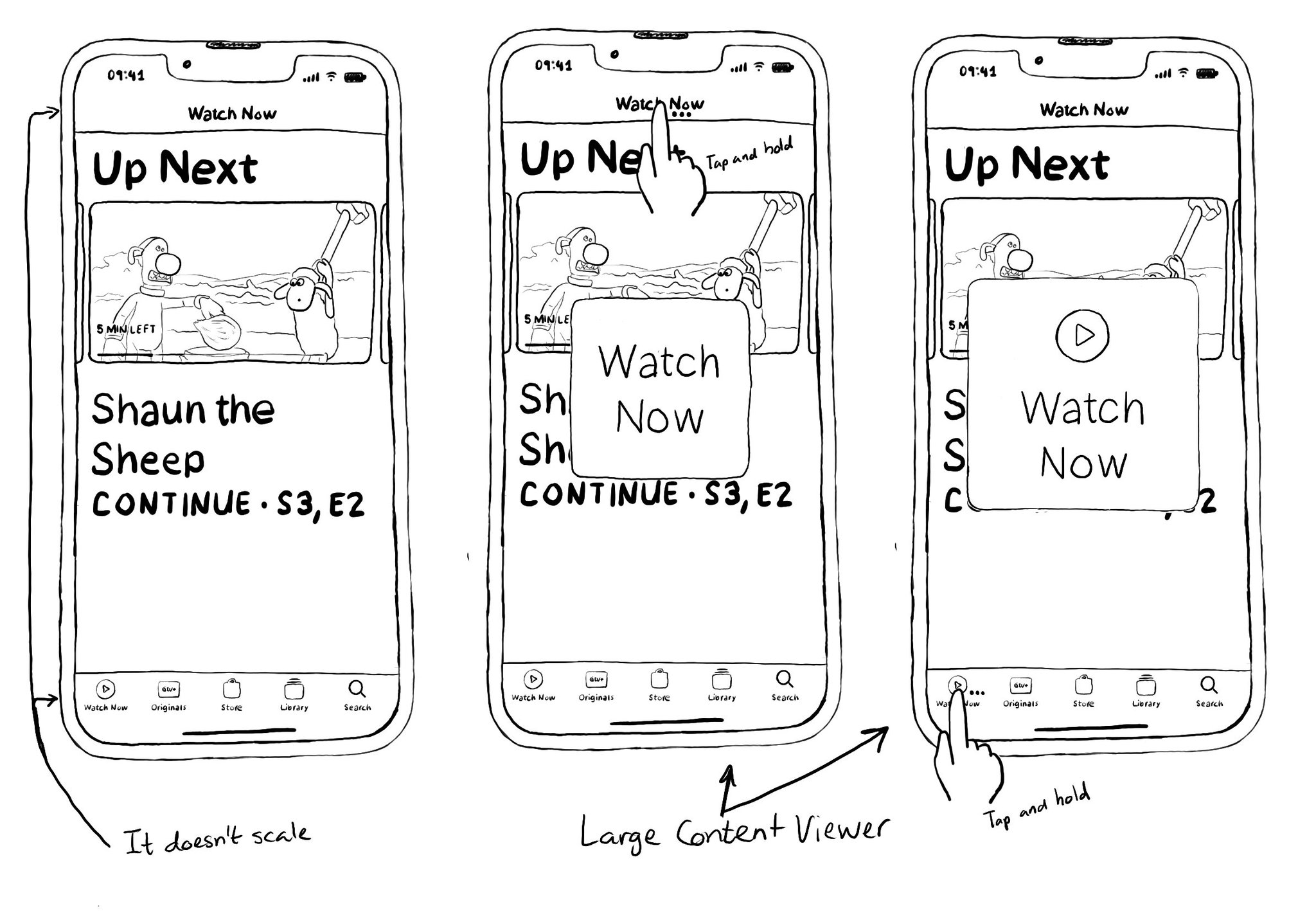
You may have noticed that navigation/tool/tab bars don't scale with large Dynamic Type sizes. It would take too much space from the screen leaving very little real estate for the actual content. A tap and hold will show the Large Content Viewer.
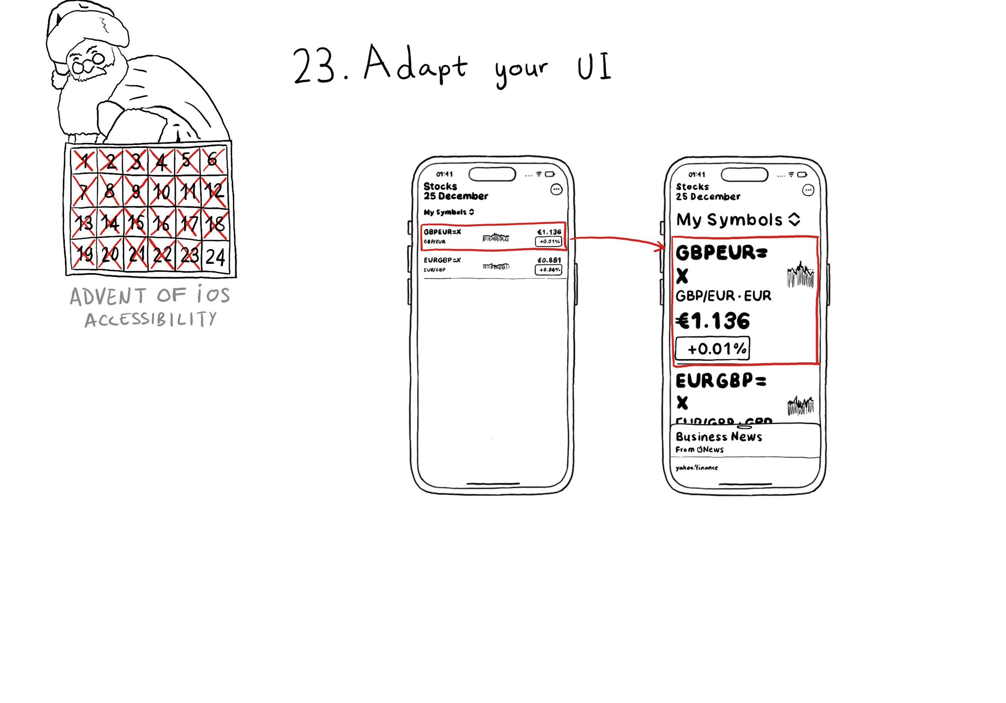
Sometimes your UI will just not scale for large text sizes. Simple changes, for large sizes, like disposing elements vertically instead of horizontally, reducing the number of columns, and allowing more lines of text, can do the trick most times.
Content © Daniel Devesa Derksen-Staats on Accessibility up to 11! is licensed under CC BY 4.0. License details