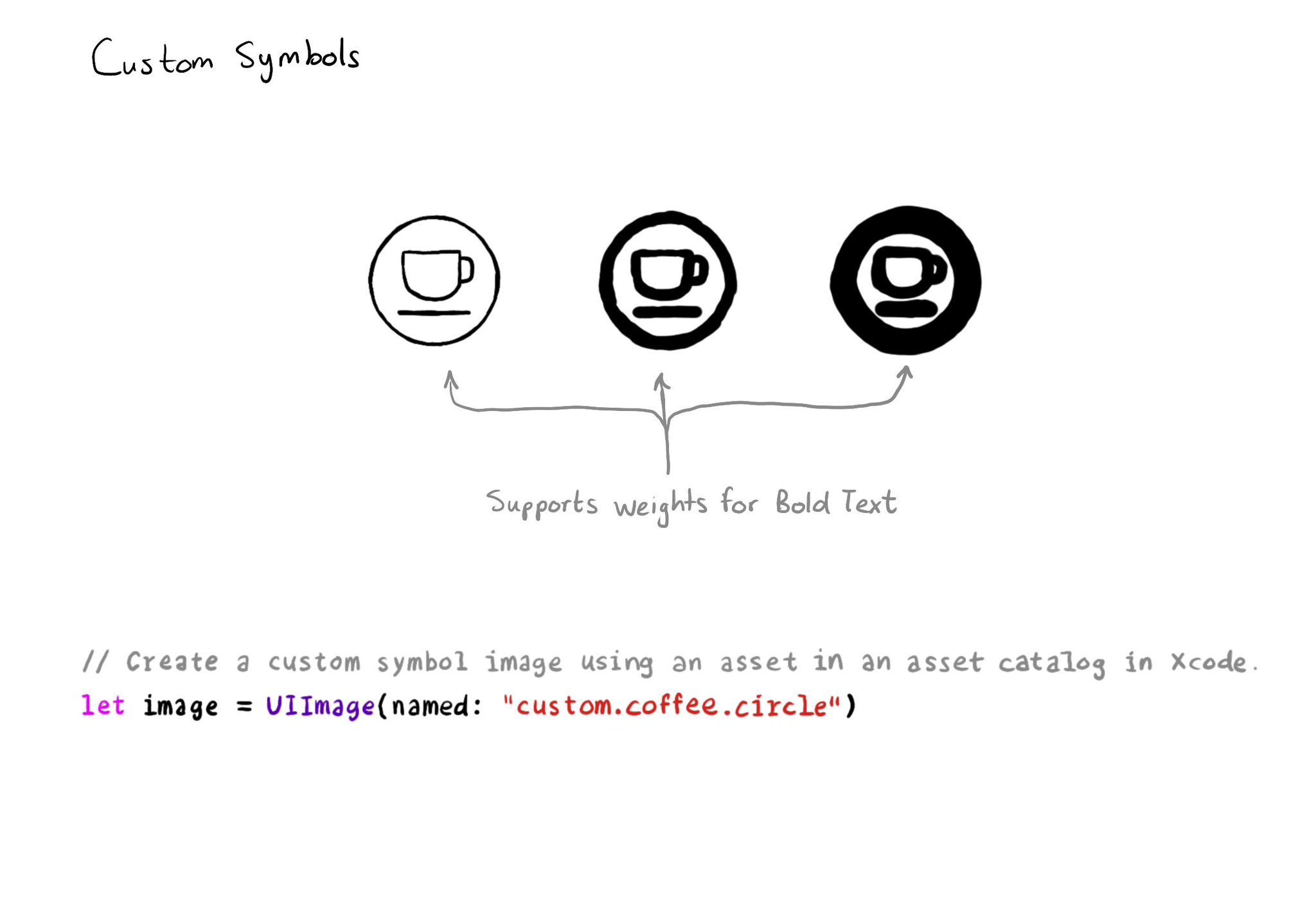
Your iconography should support Bold Text too. One way of doing it is by creating custom symbols (and specifying weights for it) to work with them as you would with regular SF Symbols.

How Creating custom symbols: https://developer.apple.com/videos/play/wwdc2021/10250/

A coffee cup within a circle icon in three different weights. Creating custom symbols with weights would make it so your iconography supports the Bold Text feature. You can create a custom symbol image using an asset in an asset catalog in Xcode and load it using the UIImage initialiser and passing the name as an attribute.

You may also find interesting...

In iOS' Settings you can specify your preference to use bold text. This can be checked in code in a couple ways: 1. isBoldTextEnabled in UIAccessibility: https://developer.apple.com/documentation/uikit/uiaccessibility/isboldtextenabled 2. legibilityWeight from UITraitCollection: https://developer.apple.com/documentation/uikit/uitraitcollection/legibilityweight

Manual testing is crucial. And therefore, reducing friction to let you start your testing process can be a huge help. Selecting some accessibility shortcuts will do that, putting most of iOS' accessibility features at a triple-click of a button.

You should convey important information in multiple modes, not just color. If you are still required to do so, at the very least you should complement that info with other modes, like symbols, if the user requested differentiation without color.

Created in Swift with Ignite.

Supporting Swift for Swifts