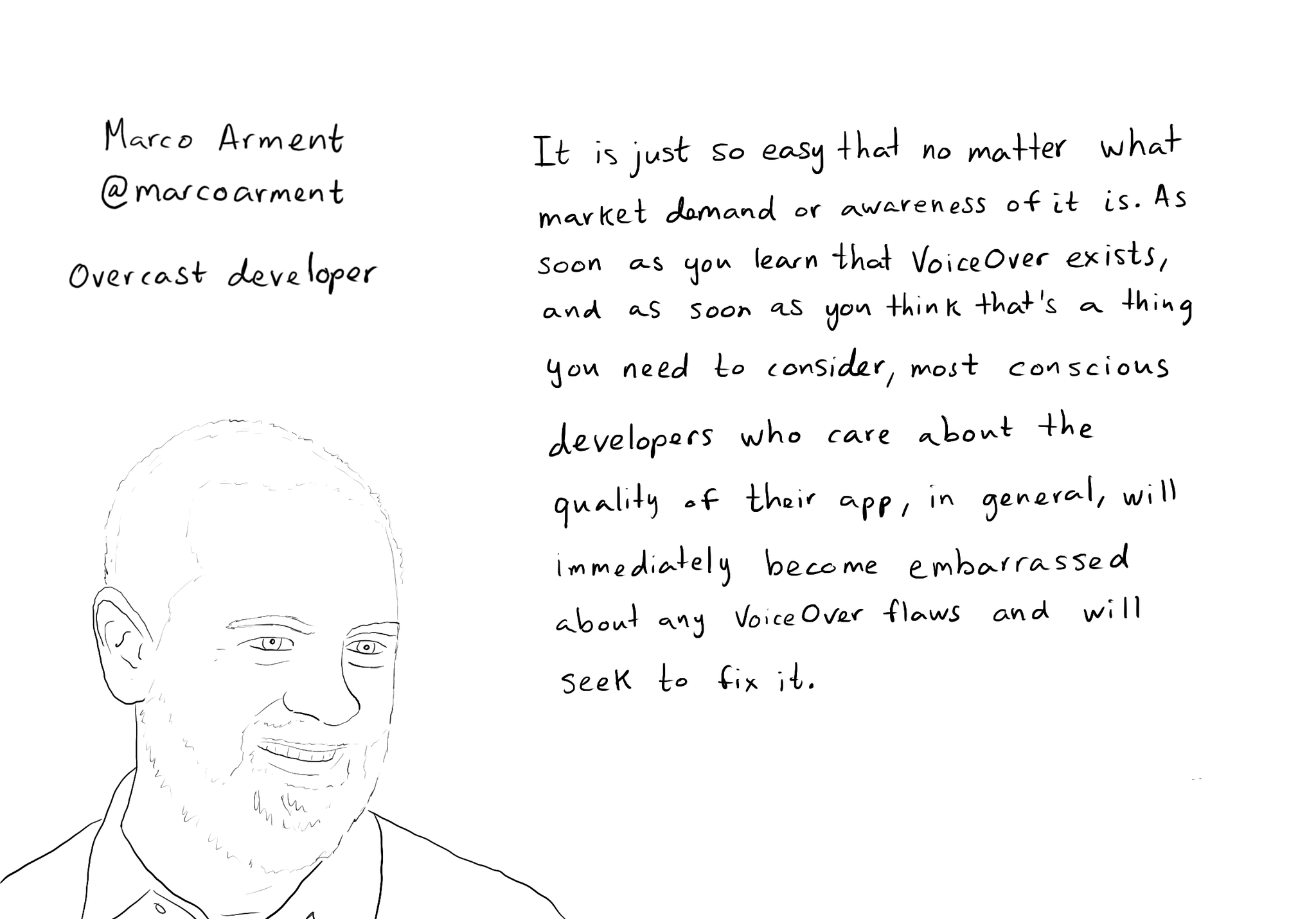
While you are at @shelly's "36 Seconds That Changed Everything", I would definitely also check out the Bonus Content. Including the full interview with @marcoarment. "Awareness is the biggest problem here."
https://www.36seconds.org/behind-the-scenes/
"Cause iOS 7 was so inaccessible in so many ways (...) it started getting under developers’ radars this section of settings, called accessibility, that changes the way my app looks or works and I need to make sure that it doesn’t break under those settings.”
"There’s so much variation out there. We no longer have just one size phone, we no longer have just one font size. It is easier for us as developers not to fall into bad assumptions of how I see it is how everyone is going to see it.”
"The good thing about VoiceOver is that the accessibility framework is pretty well built-in the standard controls. For a given app you can fix any VoiceOver problems it has in one day or less. Even if it is a complex app. Even if it has a lot of custom controls."
"What developers now do, if they care, is they treat that (accessibility issues) as if it was any other design flaw. If any other screen in your app broke visually or functionally you’d consider that a bug and you would try to fix it in the next update.”
"I think the more that we can do as a developer community to talk about these features even existing, and these problems existing, and to tell people how easy it is to fix. That is the best any of us can do to help. Awareness is the biggest problem here."