Tag: Increase Contrast
4 posts
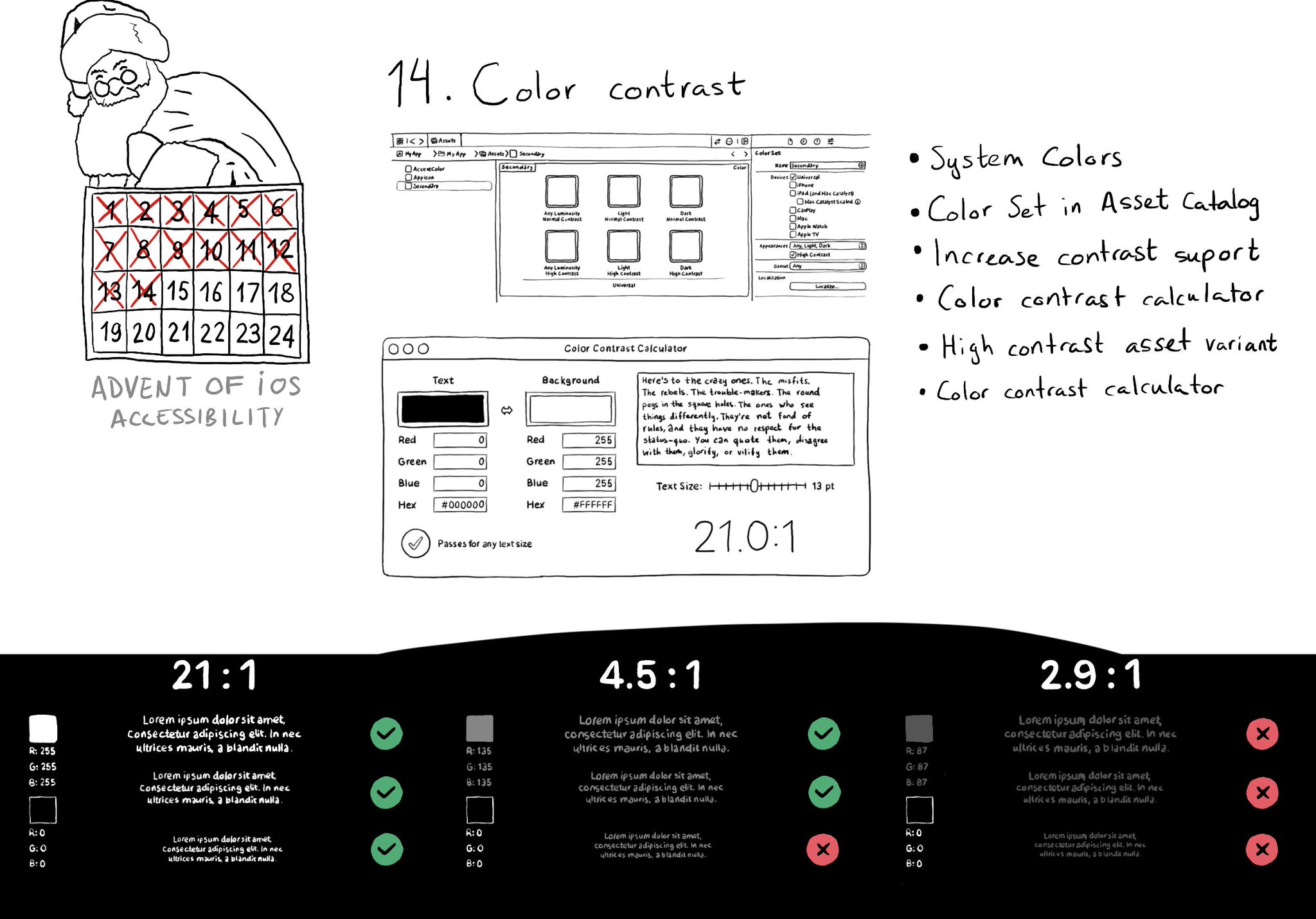
iOS and Xcode provide a wide variety of tools and options to deal with color contrast ratios. From system colors, that automatically support Increase Contrast, to high contrast color and asset variants, and even a built-in contrast calculator.
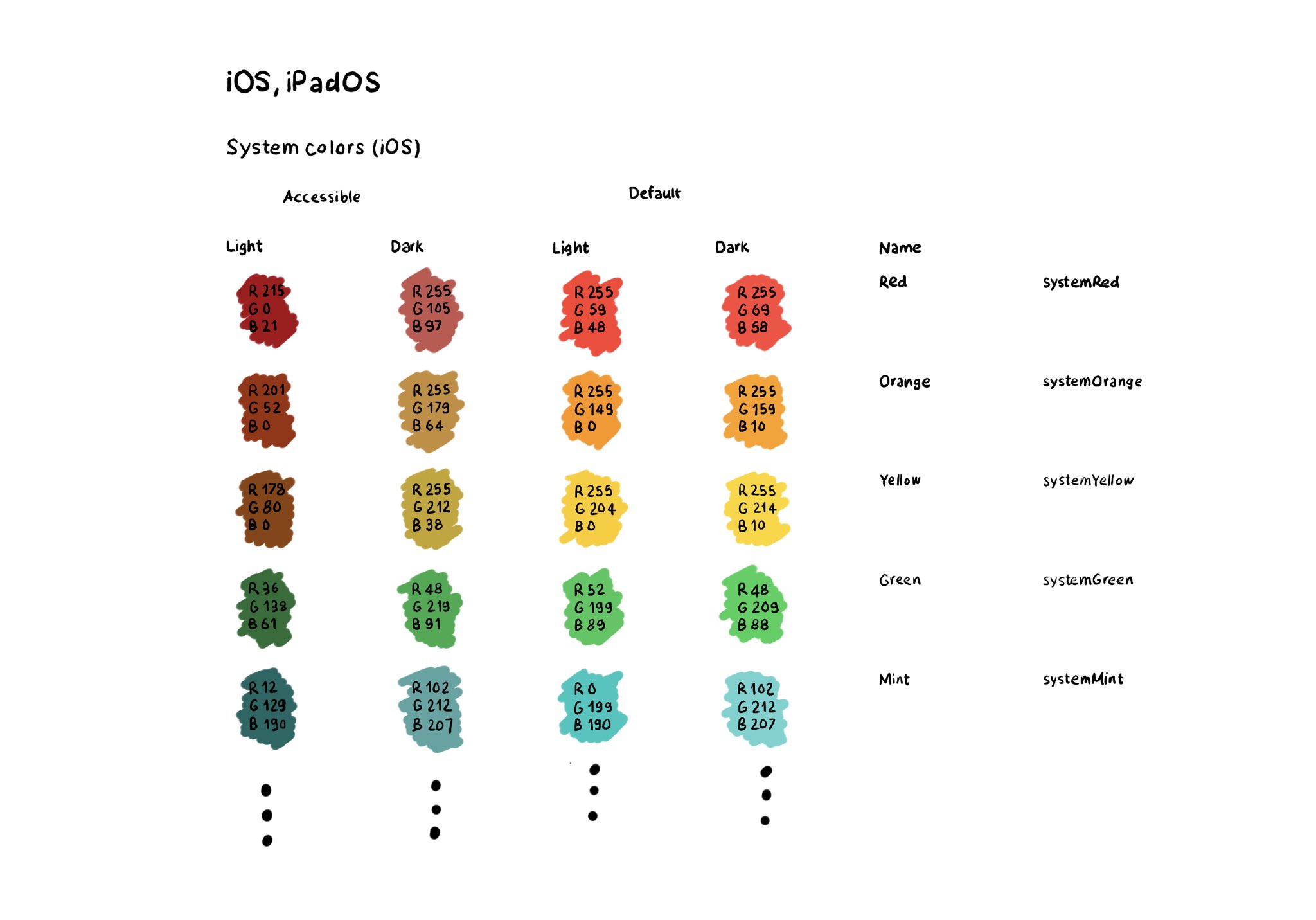
The most straightforward way for making sure your colors work well in all appearances (dark, light, increase contrast, and all the combinations) is to use the provided system colors. Check the background and label semantic colors too. All the info in the Color section of Apple’s Human Interface Guidelines: https://developer.apple.com/design/human-interface-guidelines/color
If you don't use Color Sets in your Asset Catalog, and you define your color palette in code, you can still check if the user has Increase Contrast enabled to offer a slightly different color that improves the contrast ratio even more. Day 192 (2/2). You can check if the darker system colors is enabled: https://developer.apple.com/documentation/uikit/uiaccessibility/isdarkersystemcolorsenabled Listen to a notification in case this setting changes: https://developer.apple.com/documentation/uikit/uiaccessibility/darkersystemcolorsstatusdidchangenotification And also check if the accessibility contrast is high in your trait collection: https://developer.apple.com/documentation/uikit/uitraitcollection/accessibilitycontrast
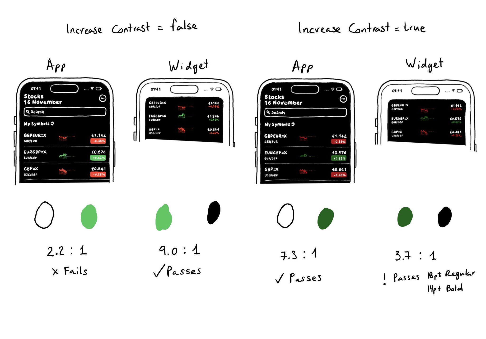
Sometimes it won't be enough to make colors darker or lighter for Increase Contrast. As always, it is important to do some testing. The same colors might be used with different backgrounds or text colors and the contrast could actually get worse.