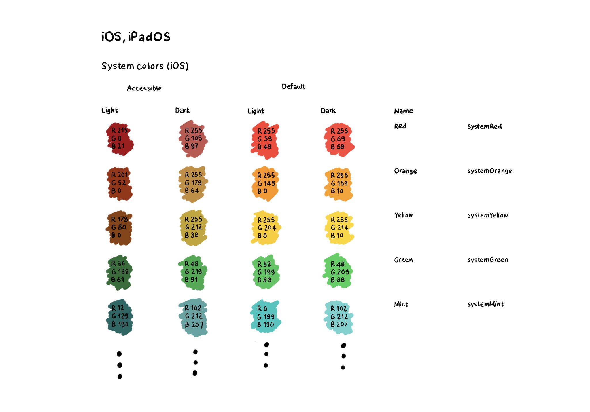
If you don't use Color Sets in your Asset Catalog, and you define your color palette in code, you can still check if the user has Increase Contrast enabled to offer a slightly different color that improves the contrast ratio even more.
Day 192 (2/2).
You can check if the darker system colors is enabled: https://developer.apple.com/documentation/uikit/uiaccessibility/isdarkersystemcolorsenabled
Listen to a notification in case this setting changes: https://developer.apple.com/documentation/uikit/uiaccessibility/darkersystemcolorsstatusdidchangenotification
And also check if the accessibility contrast is high in your trait collection: https://developer.apple.com/documentation/uikit/uitraitcollection/accessibilitycontrast
You may also find interesting...

iOS and Xcode provide a wide variety of tools and options to deal with color contrast ratios. From system colors, that automatically support Increase Contrast, to high contrast color and asset variants, and even a built-in contrast calculator.

All the accessibility capabilities you can check for, have counterpart notification names you can observe in case the user changes its preferences while using your app. https://x.com/dadederk/status/1577435144129892352
To capture the gesture, you can override the accessibilityPerformEscape() function. In there you can dismiss your view, and return true if you could successfully handle it. https://developer.apple.com/documentation/objectivec/nsobject-swift.class/accessibilityperformescape()