If you are developing a custom component, that can change value, chances are that it will need the adjustable accessibility trait (VoiceOver will say: "Adjustable"). Think of a component that lets you rate from one to five thumbs up (or stars).
Some of you have asked me how you can support what I do. This would really help, and would be hugely appreciated:
Find these posts useful? Share them at work, on social media, or with anyone that might find them interesting. Let's spread the word!
Check out any of my apps or games: Xarra!, RetroRapid!, or Mestre!.
A download and a review go a long way. They're free by default. On the App Store, ratings and reviews really help more people discover them.
Finding any of them useful? If so, and if you can afford it, purchasing lifetime access to all features or subscribing lets me buy the coffee that keeps me caffeinated. Caffeine keeps me going to maintain the apps, bring in new features that I hope you'll love, and keep writing.
You may also find interesting...
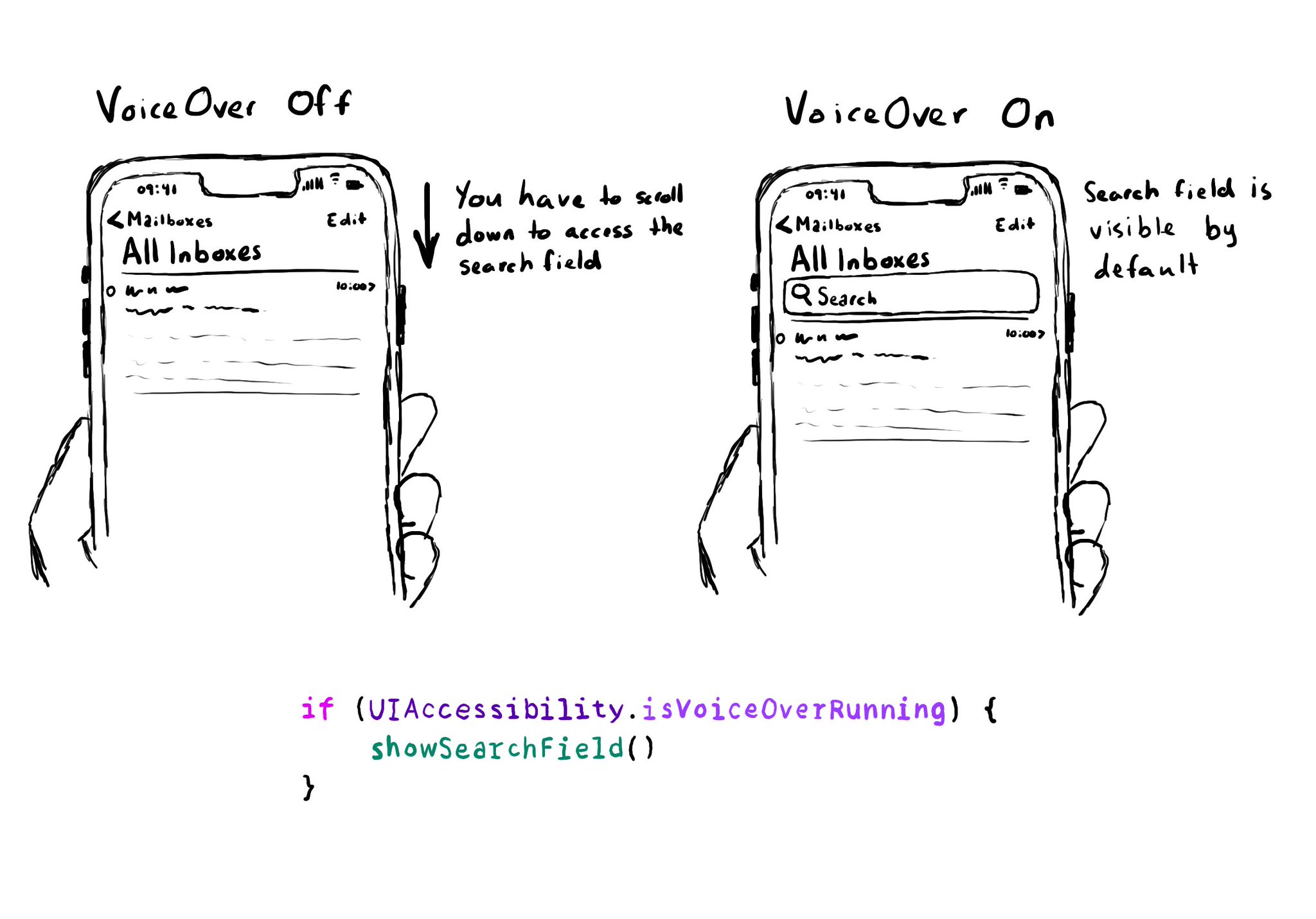
You can check if some features, like VoiceOver, are on. Experiences should not diverge too much. It could be used to avoid auto-hiding UI elements. iOS probably checks this to show search fields by default, without having to pull them down. From the documentation: isVoiceOverRunning: https://developer.apple.com/documentation/uikit/uiaccessibility/isvoiceoverrunning
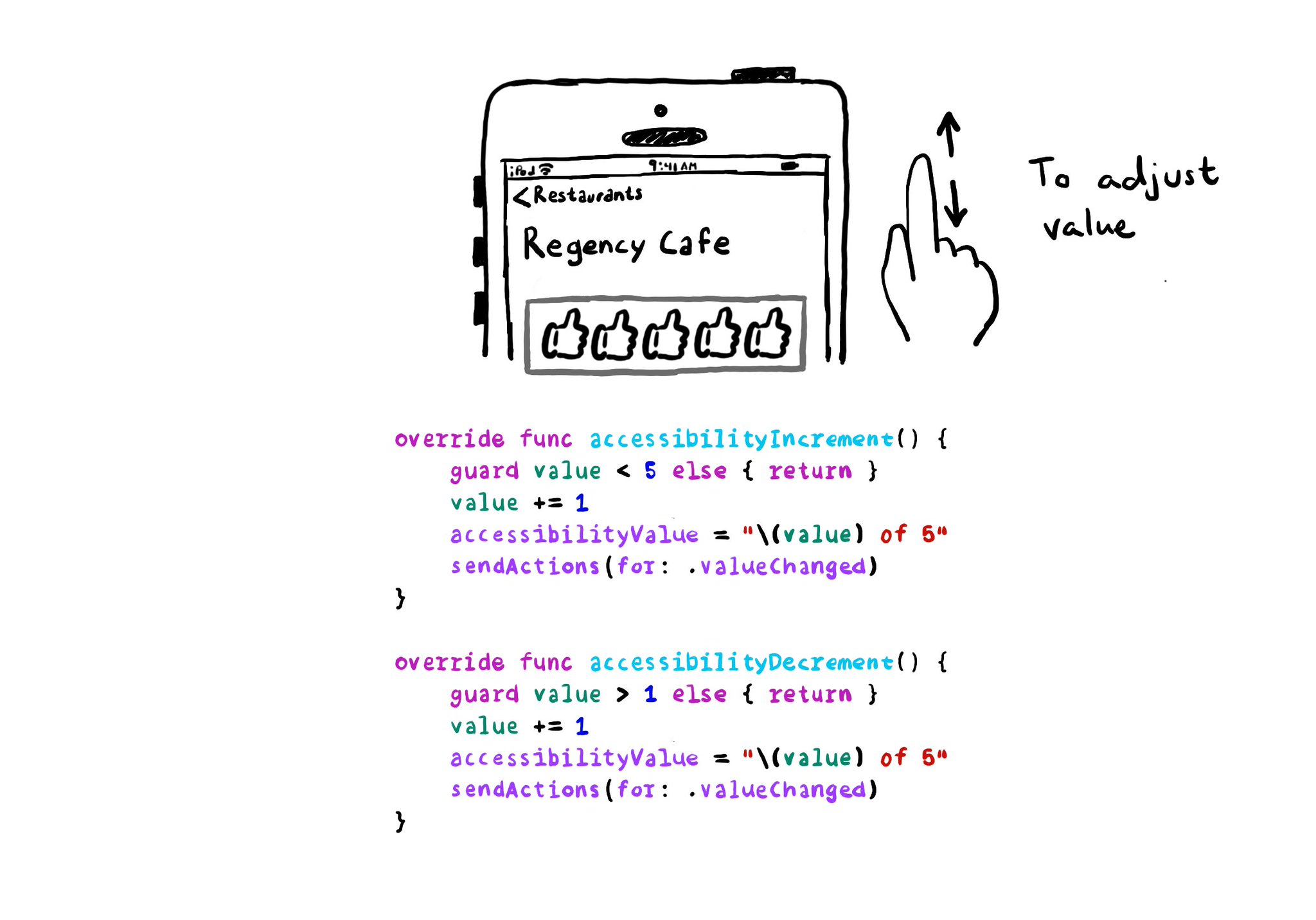
With VoiceOver, you can swipe up/down to increase/decrease the value of adjustable components. You need to implement accessibilityIncrement() and accessibilityDecrement() accordingly, and configure an accessibility value that makes sense. Example code in the image: ```swift override func accessibilityIncrement() { guard value < 5 else { return } value += 1 accessibilityValue = "\(value) of 5" sendActions(for: .valueChanged) } override func accessibilityDecrement() { guard value > 1 else { return } value -= 1 accessibilityValue = "\(value) of 5" sendActions(for: .valueChanged) } ``` Links to the official documentation: * accessibilityincrement() * accessibilitydecrement()
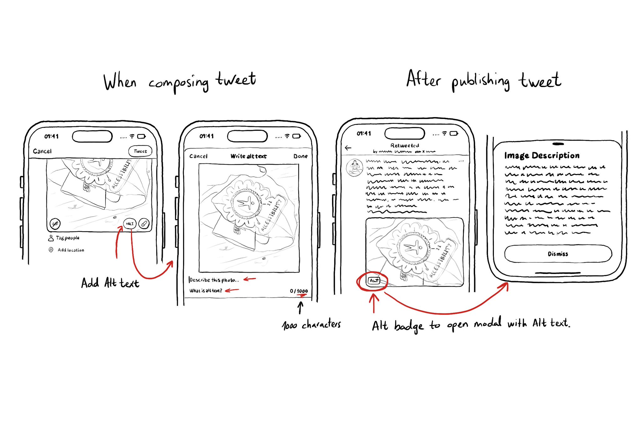
It is not just about applying accessibility APIs, but about caring, and thinking of features that can make your app more accessible and inclusive to everyone. Twitter's alt-text feature is a great example. Thanks, @TwitterA11y! You'll be missed.
Content © Daniel Devesa Derksen-Staats on Accessibility up to 11! is licensed under CC BY 4.0. License details