Consider setting a higher number of lines in your labels for large content size categories. Even to 0 (it means unlimited). That way you ensure the user will have access to the same amount of content regardless of the text size configured.
Some of you have asked me how you can support what I do. This would really help, and would be hugely appreciated:
Find these posts useful? Share them at work, on social media, or with anyone that might find them interesting. Let's spread the word!
Check out any of my apps or games: Xarra!, RetroRapid!, or Mestre!.
A download and a review go a long way. They're free by default. On the App Store, ratings and reviews really help more people discover them.
Finding any of them useful? If so, and if you can afford it, purchasing lifetime access to all features or subscribing lets me buy the coffee that keeps me caffeinated. Caffeine keeps me going to maintain the apps, bring in new features that I hope you'll love, and keep writing.
You may also find interesting...
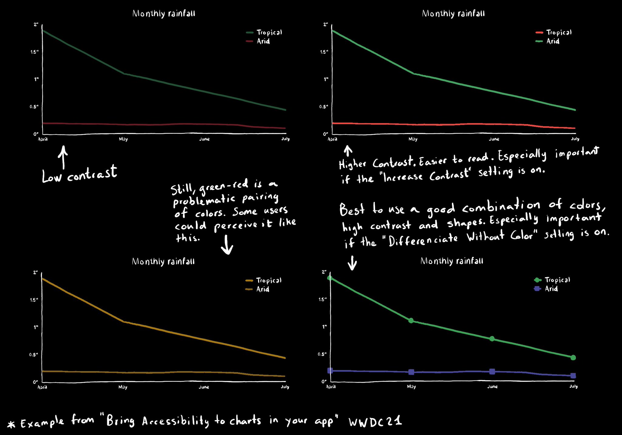
Some good practices when it comes to charts and data visualizations: use high contrast colors, avoid problematic pairings (red-green, blue-yellow), use symbols as well as colors...
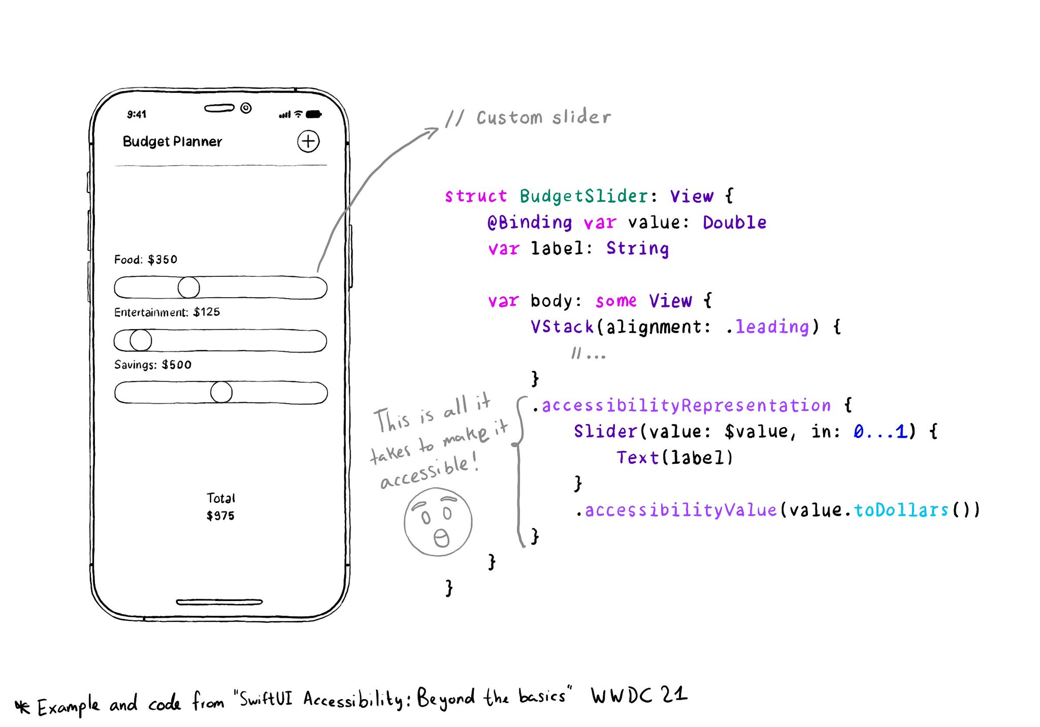
With accessibilityRepresentation(representation:), you can create a custom component and it can be perceived by assistive technologies as the view you pass as representation. No need to manually configure accessibility attributes. It is one of the most interesting additions to SwiftUI to help you develop accessible UI components. If your custom component behaves similarly to a native one, this is the way to go. https://developer.apple.com/documentation/swiftui/view/accessibilityrepresentation(representation:)
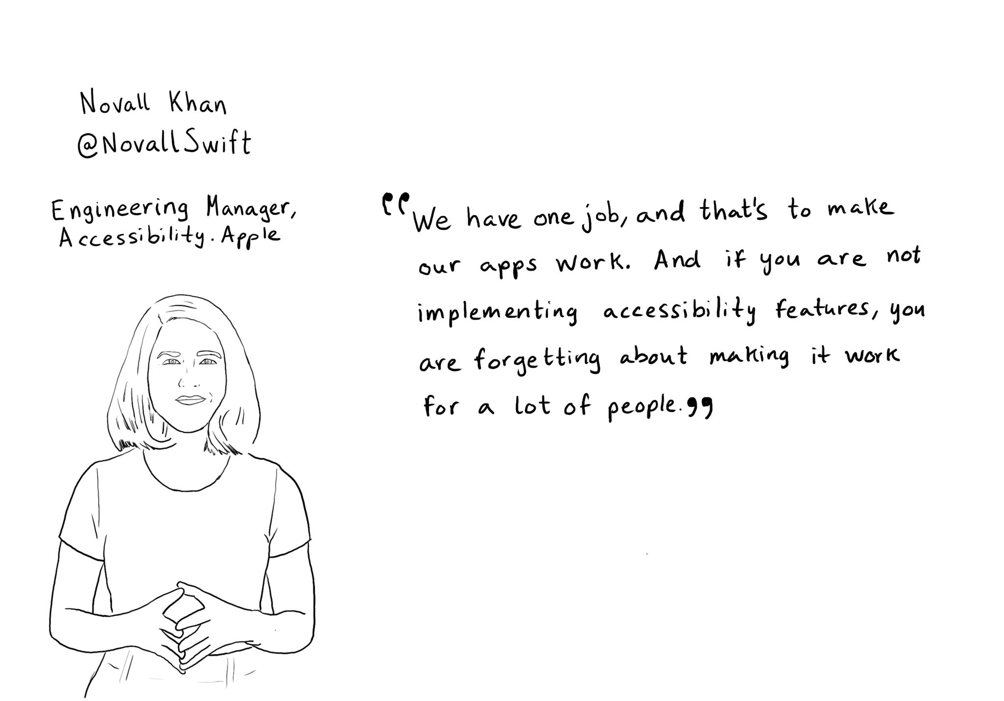
"We have one job, and that's to make our apps work. And if you are not implementing accessibility features, you are forgetting about making it work for a lot of people" @NovallSwift Couldn't have said it better! https://x.com/novallswift/status/1328387659744505856
Content © Daniel Devesa Derksen-Staats on Accessibility up to 11! is licensed under CC BY 4.0. License details