Tag: HIG
8 posts
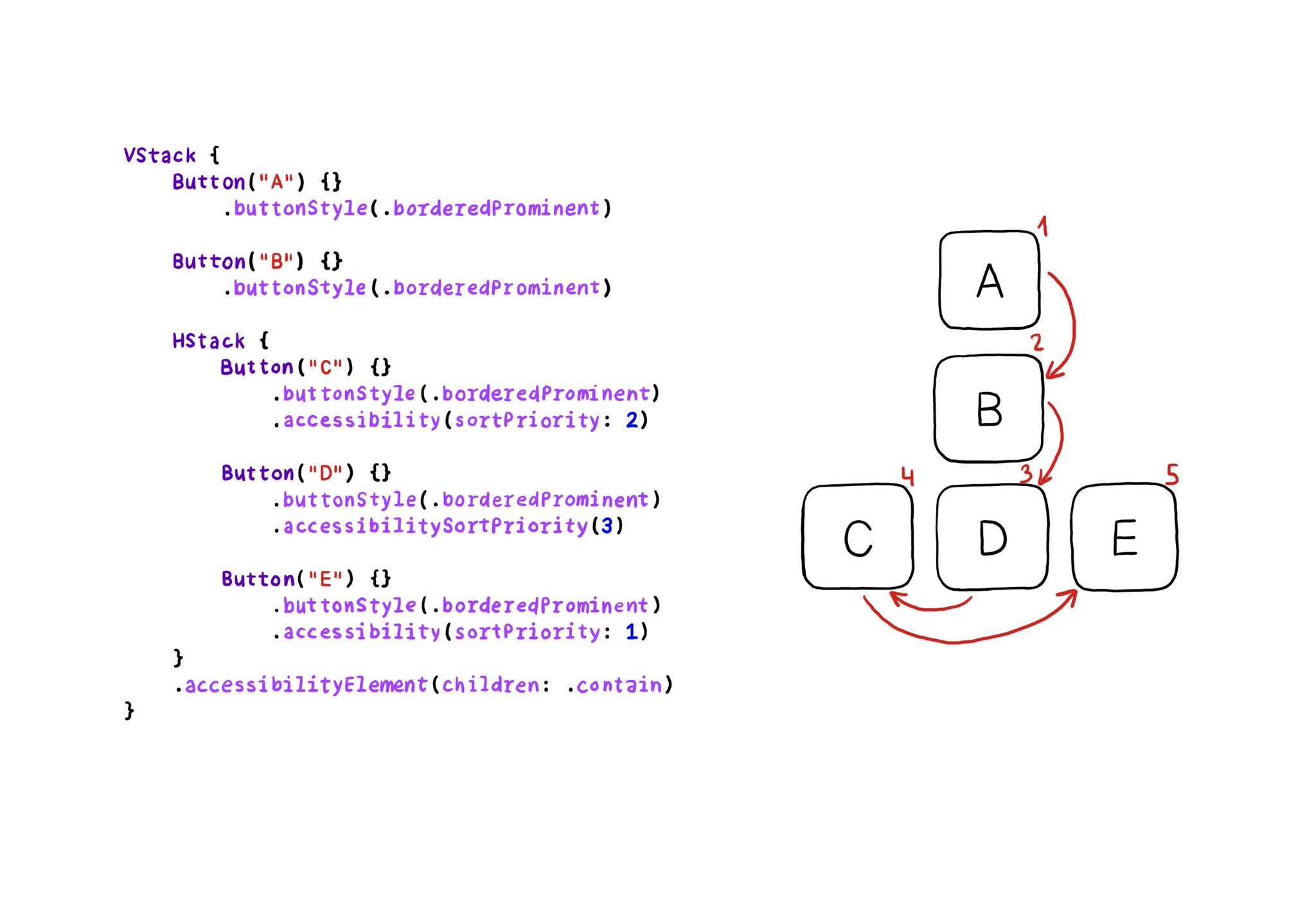
VoiceOver will traverse elements from left-right, and from top-bottom. If for any reason you need to change that order, in SwiftUI you can change the accessibility sort priority. A higher priority number in the container means it will go first.
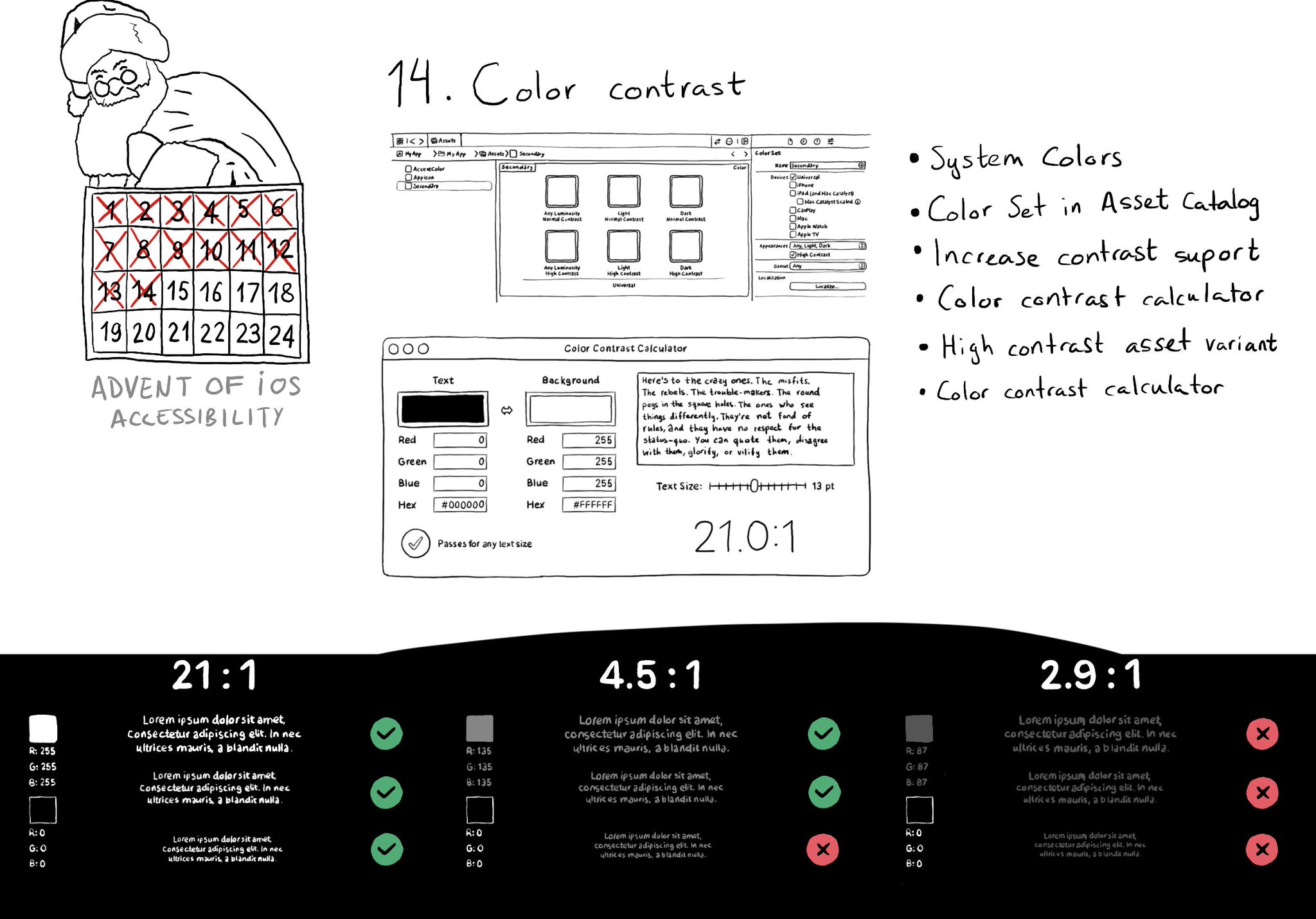
iOS and Xcode provide a wide variety of tools and options to deal with color contrast ratios. From system colors, that automatically support Increase Contrast, to high contrast color and asset variants, and even a built-in contrast calculator.
You can enable the possibility of providing assets for different appearances including light/dark modes and high contrast. As we've seen, that's valid for colors, but you can do the same for images too! https://x.com/dadederk/status/1594724075590619138?s=20&t=XJrlJiGSCTR9sJC7XPZPjA
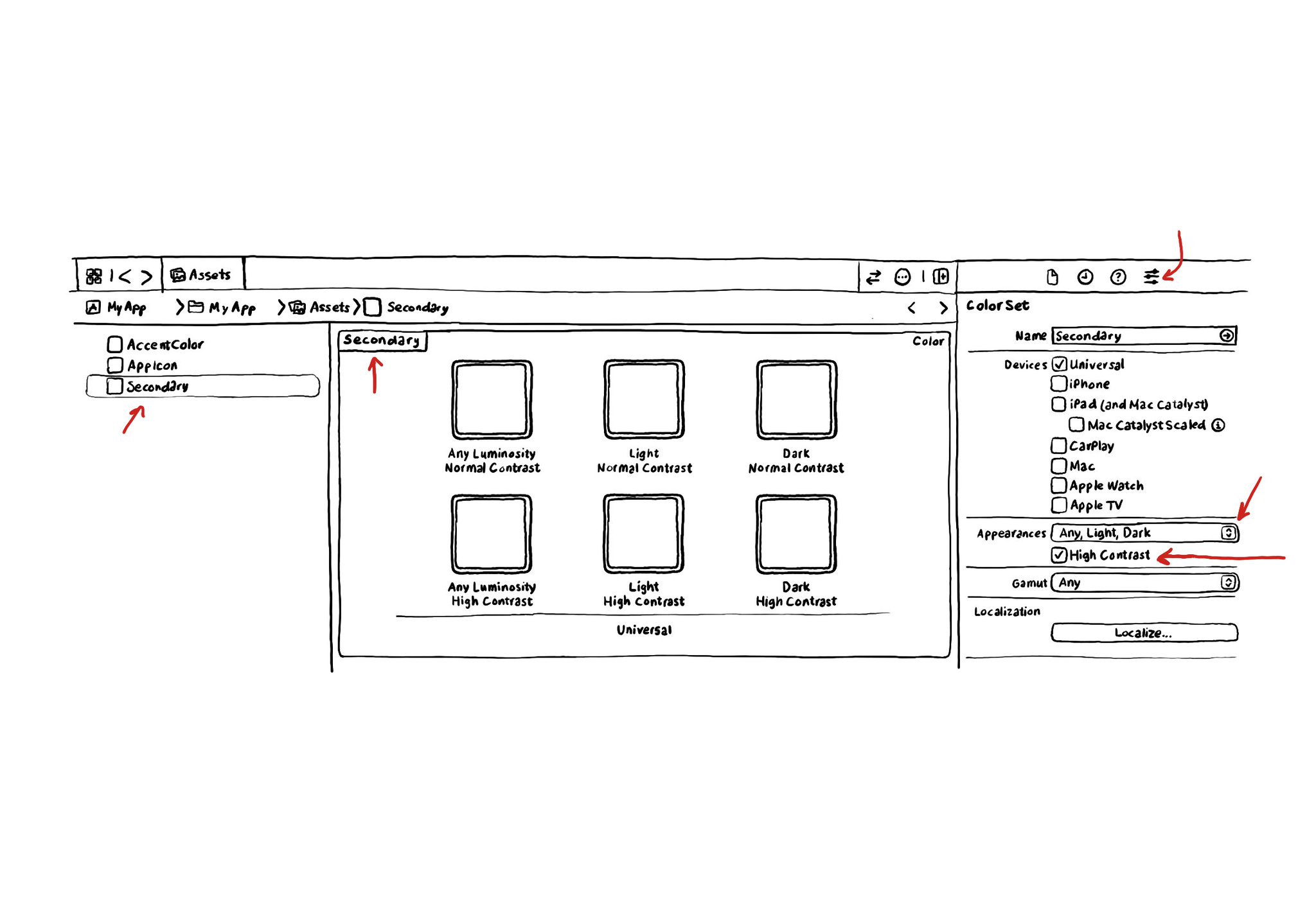
If you use Color Sets in the Assets Catalog to define your color palette, make sure you enable variants for the Any, Light and Dark appearances and also High Contrast. You'll be able to define variations of the color that have better contrast.
Second day of @a11yTO! And again, lots of talks with a ton of practical information. So here's a thread with some of my highlights. And very proud that @spotifydesign was one of the sponsors! #a11yTOconf
Consider setting a higher number of lines in your labels for large content size categories. Even to 0 (it means unlimited). That way you ensure the user will have access to the same amount of content regardless of the text size configured.
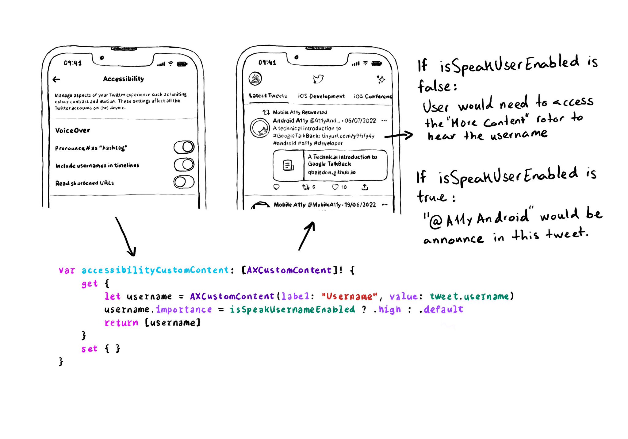
When creating AXCustomContent objects for accessibilityCustomContent, you can specify the importance of the data. If it is high, it will always be presented by VoiceOver. You could potentially ask the user if that data is of importance to them.
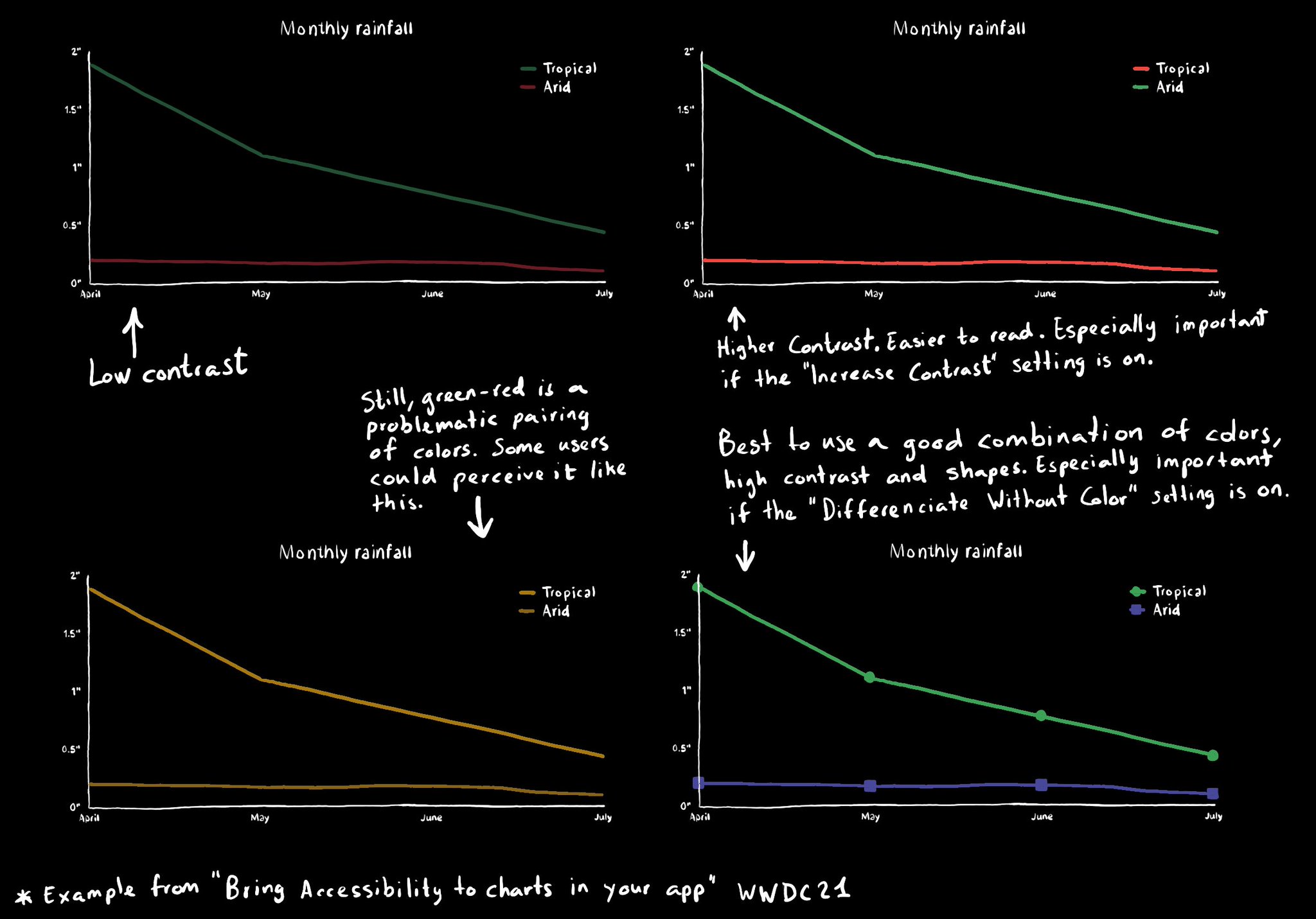
Some good practices when it comes to charts and data visualizations: use high contrast colors, avoid problematic pairings (red-green, blue-yellow), use symbols as well as colors...