iOS and Xcode provide a wide variety of tools and options to deal with color contrast ratios. From system colors, that automatically support Increase Contrast, to high contrast color and asset variants, and even a built-in contrast calculator.
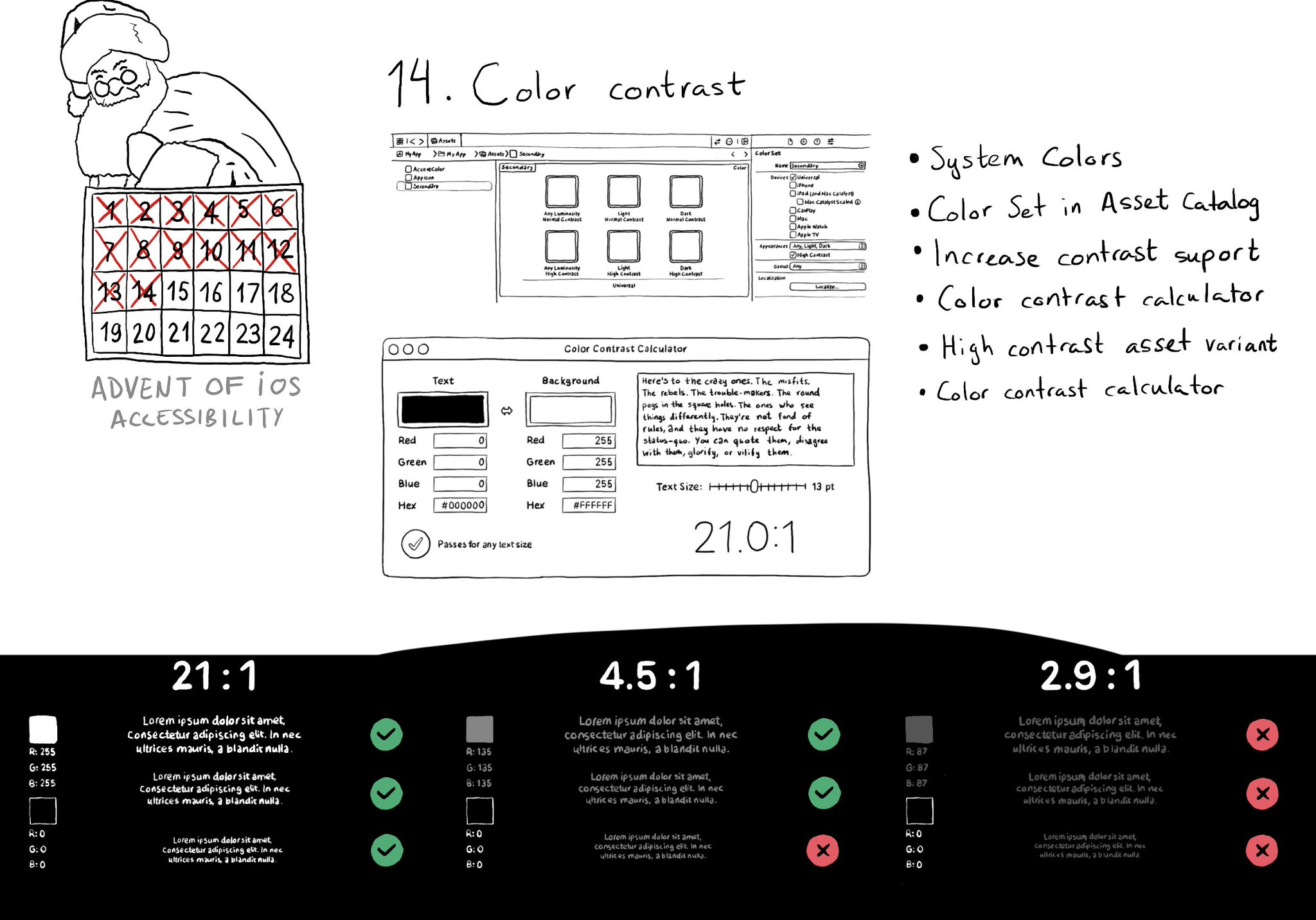
iOS and Xcode provide a wide variety of tools and options to deal with color contrast ratios. From system colors, that automatically support Increase Contrast, to high contrast color and asset variants, and even a built-in contrast calculator.
Some of you have asked me how you can support what I do. This would really help, and would be hugely appreciated:
Find these posts useful? Share them at work, on social media, or with anyone that might find them interesting. Let's spread the word!
Check out any of my apps or games: Xarra!, RetroRapid!, or Mestre!.
A download and a review go a long way. They're free by default. On the App Store, ratings and reviews really help more people discover them.
Finding any of them useful? If so, and if you can afford it, purchasing lifetime access to all features or subscribing lets me buy the coffee that keeps me caffeinated. Caffeine keeps me going to maintain the apps, bring in new features that I hope you'll love, and keep writing.
Second day of @a11yTO! And again, lots of talks with a ton of practical information. So here's a thread with some of my highlights. And very proud that @spotifydesign was one of the sponsors! #a11yTOconf
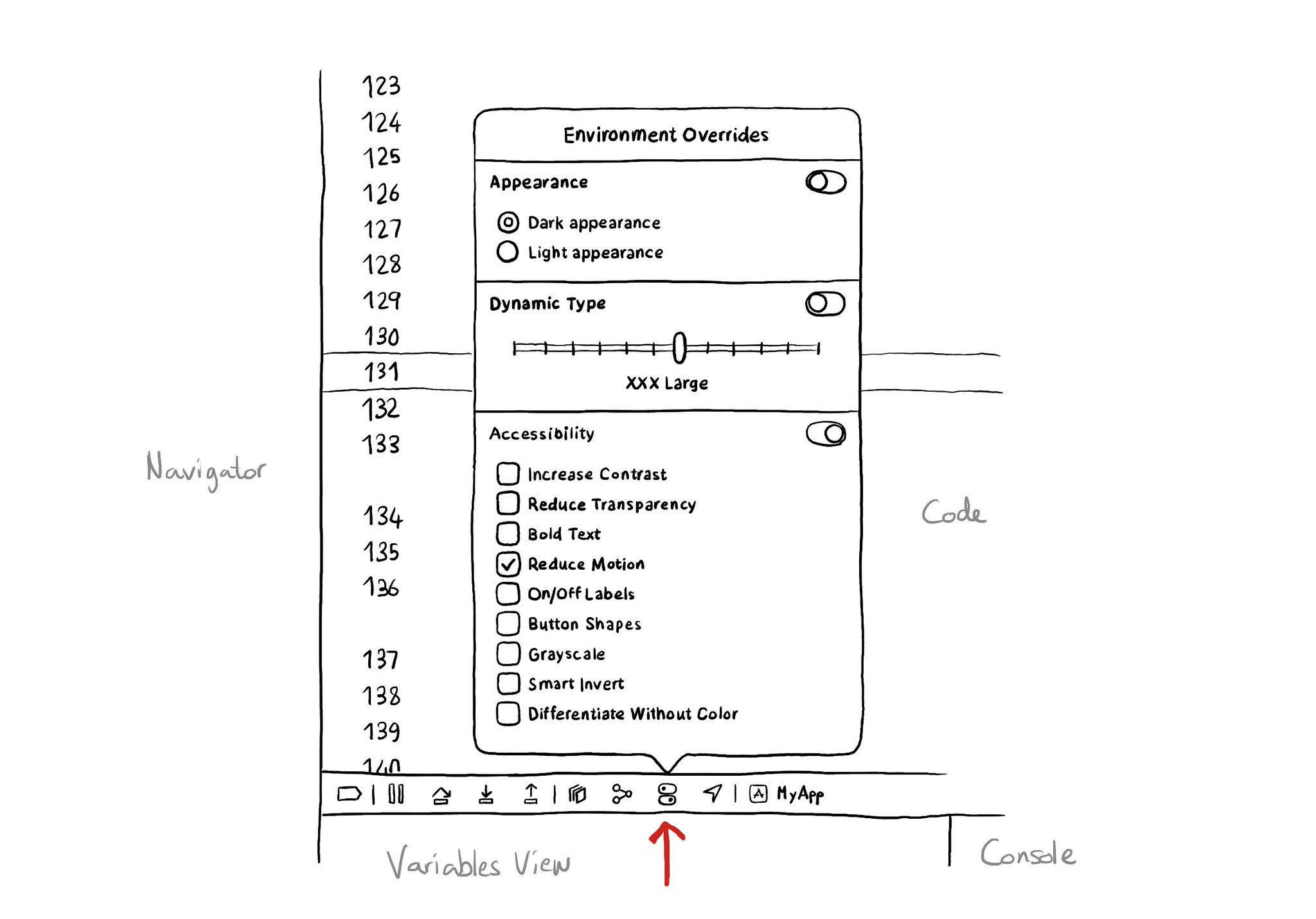
There is an Environment Overrides panel in the toolbar on top of Xcode's Debug Area. It allows you to select some of the most common accessibility options and Dynamic Type sizes, like in the Accessibility Inspector, plus select dark/light mode.
If you don't use Color Sets in your Asset Catalog, and you define your color palette in code, you can still check if the user has Increase Contrast enabled to offer a slightly different color that improves the contrast ratio even more. Day 192 (2/2). You can check if the darker system colors is enabled: https://developer.apple.com/documentation/uikit/uiaccessibility/isdarkersystemcolorsenabled Listen to a notification in case this setting changes: https://developer.apple.com/documentation/uikit/uiaccessibility/darkersystemcolorsstatusdidchangenotification And also check if the accessibility contrast is high in your trait collection: https://developer.apple.com/documentation/uikit/uitraitcollection/accessibilitycontrast
Content © Daniel Devesa Derksen-Staats on Accessibility up to 11! is licensed under CC BY 4.0. License details