With the Accessibility Inspector you can check the value for the most common accessibility attributes for individual elements, do some basic navigation, and even perform actions if the component is adjustable or if it has custom actions.
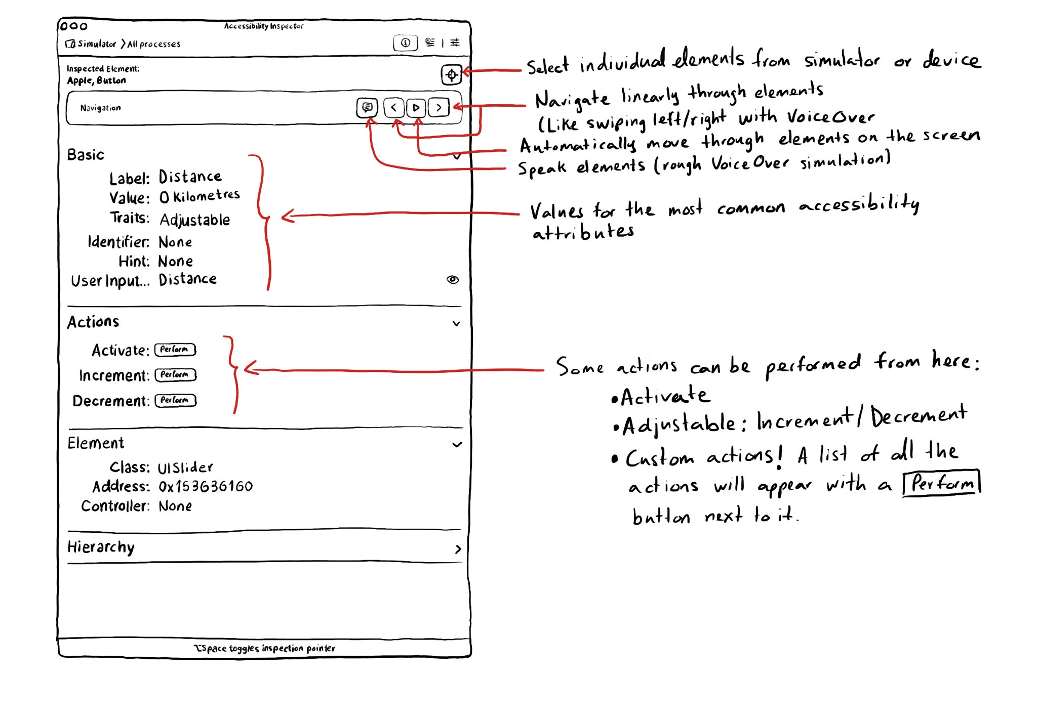
With the Accessibility Inspector you can check the value for the most common accessibility attributes for individual elements, do some basic navigation, and even perform actions if the component is adjustable or if it has custom actions.
Some of you have asked me how you can support what I do. This would really help, and would be hugely appreciated:
Find these posts useful? Share them at work, on social media, or with anyone that might find them interesting. Let's spread the word!
Check out any of my apps or games: Xarra!, RetroRapid!, or Mestre!.
A download and a review go a long way. They're free by default. On the App Store, ratings and reviews really help more people discover them.
Finding any of them useful? If so, and if you can afford it, purchasing lifetime access to all features or subscribing lets me buy the coffee that keeps me caffeinated. Caffeine keeps me going to maintain the apps, bring in new features that I hope you'll love, and keep writing.
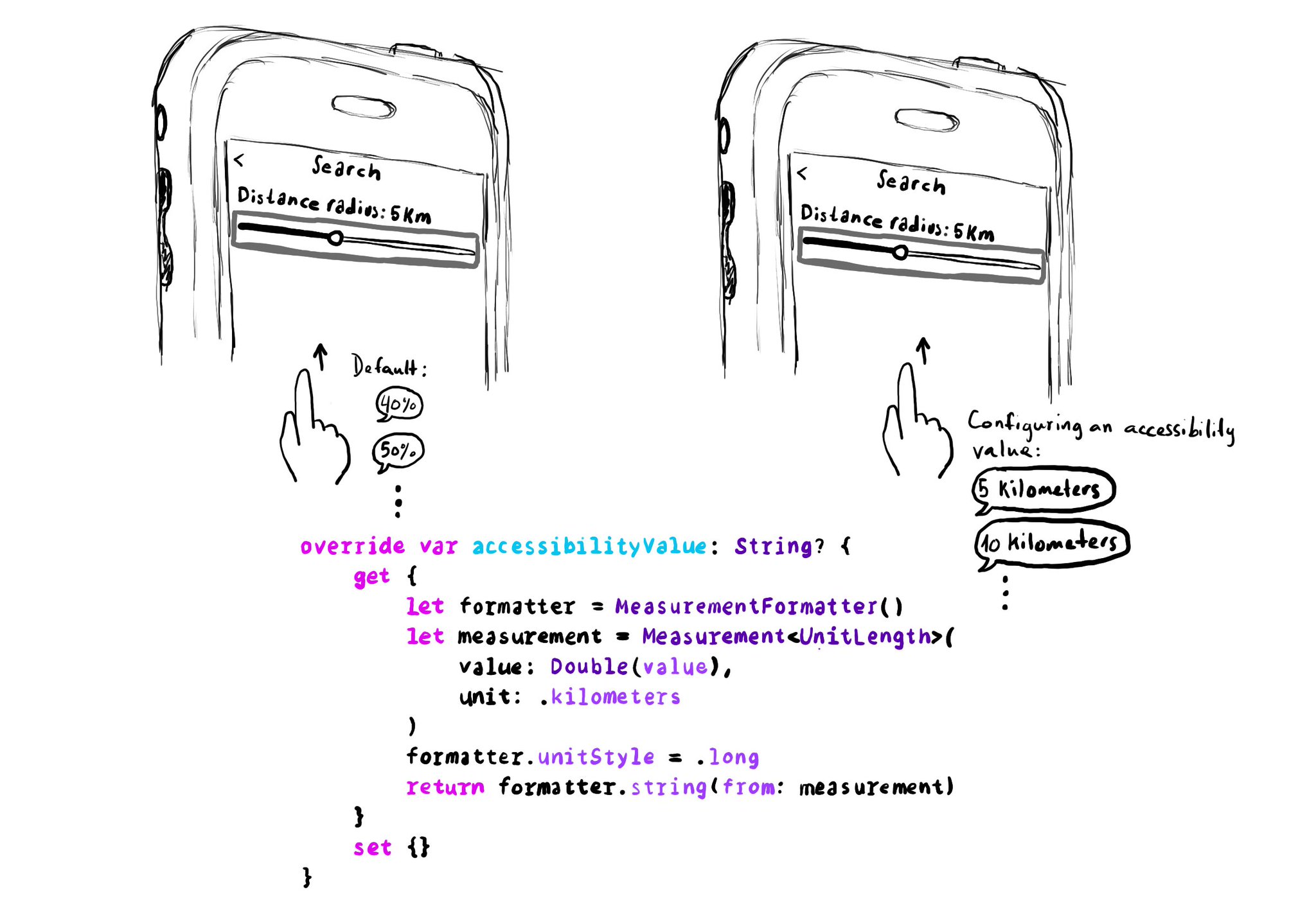
UISliders are adjustable, and its default accessibility value is represented in percentages. But that's not always the best format to express a value. Consider a slider to select a distance radius. Miles or km seem a more appropriate unit.
Example code in the image:
```swift
override var accessibilityValue: String? {
get {
let formatter = MeasurementFormatter()
let measurement = Measurement
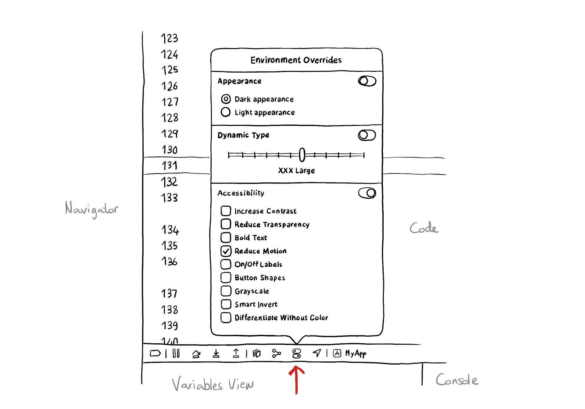
There is an Environment Overrides panel in the toolbar on top of Xcode's Debug Area. It allows you to select some of the most common accessibility options and Dynamic Type sizes, like in the Accessibility Inspector, plus select dark/light mode.
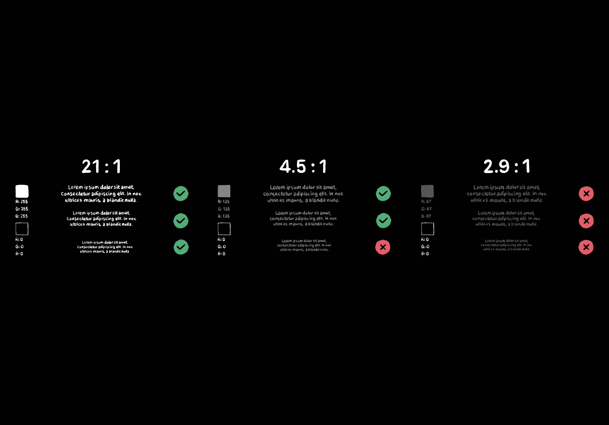
Color contrast between text and background is very important for perceivability. As colors come closer to each other, they’re more difficult to distinguish. Notice that colors that work well with big font sizes may not for smaller text.
Content © Daniel Devesa Derksen-Staats on Accessibility up to 11! is licensed under CC BY 4.0. License details