There is a Color Contrast Calculator conveniently built into the Accessibility Inspector. Find it in Window, in the top menu. Select two colors for text and background and check if it passes for all text sizes or just some of the largest ones.
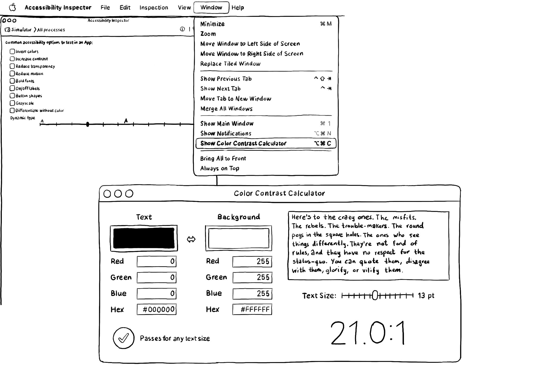
There is a Color Contrast Calculator conveniently built into the Accessibility Inspector. Find it in Window, in the top menu. Select two colors for text and background and check if it passes for all text sizes or just some of the largest ones.
Some of you have asked me how you can support what I do. This would really help, and would be hugely appreciated:
Find these posts useful? Share them at work, on social media, or with anyone that might find them interesting. Let's spread the word!
Check out any of my apps or games: Xarra!, RetroRapid!, or Mestre!.
A download and a review go a long way. They're free by default. On the App Store, ratings and reviews really help more people discover them.
Finding any of them useful? If so, and if you can afford it, purchasing lifetime access to all features or subscribing lets me buy the coffee that keeps me caffeinated. Caffeine keeps me going to maintain the apps, bring in new features that I hope you'll love, and keep writing.
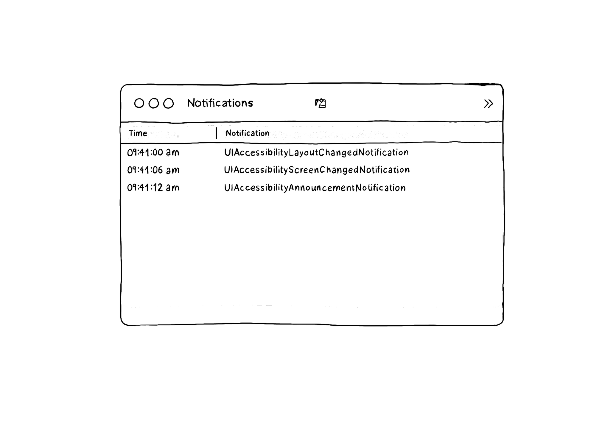
The Accessibility Inspector has a Notifications log that you can find in Window, in its top menu, and then Show Notifications. It shows accessibility-related notifications like layout changed, screen changed, or announcements... I learned about this feature from the Accessibility Inspector in this article by @basthomas. A very recommended read to learn all about the Verifying VoiceOver with the Accessibility Inspector. https://www.basbroek.nl/verifying-voiceover
@azzoor has this great video with some advice on how to set up your device for testing accessibility and a ton of tips will get you testing effectively in no time. https://m.youtube.com/watch?v=Ca1H6wF348g&feature=youtu.be
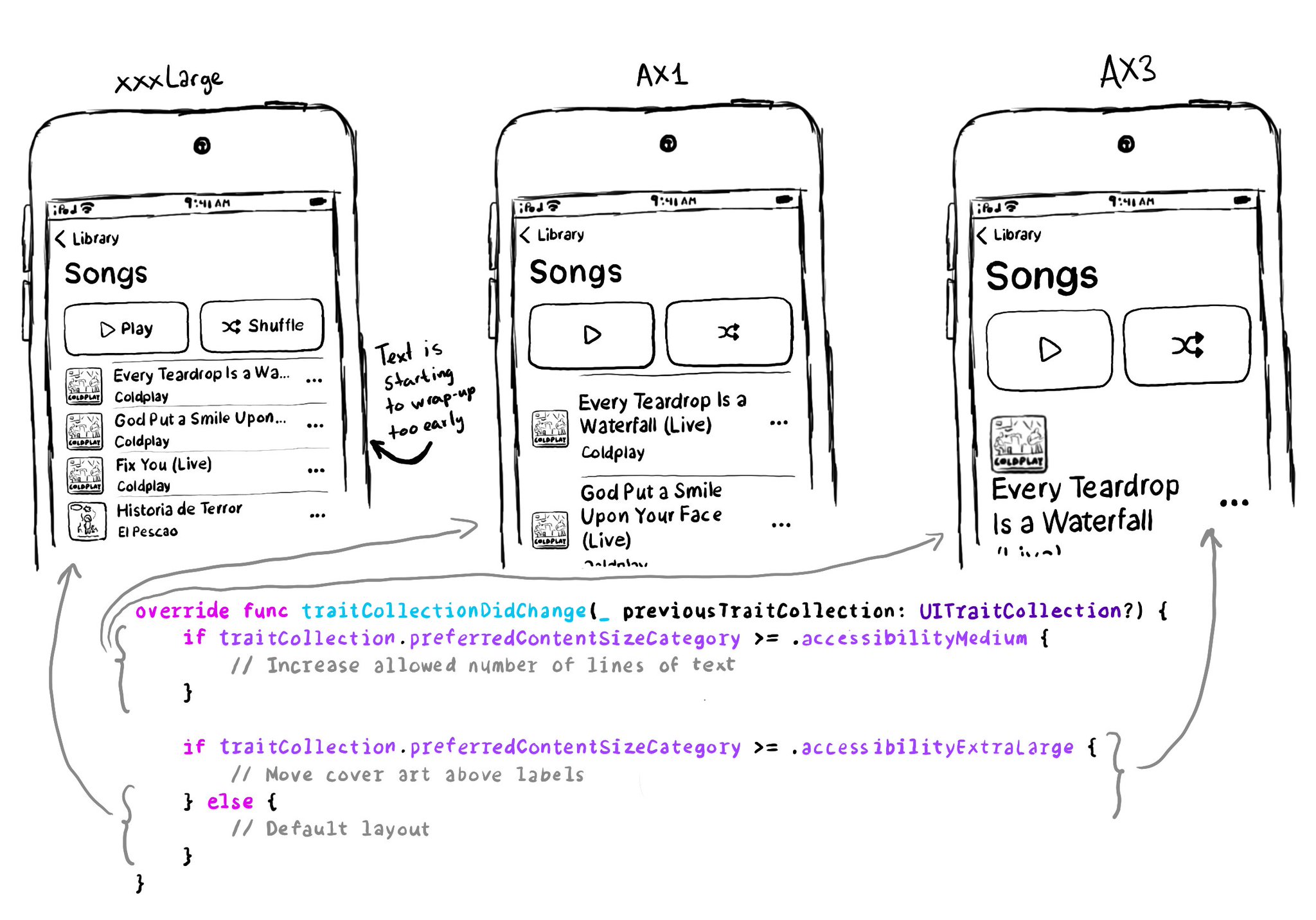
You don't have to offer an alternative layout just for the accessibility category. You can actually compare content size categories. So you could tweak the UI already for anything equal to or larger than .extraExtraLarge, for example.
Content © Daniel Devesa Derksen-Staats on Accessibility up to 11! is licensed under CC BY 4.0. License details