The Accessibility Inspector can be used with your device. It is actually quite interesting to check what other apps (or iOS) configure, for some of the basic accessibility attributes (label, value, traits, hint...), in their UI components.
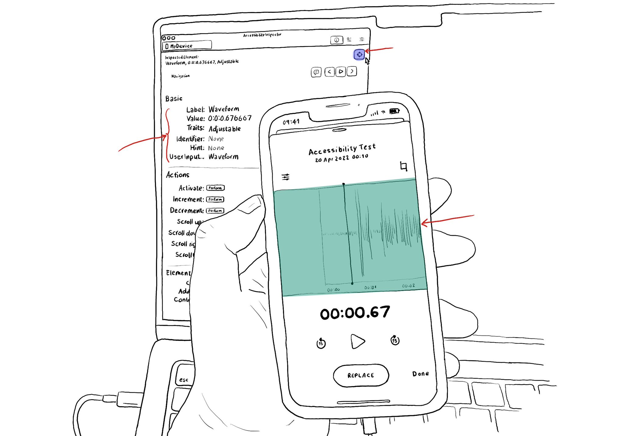
The Accessibility Inspector can be used with your device. It is actually quite interesting to check what other apps (or iOS) configure, for some of the basic accessibility attributes (label, value, traits, hint...), in their UI components.
Some of you have asked me how you can support what I do. This would really help, and would be hugely appreciated:
Find these posts useful? Share them at work, on social media, or with anyone that might find them interesting. Let's spread the word!
Check out any of my apps or games: Xarra!, RetroRapid!, or Mestre!.
A download and a review go a long way. They're free by default. On the App Store, ratings and reviews really help more people discover them.
Finding any of them useful? If so, and if you can afford it, purchasing lifetime access to all features or subscribing lets me buy the coffee that keeps me caffeinated. Caffeine keeps me going to maintain the apps, bring in new features that I hope you'll love, and keep writing.
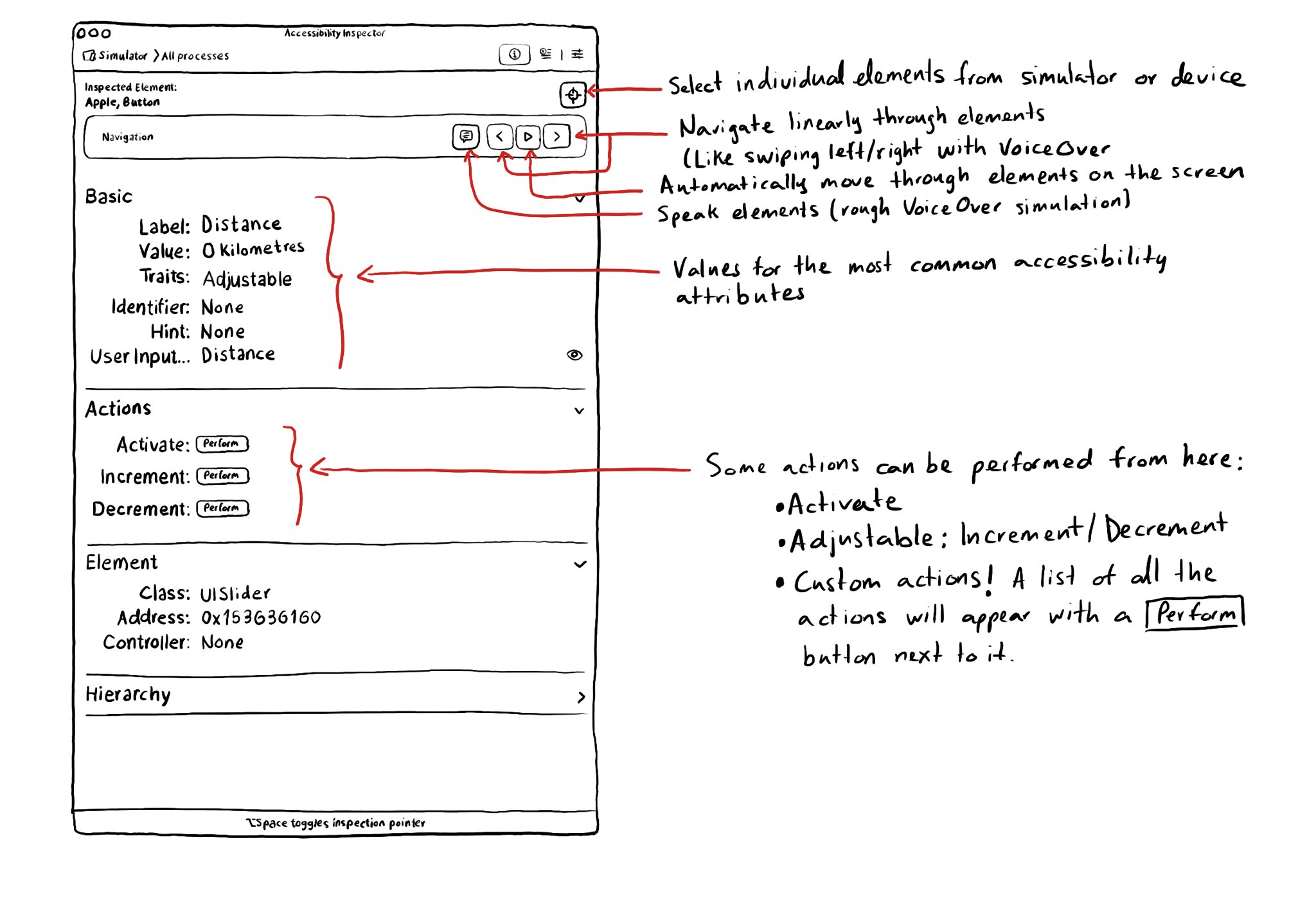
With the Accessibility Inspector you can check the value for the most common accessibility attributes for individual elements, do some basic navigation, and even perform actions if the component is adjustable or if it has custom actions.
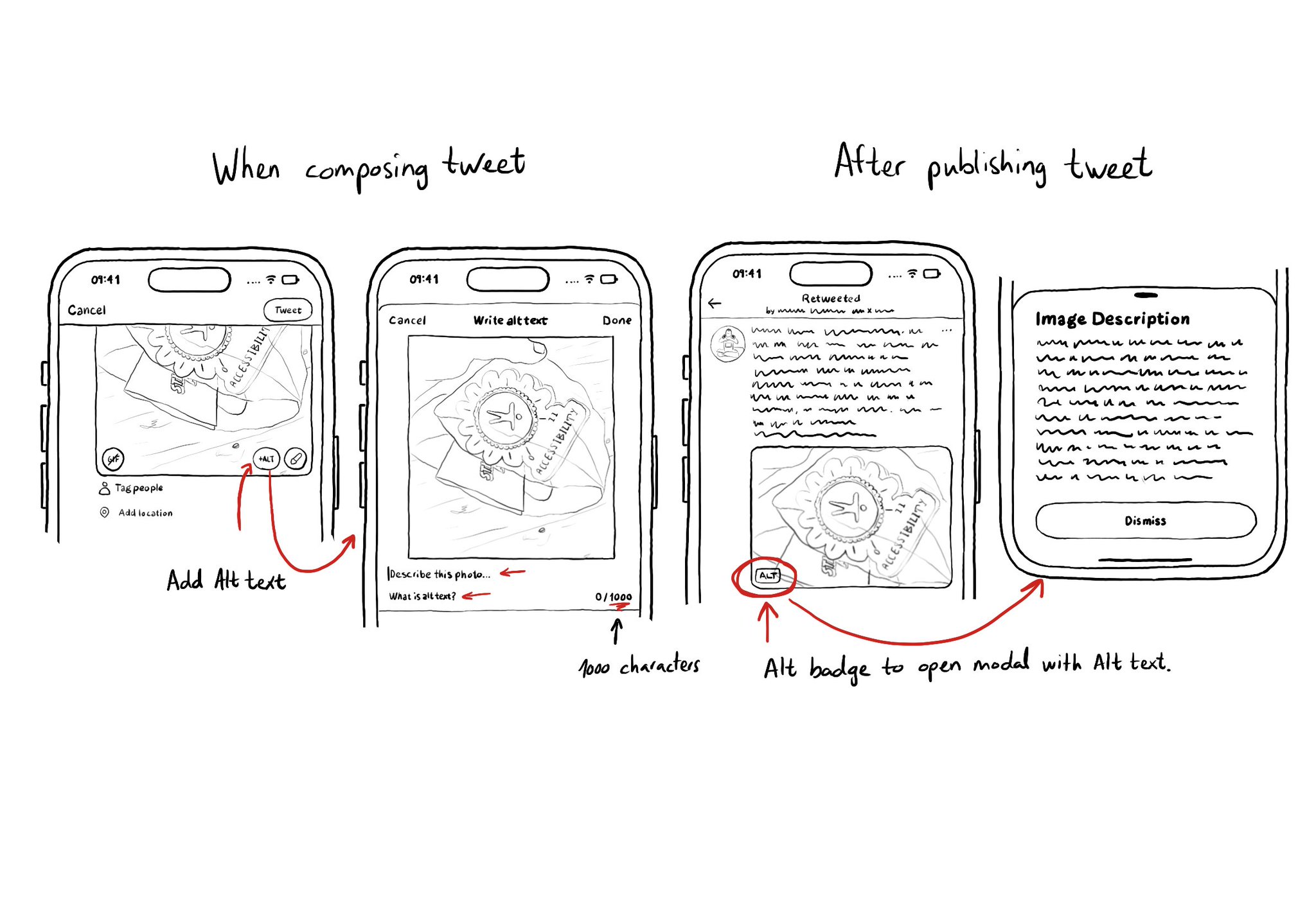
It is not just about applying accessibility APIs, but about caring, and thinking of features that can make your app more accessible and inclusive to everyone. Twitter's alt-text feature is a great example. Thanks, @TwitterA11y! You'll be missed.
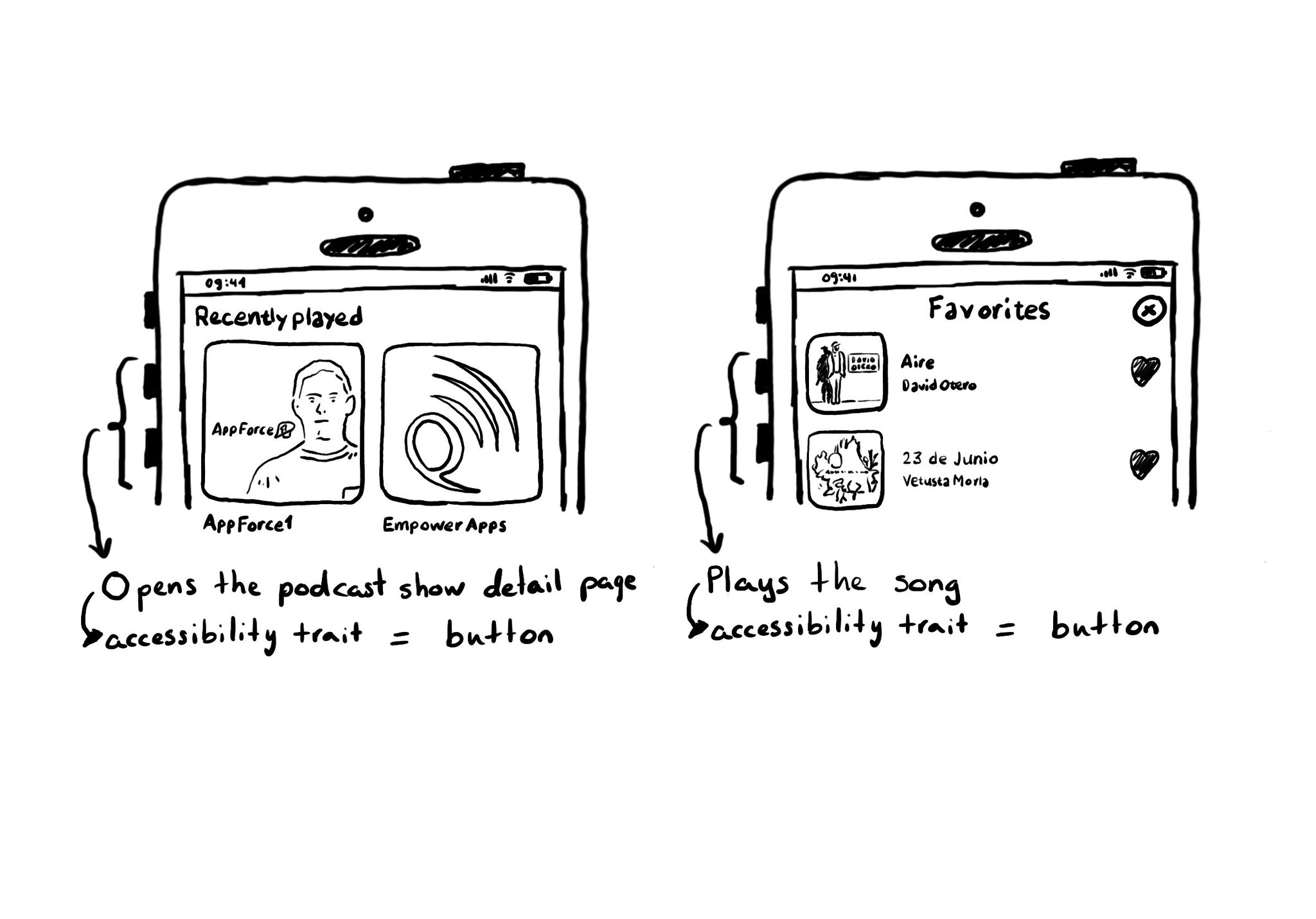
A common example where you need to manually configure the button accessibility trait is for some table/collection view cells. These tend to be “buttons” that perform an action, like playing music, or bring the user to a different screen.
Content © Daniel Devesa Derksen-Staats on Accessibility up to 11! is licensed under CC BY 4.0. License details