When building custom components, or if not relying on UIControl's attributes to configure state, it can be easy to forget to specify the right accessibility traits. These are indispensable for a good experience with VoiceOver, Switch Control...
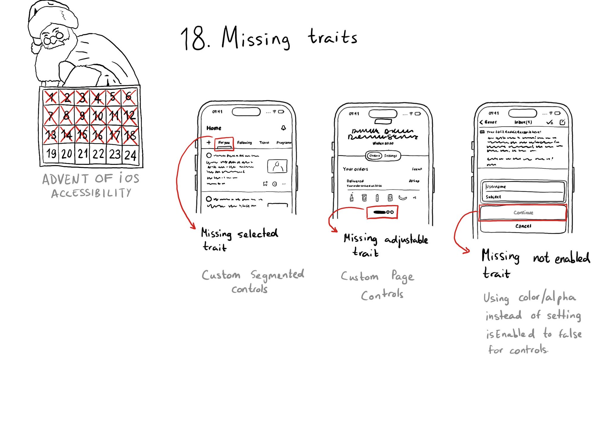
When building custom components, or if not relying on UIControl's attributes to configure state, it can be easy to forget to specify the right accessibility traits. These are indispensable for a good experience with VoiceOver, Switch Control...
Some of you have asked me how you can support what I do. This would really help, and would be hugely appreciated:
Find these posts useful? Share them at work, on social media, or with anyone that might find them interesting. Let's spread the word!
Check out any of my apps or games: Xarra!, RetroRapid!, or Mestre!.
A download and a review go a long way. They're free by default. On the App Store, ratings and reviews really help more people discover them.
Finding any of them useful? If so, and if you can afford it, purchasing lifetime access to all features or subscribing lets me buy the coffee that keeps me caffeinated. Caffeine keeps me going to maintain the apps, bring in new features that I hope you'll love, and keep writing.
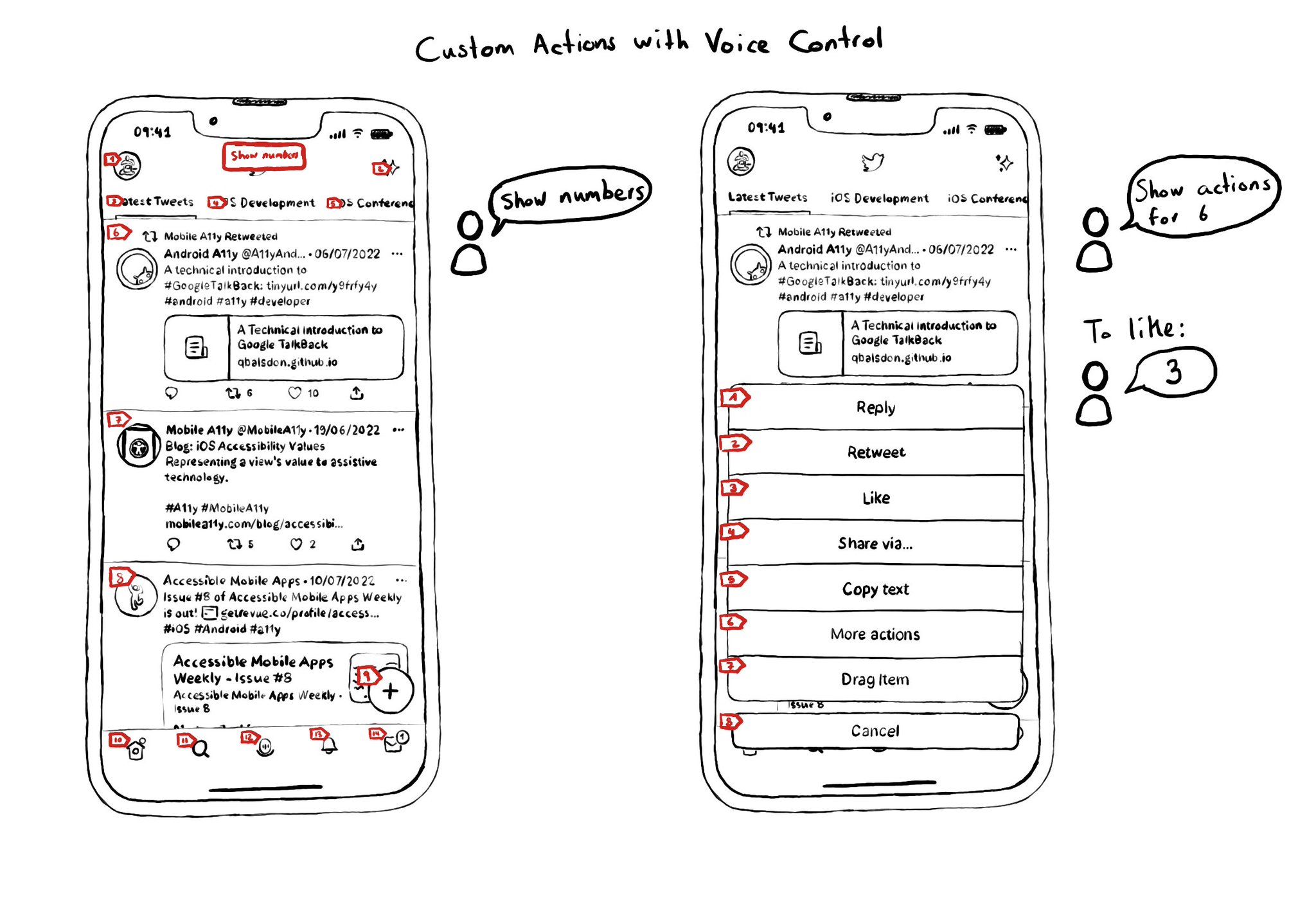
Custom actions work with VoiceOver, Switch Control and Full Keyboard Access. They also do for Voice Control. You can say "Show actions for <item name/number>", and an action sheet with all options, numbered, will be presented to the user. For some use-cases, Voice Control users might not feel it is a big win. Navigation is not as big of an issue, and interacting with custom actions might be a bit trickier than with "exposed" buttons. But lots of times seems a fair compromise.
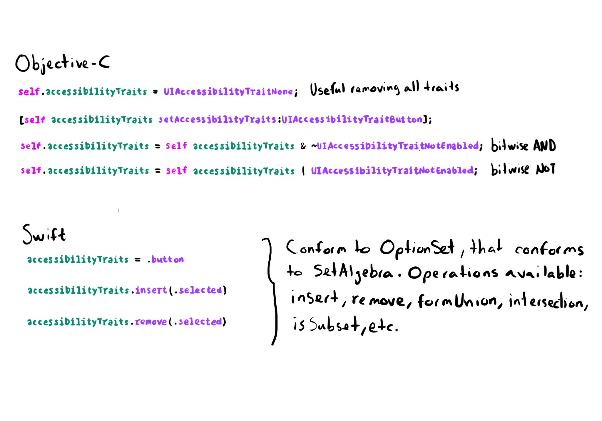
In Objective-C accessibility traits are a bitmask. Some devs find tricky to work with them using bitwise operations. In Swift they conform to the OptionSet protocol that conforms to SetAlgebra. That means you can simply insert/remove traits.
The Accessibility APIs are generic and flexible. They're not just for VoiceOver. If you implement them right, you can do it once and it will very likely work great for VoiceOver, Voice Control, Switch Control, Full Keyboard Access, and more. That's why, to start with, we tend to focus on VoiceOver, the same way you may focus on keyboard navigation for the web. A great VoiceOver experience will get you most of the way to a good experience with the other assistive technologies. We've seen one example with Custom Actions. One implementation works for: VoiceOver: https://x.com/dadederk/status/1550099327053451266 Switch Control: https://x.com/dadederk/status/1551236244088279040 Full Keyboard Access: https://x.com/dadederk/status/1551874732504629249 And Voice Control: https://x.com/dadederk/status/1552253520182640645 Of course that doesn't mean you don't have to test and check how the experience is with the other technologies. But before feeling overwhelmed, or for small teams, making sure your app works for VoiceOver is a great start.
Content © Daniel Devesa Derksen-Staats on Accessibility up to 11! is licensed under CC BY 4.0. License details